Unlock a world of possibilities! Login now and discover the exclusive benefits awaiting you.
- Qlik Community
- :
- Forums
- :
- Analytics
- :
- Topics
- :
- Visualization and Usability
- :
- how to adjust the legend of scatter plot chart
- Subscribe to RSS Feed
- Mark Topic as New
- Mark Topic as Read
- Float this Topic for Current User
- Bookmark
- Subscribe
- Mute
- Printer Friendly Page
- Mark as New
- Bookmark
- Subscribe
- Mute
- Subscribe to RSS Feed
- Permalink
- Report Inappropriate Content
how to adjust the legend of scatter plot chart

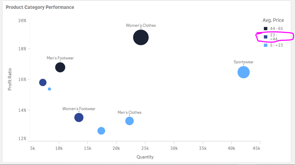
As you can see my dear experts, the middle range legend 23-44 is wrapped, how can I make it one single line? (I have tried to readjust the side of the chart, not working, and the price range segmentation is not allowed to change)
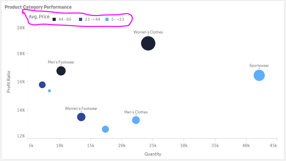
If I change the legend position to the top, there is another miner issue as below: 
How can I make the title aligned? I know this might seem some small details, but it does matter to our board members, and it is exactly the details will give them the impression that whether this is a good report. I really dont want this kind of detail "kill" the real dashboard.
Pls can someone help me with this? Thank you guys!
- Mark as New
- Bookmark
- Subscribe
- Mute
- Subscribe to RSS Feed
- Permalink
- Report Inappropriate Content
ur using meshups or only qlik visualization
if you use meshup try
- Mark as New
- Bookmark
- Subscribe
- Mute
- Subscribe to RSS Feed
- Permalink
- Report Inappropriate Content
Hello Channa, I used qlik sense feb 2019 edition to make that chart.
not using any developer tool yet. this can be a bit more advanced for me.
thank you for your link, I checked it, so i need to use dev hub to customize the chart?
- Mark as New
- Bookmark
- Subscribe
- Mute
- Subscribe to RSS Feed
- Permalink
- Report Inappropriate Content
nothing more we can do try to hide legend or try to move left ,right or bottom