Unlock a world of possibilities! Login now and discover the exclusive benefits awaiting you.
- Qlik Community
- :
- Forums
- :
- Analytics
- :
- New to Qlik Analytics
- :
- Re: "Color by measure" number formatting
- Subscribe to RSS Feed
- Mark Topic as New
- Mark Topic as Read
- Float this Topic for Current User
- Bookmark
- Subscribe
- Mute
- Printer Friendly Page
- Mark as New
- Bookmark
- Subscribe
- Mute
- Subscribe to RSS Feed
- Permalink
- Report Inappropriate Content
"Color by measure" number formatting
Is there a way to change the number formatting in the example below (map colored by a measure)?
Not only is the measure shown twice, but the second appearance displays way too many decimal places.
- « Previous Replies
-
- 1
- 2
- Next Replies »
- Mark as New
- Bookmark
- Subscribe
- Mute
- Subscribe to RSS Feed
- Permalink
- Report Inappropriate Content
Good Morning Mike,
any update about this frustrating bug? Still the same in Feb2019 version.
Regards,
Paolo.
- Mark as New
- Bookmark
- Subscribe
- Mute
- Subscribe to RSS Feed
- Permalink
- Report Inappropriate Content
Hi @Patric_Nordstrom . Tried again with Qlik Sense April 2020 release, but still have the same problem.
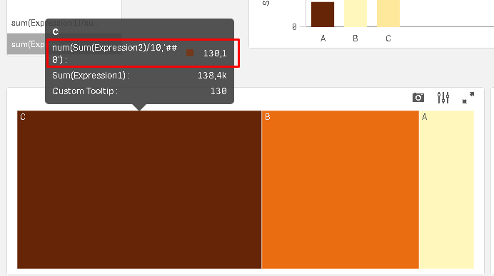
In the image below you see the "color by measure" expression enclosed by a num function to force the number formatting but it´s completely ignored.
The new custom tool tip functionality works with number formatting applied.
How to solve this ?
- Mark as New
- Bookmark
- Subscribe
- Mute
- Subscribe to RSS Feed
- Permalink
- Report Inappropriate Content
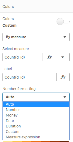
Number formatting are coming to Color by and Size by. First out is the map chart, which has that option in April 2020:
The Pie, Bar and Line chart will get it in June 2020.
And hopefully master measures later this year.
Thanks,
Patric
- Mark as New
- Bookmark
- Subscribe
- Mute
- Subscribe to RSS Feed
- Permalink
- Report Inappropriate Content
At last! 😉
My personal wait list:
- self reference to measure when e.g. you want to customize colors, titles and so on, without repeat formulas (I know that I can define variables and master measure but there are too many situations when this isn't needed);
- lockable pivot tables (when you want to define a hierarchy and avoid changes by users);
- decent (yes, without S...) sorting options for pivot tables, especially regarding order by measure and working right in sublevels, as Excel does from decades...
Personally I don't care too much of advanced features if I don't have much simple ones...
Regards,
Paolo.
- Mark as New
- Bookmark
- Subscribe
- Mute
- Subscribe to RSS Feed
- Permalink
- Report Inappropriate Content
1. Self reference, may come later this year.
3. Pivot sorting, please check out "Sort by first measure", new feature in April 2020
As for lockable pivots (and other ideas), go and vote for the idea or create a new one if it is missing:
Thanks,
Patric
- Mark as New
- Bookmark
- Subscribe
- Mute
- Subscribe to RSS Feed
- Permalink
- Report Inappropriate Content
Great news Patric ! This is the last time I will annoy you about this issue !
- « Previous Replies
-
- 1
- 2
- Next Replies »

