Unlock a world of possibilities! Login now and discover the exclusive benefits awaiting you.
- Qlik Community
- :
- Forums
- :
- Analytics
- :
- New to Qlik Analytics
- :
- Re: "Color by measure" number formatting
- Subscribe to RSS Feed
- Mark Topic as New
- Mark Topic as Read
- Float this Topic for Current User
- Bookmark
- Subscribe
- Mute
- Printer Friendly Page
- Mark as New
- Bookmark
- Subscribe
- Mute
- Subscribe to RSS Feed
- Permalink
- Report Inappropriate Content
"Color by measure" number formatting
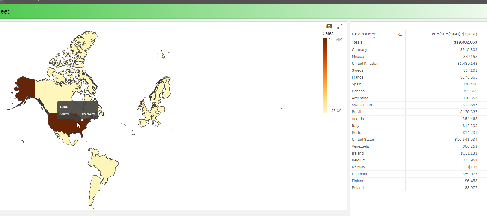
Is there a way to change the number formatting in the example below (map colored by a measure)?
Not only is the measure shown twice, but the second appearance displays way too many decimal places.
- « Previous Replies
-
- 1
- 2
- Next Replies »
Accepted Solutions
- Mark as New
- Bookmark
- Subscribe
- Mute
- Subscribe to RSS Feed
- Permalink
- Report Inappropriate Content
It seems with the default map , there isn't but this will change with our new mapping capability being added to Qlik Sense.I attempted to us num(Sum(Sales),'$#,##0') as an expression in color by - but it did not do anything for the pop up.
I will check one last time with a product manager - but at this time I don't think it is possible with the default map.
Mike Tarallo
Qlik
- Mark as New
- Bookmark
- Subscribe
- Mute
- Subscribe to RSS Feed
- Permalink
- Report Inappropriate Content
mto Any thoughts?
- Mark as New
- Bookmark
- Subscribe
- Mute
- Subscribe to RSS Feed
- Permalink
- Report Inappropriate Content
Hi William sorry for the delay - let me take a look.
Mike Tarallo
Qlik
- Mark as New
- Bookmark
- Subscribe
- Mute
- Subscribe to RSS Feed
- Permalink
- Report Inappropriate Content
It seems with the default map , there isn't but this will change with our new mapping capability being added to Qlik Sense.I attempted to us num(Sum(Sales),'$#,##0') as an expression in color by - but it did not do anything for the pop up.
I will check one last time with a product manager - but at this time I don't think it is possible with the default map.

Mike Tarallo
Qlik
- Mark as New
- Bookmark
- Subscribe
- Mute
- Subscribe to RSS Feed
- Permalink
- Report Inappropriate Content
- Mark as New
- Bookmark
- Subscribe
- Mute
- Subscribe to RSS Feed
- Permalink
- Report Inappropriate Content
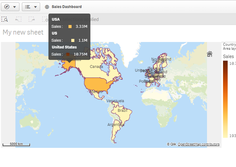
Hi Stefano - thanks for following up - I added patricn on this as well as our new native map capabilities have been added - however I do not see an option to format the numbers:
Mike Tarallo
Qlik
- Mark as New
- Bookmark
- Subscribe
- Mute
- Subscribe to RSS Feed
- Permalink
- Report Inappropriate Content
Hi,
Yes, formatting is limited so far, I hope to be able to custom tooltips in a not too distant future for all charts.
Some customization will be possible as of Sept 2018 when the native map chart will use the custom numerical abbreviations if they are defined:
Thanks,
Patric
- Mark as New
- Bookmark
- Subscribe
- Mute
- Subscribe to RSS Feed
- Permalink
- Report Inappropriate Content
Hi Patric,
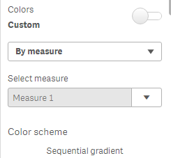
I'm using Sept 2018 and still found an issue with the color by measure formatting. Look at the bar chart bellow.
The bar chart at left uses single color so number shown in the tool tip have the correct formatting.
The bar chart at right uses color by measure and number have no formatting.

I'm referencing Measure 1 from the object that is already formatted.
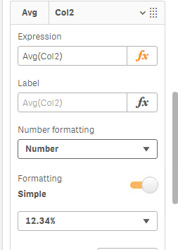
There is a workaround to overcome this issue ?
- Mark as New
- Bookmark
- Subscribe
- Mute
- Subscribe to RSS Feed
- Permalink
- Report Inappropriate Content
Hi Pablo, yes that is a limitation that master item measures don't have formatting. The workaround is to do the formatting in the master item expression. Like this: num(avg(Col2),'0,00%')
Thanks,
Patric
- Mark as New
- Bookmark
- Subscribe
- Mute
- Subscribe to RSS Feed
- Permalink
- Report Inappropriate Content
Hi Patrick,
Tried the workaround but it doesn´t work for me.
Thanks,
Pablo
- « Previous Replies
-
- 1
- 2
- Next Replies »