Unlock a world of possibilities! Login now and discover the exclusive benefits awaiting you.
- Qlik Community
- :
- Forums
- :
- Analytics
- :
- New to Qlik Analytics
- :
- show constant value over time
- Subscribe to RSS Feed
- Mark Topic as New
- Mark Topic as Read
- Float this Topic for Current User
- Bookmark
- Subscribe
- Mute
- Printer Friendly Page
- Mark as New
- Bookmark
- Subscribe
- Mute
- Subscribe to RSS Feed
- Permalink
- Report Inappropriate Content
show constant value over time
hello friends of the Qlik community,
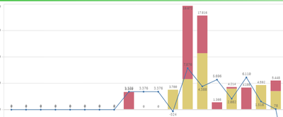
I have a question regarding the combination chart. I have my sales and purchases over time presented in the two bar charts. And the 'stock level' as a line chart (sales minus purchases). This works perfect and is exactly what i need. But i do also have something in store that has no 'time' linked to it, so it will not appear in the chart. I want this amount in a bar chart as well and calculate this in my 'stock level'. Does someone have a tip/trick to make this work?
Besides that, is there a limit of 'bar charts' in the combination chart that you can add?
thanks in advance!
This is what i have so far:
- Tags:
- bar chart
- Mark as New
- Bookmark
- Subscribe
- Mute
- Subscribe to RSS Feed
- Permalink
- Report Inappropriate Content
Not exactly, What you are thinking. But If the Stock level is not linked to your fact. I would recommend to make via Inline table with static values and then use that static to print from Stock value and it includes the dimension and measure what you have now. If you need some workaround, May be we can try something IF you can share sample data set 🙂
