Unlock a world of possibilities! Login now and discover the exclusive benefits awaiting you.
- Qlik Community
- :
- Forums
- :
- Analytics
- :
- New to Qlik Analytics
- :
- Re: Accumulated sales chart in qliksense
- Subscribe to RSS Feed
- Mark Topic as New
- Mark Topic as Read
- Float this Topic for Current User
- Bookmark
- Subscribe
- Mute
- Printer Friendly Page
- Mark as New
- Bookmark
- Subscribe
- Mute
- Subscribe to RSS Feed
- Permalink
- Report Inappropriate Content
Accumulated sales chart in qliksense
I want to build an accumulated sales chart where the dimension is now set to be suppliers and the measure is the sales from the suppliers. what i want to change is that to show that majority is concentrated on small amounts of suppliers. so i am thinking to covert the dimension to accumulated number of suppliers as well (e,g, from 1---maximum). is there anyway to achieve this? thanks
Accepted Solutions
- Mark as New
- Bookmark
- Subscribe
- Mute
- Subscribe to RSS Feed
- Permalink
- Report Inappropriate Content
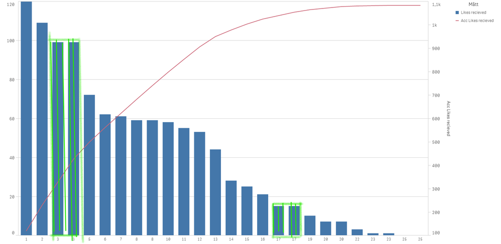
You can use the rank function to replace the supplier dimension, it is not perfect if you have suppliers with the same rank but it will give you a good indication. Notice my green marked bars, they have the same number, but the total count is correct .
To replace my "Supplier Name" dimension I've used this expression:
=aggr(rank(Sum(Likes),4,1), [Supplier Name])
Qlik Community MVP
- Mark as New
- Bookmark
- Subscribe
- Mute
- Subscribe to RSS Feed
- Permalink
- Report Inappropriate Content
kindly send me the sample report of which you want
- Mark as New
- Bookmark
- Subscribe
- Mute
- Subscribe to RSS Feed
- Permalink
- Report Inappropriate Content
Ut sounds like you are trying to do a pareto analysis. Please check out @hic blog post Recipe for a Pareto Analysis – Revisited - “Which products contribute to the first 80% of our turnover?”
Qlik Community MVP
- Tags:
- pareto
- Mark as New
- Bookmark
- Subscribe
- Mute
- Subscribe to RSS Feed
- Permalink
- Report Inappropriate Content
Hi Vegar,
yes, that is what I want but I also want to show the horizontal as the accumulated number of suppliers, (e,g not the actual supplier name)
- Mark as New
- Bookmark
- Subscribe
- Mute
- Subscribe to RSS Feed
- Permalink
- Report Inappropriate Content
You can use the rank function to replace the supplier dimension, it is not perfect if you have suppliers with the same rank but it will give you a good indication. Notice my green marked bars, they have the same number, but the total count is correct .
To replace my "Supplier Name" dimension I've used this expression:
=aggr(rank(Sum(Likes),4,1), [Supplier Name])
Qlik Community MVP
- Mark as New
- Bookmark
- Subscribe
- Mute
- Subscribe to RSS Feed
- Permalink
- Report Inappropriate Content
Hi Vegar,
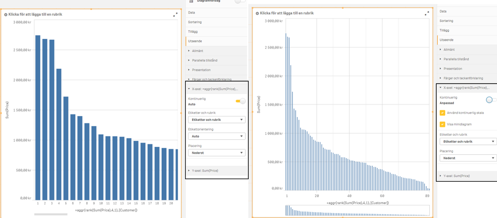
another question, is it possible to squeeze the horizontal scale? as I got thousands of suppliers and I understand each number is representing a supplier and not actual continues measures, but just to see if options available to squeeze the axe within one page without horizontal bar being used
- Mark as New
- Bookmark
- Subscribe
- Mute
- Subscribe to RSS Feed
- Permalink
- Report Inappropriate Content
- Tags:
- continous axis

