Unlock a world of possibilities! Login now and discover the exclusive benefits awaiting you.
- Qlik Community
- :
- Forums
- :
- Analytics
- :
- New to Qlik Analytics
- :
- Pie Chart with Sum of the Count of some data value...
- Subscribe to RSS Feed
- Mark Topic as New
- Mark Topic as Read
- Float this Topic for Current User
- Bookmark
- Subscribe
- Mute
- Printer Friendly Page
- Mark as New
- Bookmark
- Subscribe
- Mute
- Subscribe to RSS Feed
- Permalink
- Report Inappropriate Content
Pie Chart with Sum of the Count of some data values in one color and the rest in another color
Hello,
I have a Data file which includes the occurrence of several different values. I want to group some of those values to be displayed all together in the same pie sector, while the remaining would be displayed as the leftover sector of the pie chart.
Simplified Example:
'Command' values can be: LAYER, PEDIT, 3DORBIT, EXTRUDE.
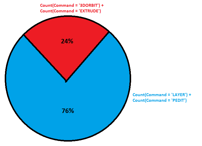
I want LAYER, PEDIT to be displayed in the color blue and in percentage (e.g. 76%).
I want the remaining values (which are basicaly 3DORBIT, EXTRUDE) to be displayed in the color red and in percentage (remaining 24%).
I have tried:
If(Command = 'LAYER' OR Comando = 'PEDIT', Count(Command), Count(Comando))
However, it does not distinguish between the first group LAYER and PEDIT from the remaining.
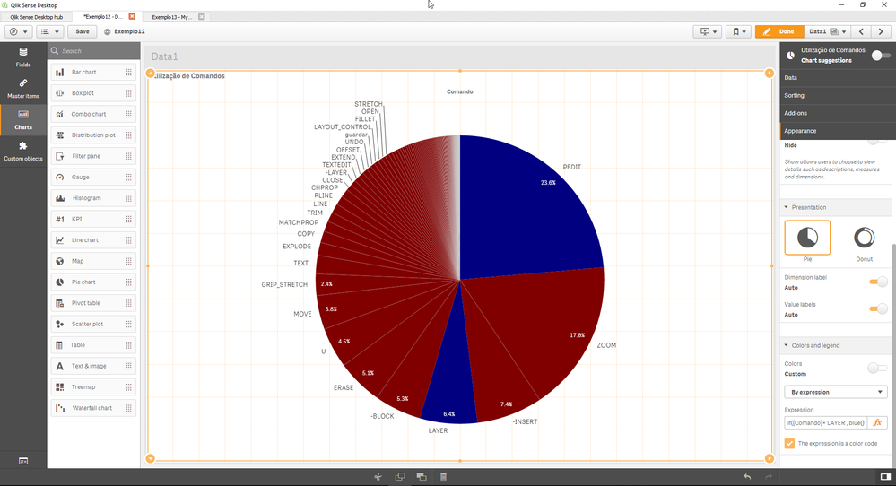
Then I added this to the colors and legend expression:
if([Comando]='LAYER' OR [Comando]='PEDIT', blue(), red())
Which is pretty close to what I want. However, I want the chart to Sum the percentages in blue and to Sum the percentages in red.
How can I do this?
Many thanks
Accepted Solutions
- Mark as New
- Bookmark
- Subscribe
- Mute
- Subscribe to RSS Feed
- Permalink
- Report Inappropriate Content
Dimension: =if(match(Command, 'PEDIT', 'LAYER'), 'BLUE', 'RED')
Expression: count(Command)
Alternatively you could calculation that in script too:
like:
if(match(Command, 'PEDIT', 'LAYER'), 'BLUE', 'RED') as Command_Segment
then use
Dimension: Command_Segment
Expression: count(Command)
- Mark as New
- Bookmark
- Subscribe
- Mute
- Subscribe to RSS Feed
- Permalink
- Report Inappropriate Content
hi instead of measure try to have calculated dimension
If(Command = 'LAYER' OR Comando = 'PEDIT', 'PEDIT', 'other')
- Mark as New
- Bookmark
- Subscribe
- Mute
- Subscribe to RSS Feed
- Permalink
- Report Inappropriate Content
Sorry, what do you mean?
I don't think I understood.
do you mean to put 'LAYER' and 'PEDIT' all inside the pie sector 'PEDIT' while the remaining commands are inside a pie sector namer 'other'? (I changed other to 'EDIT' because there isn't actually any command with the name 'other')
I just tried it, but it doesn't work 😕
- Mark as New
- Bookmark
- Subscribe
- Mute
- Subscribe to RSS Feed
- Permalink
- Report Inappropriate Content
Count(Command)
this need to be ur measure
- Mark as New
- Bookmark
- Subscribe
- Mute
- Subscribe to RSS Feed
- Permalink
- Report Inappropriate Content
Yes. That's what I have been using.
I just don't know how to group the data of several values.
I want a pie chart with two sectors:
PEDIT + LAYER = 23.6 + 6.4 = 30% group sector of the pie chart
While the remaining commands are displayed in a sector with 70%
- Mark as New
- Bookmark
- Subscribe
- Mute
- Subscribe to RSS Feed
- Permalink
- Report Inappropriate Content
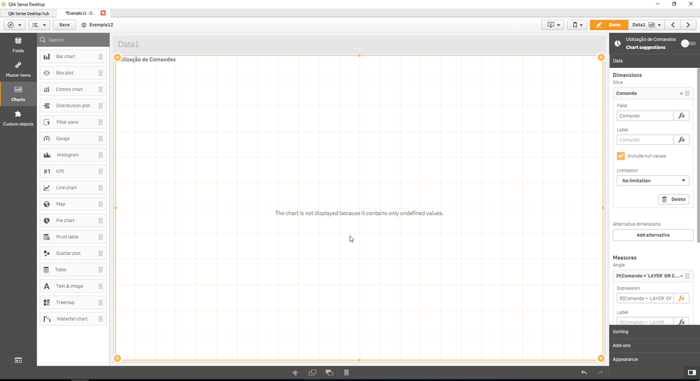
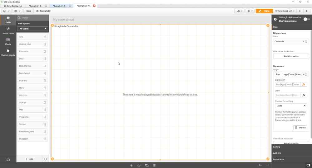
I have tried using the following on 'Measures':
Sum(aggr(Count([Comando] = 'PEDIT'), Count([Comando] = 'LAYER')))
However, it doesn't work at all and I get:
- Mark as New
- Bookmark
- Subscribe
- Mute
- Subscribe to RSS Feed
- Permalink
- Report Inappropriate Content
Dimension: =if(match(Command, 'PEDIT', 'LAYER'), 'BLUE', 'RED')
Expression: count(Command)
Alternatively you could calculation that in script too:
like:
if(match(Command, 'PEDIT', 'LAYER'), 'BLUE', 'RED') as Command_Segment
then use
Dimension: Command_Segment
Expression: count(Command)


