Unlock a world of possibilities! Login now and discover the exclusive benefits awaiting you.
- Qlik Community
- :
- Forums
- :
- Analytics
- :
- New to Qlik Analytics
- :
- Re: Help required for creation of chart
- Subscribe to RSS Feed
- Mark Topic as New
- Mark Topic as Read
- Float this Topic for Current User
- Bookmark
- Subscribe
- Mute
- Printer Friendly Page
- Mark as New
- Bookmark
- Subscribe
- Mute
- Subscribe to RSS Feed
- Permalink
- Report Inappropriate Content
Help required for creation of chart
Hi
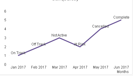
I'm wondering if we can create the below visual in QlikSense?
If Yes, please help in achieving it.
I have only 2 dimensions with MonthYear and Project Status
- « Previous Replies
-
- 1
- 2
- Next Replies »
- Mark as New
- Bookmark
- Subscribe
- Mute
- Subscribe to RSS Feed
- Permalink
- Report Inappropriate Content
ANy update...
- Mark as New
- Bookmark
- Subscribe
- Mute
- Subscribe to RSS Feed
- Permalink
- Report Inappropriate Content
Hi Satish,
Can we have a sample data please?
Regards,
Rajesh
- Mark as New
- Bookmark
- Subscribe
- Mute
- Subscribe to RSS Feed
- Permalink
- Report Inappropriate Content
It seem like a normal trend chart (line chart). Guess it should be do-able.
If you can provide sample data?
- Mark as New
- Bookmark
- Subscribe
- Mute
- Subscribe to RSS Feed
- Permalink
- Report Inappropriate Content
The data what i have is showing up in Chart
Dimensions: MonthYear (jan 2017....) and ProjectStatus as OnTrack....)
My concern is i do not have a measure
Hope this clarifies
- Mark as New
- Bookmark
- Subscribe
- Mute
- Subscribe to RSS Feed
- Permalink
- Report Inappropriate Content
Hello Satish,
Without looking the data, I would say you can use the numerical data generated by the measure and show the legend (in the properties panel under Appearance->Colors and Legend->Show Legend Toggle) and adding a key in the subtitle area or the chart (located in properties panel under Appearance->general->Subtitle prompt box). (ie. x=on track, y=at risk, z=not active, etc)
- Mark as New
- Bookmark
- Subscribe
- Mute
- Subscribe to RSS Feed
- Permalink
- Report Inappropriate Content
May be scatter object deserve this. And you need to show the data points as [Project status] ??
- Mark as New
- Bookmark
- Subscribe
- Mute
- Subscribe to RSS Feed
- Permalink
- Report Inappropriate Content
Hi Anil
Yes. Refer Image (Chart.png)
- Mark as New
- Bookmark
- Subscribe
- Mute
- Subscribe to RSS Feed
- Permalink
- Report Inappropriate Content
Like this?
- Mark as New
- Bookmark
- Subscribe
- Mute
- Subscribe to RSS Feed
- Permalink
- Report Inappropriate Content
will this work for you?
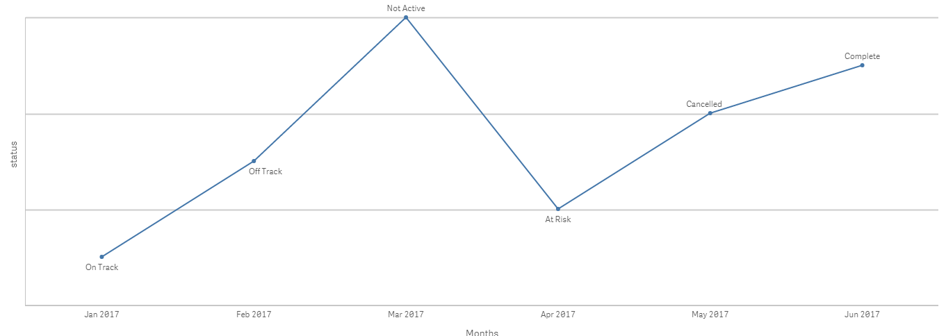
updated with dual function to what anil has already done .
regards
Pradosh
- « Previous Replies
-
- 1
- 2
- Next Replies »