Unlock a world of possibilities! Login now and discover the exclusive benefits awaiting you.
- Qlik Community
- :
- All Forums
- :
- QlikView App Dev
- :
- Bubble Chart
- Subscribe to RSS Feed
- Mark Topic as New
- Mark Topic as Read
- Float this Topic for Current User
- Bookmark
- Subscribe
- Mute
- Printer Friendly Page
- Mark as New
- Bookmark
- Subscribe
- Mute
- Subscribe to RSS Feed
- Permalink
- Report Inappropriate Content
Bubble Chart
I am having trouble developing clear bubble charts.
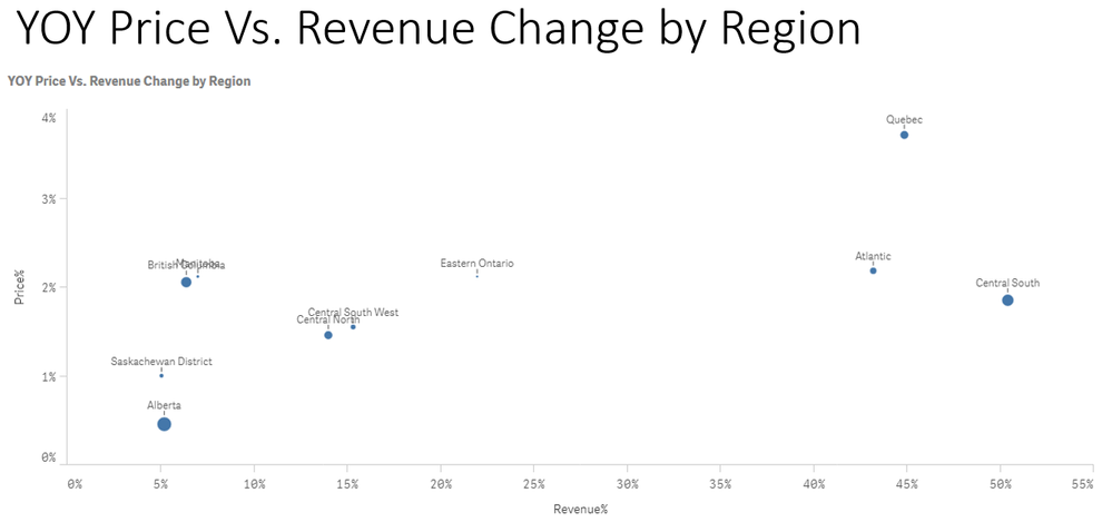
We are trying to compare price increase % to revenue increase percent. The chart has several issues
1) Bubbles are too small. How do I increase?
2) Assuming I can increase size of bubble., can I put percent inside bubble?
3) Labels are not readable (too small) or overlap. Is there a way to separate? Should I color code bubbles and put them in a legend?
- Mark as New
- Bookmark
- Subscribe
- Mute
- Subscribe to RSS Feed
- Permalink
- Report Inappropriate Content
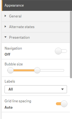
In the properties Under Presentation You can increase bubble Size
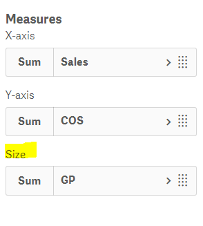
If you want it to be base on Revenue Increase Percentage you can write a Measure for the Bubble Size
- Mark as New
- Bookmark
- Subscribe
- Mute
- Subscribe to RSS Feed
- Permalink
- Report Inappropriate Content
Here is the one
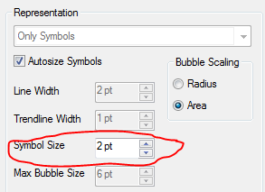
1) Bubbles are too small. How do I increase? - You can increase from
2) Assuming I can increase size of bubble., can I put percent inside bubble? - First option is Year but second option we can't build inside the circle hence NO
3) Labels are not readable (too small) or overlap. Is there a way to separate? Should I color code bubbles and put them in a legend? - Probably, You can use Dual with Chr(10) as a work around
- Mark as New
- Bookmark
- Subscribe
- Mute
- Subscribe to RSS Feed
- Permalink
- Report Inappropriate Content
Thanks for all the tips.............back to you shortly as we try these suggestions.


