Unlock a world of possibilities! Login now and discover the exclusive benefits awaiting you.
- Qlik Community
- :
- All Forums
- :
- QlikView App Dev
- :
- Help formatting a bar chart
- Subscribe to RSS Feed
- Mark Topic as New
- Mark Topic as Read
- Float this Topic for Current User
- Bookmark
- Subscribe
- Mute
- Printer Friendly Page
- Mark as New
- Bookmark
- Subscribe
- Mute
- Subscribe to RSS Feed
- Permalink
- Report Inappropriate Content
Help formatting a bar chart
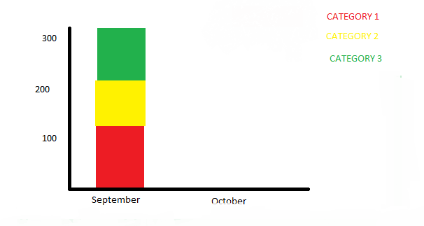
Is there a way that I can create a bar chart similar to the one illustrated above? I want to show months on the X axis and minutes on the Y axis, and then 'stack' the minutes assigned to each category on top of one another in a single bar.
Accepted Solutions
- Mark as New
- Bookmark
- Subscribe
- Mute
- Subscribe to RSS Feed
- Permalink
- Report Inappropriate Content
Hi,
See the attached QV application.
Use Month and Categaory as your dimension and minutes as your expression.
In the Style tab use Stacked as the Subtype.
Hope this helps
Regards
Mhatim
- Mark as New
- Bookmark
- Subscribe
- Mute
- Subscribe to RSS Feed
- Permalink
- Report Inappropriate Content
Hi,
See the attached QV application.
Use Month and Categaory as your dimension and minutes as your expression.
In the Style tab use Stacked as the Subtype.
Hope this helps
Regards
Mhatim
- Mark as New
- Bookmark
- Subscribe
- Mute
- Subscribe to RSS Feed
- Permalink
- Report Inappropriate Content
Thanks for the response - I didn't see the 'stacked' option for bar charts. I couldn't get your sample to run in QV because of the licensing but I followed your instructions and it works great.
- Mark as New
- Bookmark
- Subscribe
- Mute
- Subscribe to RSS Feed
- Permalink
- Report Inappropriate Content
Another question. The first set of data comes from a project management system, and shows a stacked view of the number of minutes spent on different projects by an individual in a month. Could I add a second bar that shows the number of minutes booked in the timesheet system we have? This wouldn't need to be stacked because it's just one number, I want to show a graphical comparison between the two.