Unlock a world of possibilities! Login now and discover the exclusive benefits awaiting you.
- Qlik Community
- :
- All Forums
- :
- QlikView App Dev
- :
- How to create a multiple line chart of trending by...
- Subscribe to RSS Feed
- Mark Topic as New
- Mark Topic as Read
- Float this Topic for Current User
- Bookmark
- Subscribe
- Mute
- Printer Friendly Page
- Mark as New
- Bookmark
- Subscribe
- Mute
- Subscribe to RSS Feed
- Permalink
- Report Inappropriate Content
How to create a multiple line chart of trending by time
Hello,
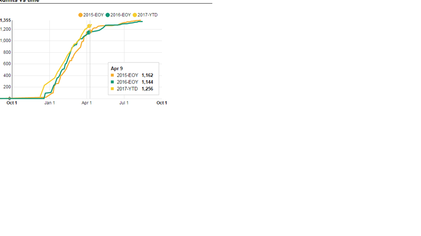
I am totally new on Qlik. I need a line chart to plot a total for all the selected years for a given date(see below). It means that if ones stops the mouse on any given point at the graph, one will see the total at that given date (day/mom/yy) for all the years on the chart. The Qlik chart below only has two years (the year selected and the prior one), but I do actually need all the years I have on the data set (the max is five years). The first graph is a snapshot of what I need (dont worry about the different shape of the line) and the second is what I manage to get so far with Qlik.
If I pick the date as a dimension for the x axis, Qlik will get rid of the super posing of the years and make the graphs be sequential.
Any help is appreciated.

- Mark as New
- Bookmark
- Subscribe
- Mute
- Subscribe to RSS Feed
- Permalink
- Report Inappropriate Content
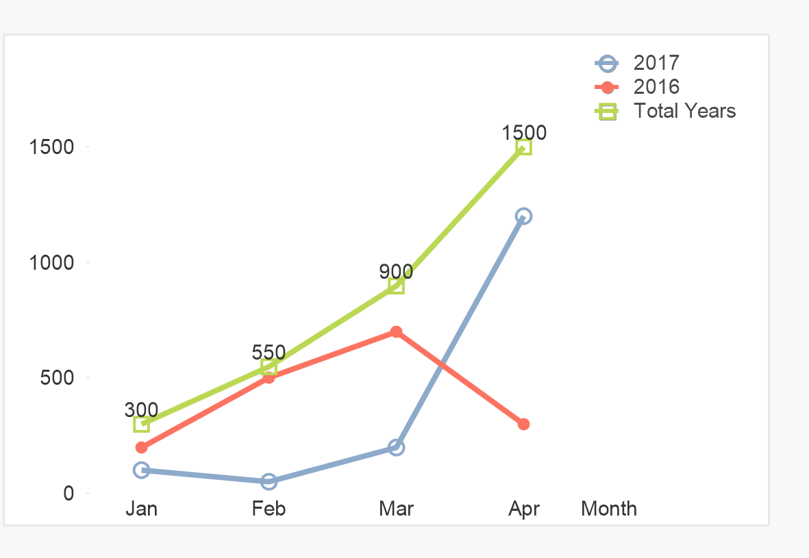
Not sure but do you want something like this?
- Mark as New
- Bookmark
- Subscribe
- Mute
- Subscribe to RSS Feed
- Permalink
- Report Inappropriate Content
yes, but adding that when I hover the mouse at any point of any of the lines, I will see the total for that day (so the point needs to represent a date or at least the day/mon for the year in question.
Does it make sense? Exactly like the April 9th data point on my 1st chart.
Thanks,
A
- Mark as New
- Bookmark
- Subscribe
- Mute
- Subscribe to RSS Feed
- Permalink
- Report Inappropriate Content
So if you have 3 lines for 2014,2015,2016. If you hover over on any line at any point(suppose you have day as most granular point). Are you expecting total for that day for all the years 2014,2015, 2016?
There is a way you can customize your pop-up using 'Text as pop-up' in the expression tab.
Try adding new expression for the value you need in the pop up, check only text as pop-up for that expression in the expression tab, disable line option. Also disable pop-up lables in the 'presentation tab' else you will have custom pop-up as well as default popup overlapping.
The chart data points granularity cannot go deeper than your data model, you may go higher and aggregate to show summary levels. So data points where it shows the values are based on the aggregation level or X-axis category you choose in your chart.
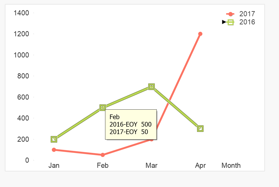
See the attached chart in case it can help you to move forward.
- Mark as New
- Bookmark
- Subscribe
- Mute
- Subscribe to RSS Feed
- Permalink
- Report Inappropriate Content
Thank you for your help, but it seems like I need a bit more info. Where do I find this pop-up you are referring to. I searched for it on appearance and general without any luck.
I do have the date of admission and that is what should drive the sum of admits for that day; I believe I need an expression to sum for the whole enroll year (a past one) in order to get the EOY, but for need the sum for the year to date for all the enroll years superposed on my chart.
As you can see on my first chart, the day & month only pops up when the mouse hover over any point of the graph. So, your direction of defining a pop up sounds perfect, but how do I do it/find it?
Thanks again,
A
- Mark as New
- Bookmark
- Subscribe
- Mute
- Subscribe to RSS Feed
- Permalink
- Report Inappropriate Content
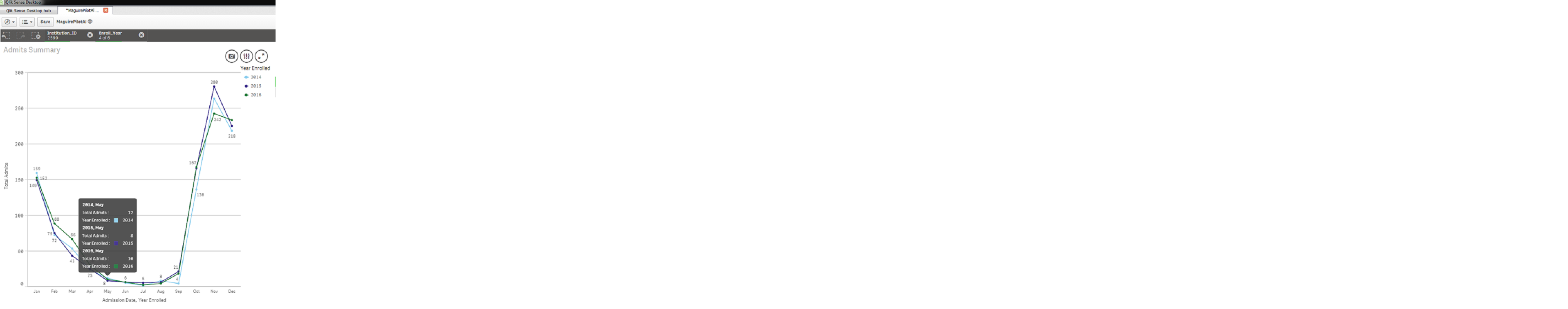
Here it is what I have so far on Qlik Sense. Those are all the years I selected, so that is cool. Now I need to be able to display the total admits for a given day in the month. I added the sum as a calculation under data handling calculation as sum({<Admit_Date={$(=max(Admit_Date))}>}bo_admitflag) , on the hope it would show up as a pop up, but it aint happening.
Can I really accomplish what I need?
Thanks
- Mark as New
- Bookmark
- Subscribe
- Mute
- Subscribe to RSS Feed
- Permalink
- Report Inappropriate Content
I want to create a multi-line trend chart by month. The use case is to measure the traffic by month per each application running in production. Has anyone come across this use case? How were you able to do it the Qlik Sense? Any help would be greatly appreciated.