How to create a multiple line chart of trending by time
Hello,
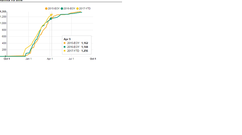
I am totally new on Qlik. I need a line chart to plot a total for all the selected years for a given date(see below). It means that if ones stops the mouse on any given point at the graph, one will see the total at that given date (day/mom/yy) for all the years on the chart. The Qlik chart below only has two years (the year selected and the prior one), but I do actually need all the years I have on the data set (the max is five years). The first graph is a snapshot of what I need (dont worry about the different shape of the line) and the second is what I manage to get so far with Qlik.
If I pick the date as a dimension for the x axis, Qlik will get rid of the super posing of the years and make the graphs be sequential.