Unlock a world of possibilities! Login now and discover the exclusive benefits awaiting you.
- Qlik Community
- :
- All Forums
- :
- QlikView App Dev
- :
- Line Chart help
- Subscribe to RSS Feed
- Mark Topic as New
- Mark Topic as Read
- Float this Topic for Current User
- Bookmark
- Subscribe
- Mute
- Printer Friendly Page
- Mark as New
- Bookmark
- Subscribe
- Mute
- Subscribe to RSS Feed
- Permalink
- Report Inappropriate Content
Line Chart help
Hello Community,
I need help with a Line Chart
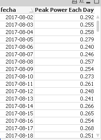
I have a table like this with a similar data
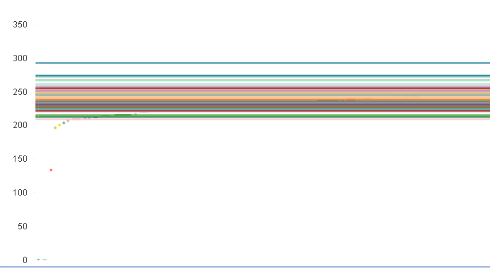
and when i'm trying to do a line chart that reflect the peack for every day in a date range I get something like this
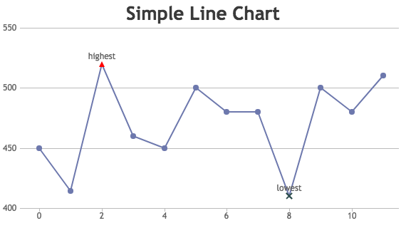
I need to look something liket this
can someone help me, i dont know what to put in the expresion to make it look it like this one, im new to QlikView
- Mark as New
- Bookmark
- Subscribe
- Mute
- Subscribe to RSS Feed
- Permalink
- Report Inappropriate Content
pls share sample qvw with ur data.
- Mark as New
- Bookmark
- Subscribe
- Mute
- Subscribe to RSS Feed
- Permalink
- Report Inappropriate Content
I can't the data come from a private base data via odbc connector with credentials
- Mark as New
- Bookmark
- Subscribe
- Mute
- Subscribe to RSS Feed
- Permalink
- Report Inappropriate Content
What is the expression you are using in your line chart. Like Sum(yourfieldname) ?
- Mark as New
- Bookmark
- Subscribe
- Mute
- Subscribe to RSS Feed
- Permalink
- Report Inappropriate Content
for now im using avg(nr_vaule)/1000 , nr_value is a data that is a electronic pulse each 15mim , and the peak power that you see on the the table is the max pulse of the day