Unlock a world of possibilities! Login now and discover the exclusive benefits awaiting you.
- Qlik Community
- :
- All Forums
- :
- QlikView App Dev
- :
- Merge bars on Gantt chart
- Subscribe to RSS Feed
- Mark Topic as New
- Mark Topic as Read
- Float this Topic for Current User
- Bookmark
- Subscribe
- Mute
- Printer Friendly Page
- Mark as New
- Bookmark
- Subscribe
- Mute
- Subscribe to RSS Feed
- Permalink
- Report Inappropriate Content
Merge bars on Gantt chart
Hello,
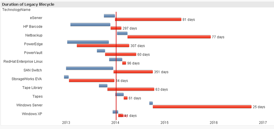
I have a Gantt chart where each technology is broken up into two phases. I've plotted these onto the Gantt chart, but it shows the phases on two separate lines. Is there a way to merge it onto one?
Screenshot below shows each technology taking up two lines. Thanks
 Hello,
- « Previous Replies
-
- 1
- 2
- Next Replies »
Accepted Solutions
- Mark as New
- Bookmark
- Subscribe
- Mute
- Subscribe to RSS Feed
- Permalink
- Report Inappropriate Content
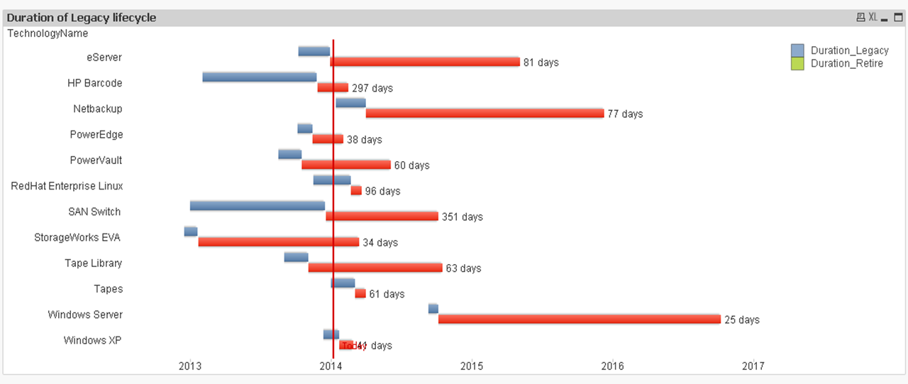
See the attached.
1. Removed Bar Offset from Duration_Retire expression.
2. Changed to Stacked.
3. Added min Axis as =min(Legacy_StartDate).
- Mark as New
- Bookmark
- Subscribe
- Mute
- Subscribe to RSS Feed
- Permalink
- Report Inappropriate Content
Hi,
You can try looking into http://community.qlik.com/docs/DOC-3113
Not excatly what you are looking for but might be of help.
- Mark as New
- Bookmark
- Subscribe
- Mute
- Subscribe to RSS Feed
- Permalink
- Report Inappropriate Content
Hi Thuy,
sorry, I have no experience specifically with this chart_type - it looks very much like a flipped barchart, though.
=> In principle, it might be possible to stack the columns - depends on the values
<=> How would you then want to handle those "columns" where the phases overlap, like they did e.g. for "PowerEdge"?
Best regards,
DataNibbler
- Mark as New
- Bookmark
- Subscribe
- Mute
- Subscribe to RSS Feed
- Permalink
- Report Inappropriate Content
i think there is two expressions and check your offset property, id is sets , clear it,
usually negatives values goes under base, mean 0.
can you share documents. or sample...
- Mark as New
- Bookmark
- Subscribe
- Mute
- Subscribe to RSS Feed
- Permalink
- Report Inappropriate Content
I've tried to stack the columns but it does not work.
Please see sheet1
- Mark as New
- Bookmark
- Subscribe
- Mute
- Subscribe to RSS Feed
- Permalink
- Report Inappropriate Content
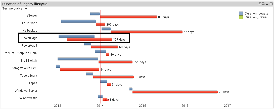
The stacked won't work for you because you have bars that "overlap". I'm not sure how you expect your bars to be merged into one line when you have values like PowerEdge that overlap. How would you expect PowerEdge to look after it has been merged into one line?
- Mark as New
- Bookmark
- Subscribe
- Mute
- Subscribe to RSS Feed
- Permalink
- Report Inappropriate Content
If you take the bar offset off the expressions and select stacked in style the bars merge, but the Today reference line disappears....it has to do with your date fields as well...they have years as early as 1900...seems odd.
- Mark as New
- Bookmark
- Subscribe
- Mute
- Subscribe to RSS Feed
- Permalink
- Report Inappropriate Content
Good spot Nicole, PowerEdge shouldn't overlap. That was a typo in the data. I've reloaded it and it should look like this.
The next phase starts when the previous one ends.
- Mark as New
- Bookmark
- Subscribe
- Mute
- Subscribe to RSS Feed
- Permalink
- Report Inappropriate Content
Hello Christian,
Yes I tried your suggestion and I don't understand why it goes back to 1900. None of my dates follow this.
This is the exact data in which I am using
| TechnologyName | LifecyclePhase | Legacy_StartDate | Legacy_EndDate | Retire_StartDate | Retire_EndDate |
| SAN Switch | Retire | 01/01/2013 | 18/12/2013 | 19/12/2013 | 07/10/2014 |
| PowerEdge | Retire | 07/10/2013 | 14/11/2013 | 15/11/2013 | 02/02/2014 |
| Tapes | Legacy | 02/01/2014 | 04/03/2014 | 05/03/2014 | 01/04/2014 |
| Windows Server | Retire | 11/09/2014 | 06/10/2014 | 07/10/2014 | 07/10/2016 |
| Netbackup | Retire | 15/01/2014 | 02/04/2014 | 03/04/2014 | 10/12/2015 |
| eServer | Retire | 10/10/2013 | 30/12/2013 | 31/12/2013 | 06/05/2015 |
| StorageWorks EVA | Legacy | 18/12/2012 | 21/01/2013 | 22/01/2013 | 16/03/2014 |
| PowerVault | Legacy | 18/08/2013 | 17/10/2013 | 18/10/2013 | 06/06/2014 |
| Tape Library | Legacy | 02/09/2013 | 04/11/2013 | 05/11/2013 | 18/10/2014 |
| HP Barcode | Retire | 02/02/2013 | 26/11/2013 | 27/11/2013 | 15/02/2014 |
| RedHat Enterprise Linux | Legacy | 18/11/2013 | 22/02/2014 | 23/02/2014 | 22/03/2014 |
| Windows XP | Retire | 12/12/2013 | 22/01/2014 | 23/01/2014 | 28/02/2014 |
- Mark as New
- Bookmark
- Subscribe
- Mute
- Subscribe to RSS Feed
- Permalink
- Report Inappropriate Content
See the attached.
1. Removed Bar Offset from Duration_Retire expression.
2. Changed to Stacked.
3. Added min Axis as =min(Legacy_StartDate).
- « Previous Replies
-
- 1
- 2
- Next Replies »