Unlock a world of possibilities! Login now and discover the exclusive benefits awaiting you.
- Qlik Community
- :
- All Forums
- :
- QlikView App Dev
- :
- Re: Trendline for a multiple dimension line chart
- Subscribe to RSS Feed
- Mark Topic as New
- Mark Topic as Read
- Float this Topic for Current User
- Bookmark
- Subscribe
- Mute
- Printer Friendly Page
- Mark as New
- Bookmark
- Subscribe
- Mute
- Subscribe to RSS Feed
- Permalink
- Report Inappropriate Content
Trendline for a multiple dimension line chart
Is there an easy way to create an 'average' trendline for a line chart with 2 dimensions? I have the following, and wish to produce an average of the 4 lines on the same chart, but since I have 2 dimensions, clicking the Average trendline box produces 4 additional trendlines, instead of 1. I'd rather not have to create a transparent chart on top if possible. Thanks
- « Previous Replies
-
- 1
- 2
- Next Replies »
- Mark as New
- Bookmark
- Subscribe
- Mute
- Subscribe to RSS Feed
- Permalink
- Report Inappropriate Content
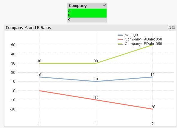
Why are both the Sum and Avg displayed in the below instance, but when selecting only one company, just the sum(sales) is displayed? (And sorry, I was just playing around and added Company C to the original file). Just trying to understand the relationship between the 'Dim Load Inline 1, 2' you touched on, and the first field in the Pick function (the 'Dim') in the chart
- Mark as New
- Bookmark
- Subscribe
- Mute
- Subscribe to RSS Feed
- Permalink
- Report Inappropriate Content
When you select just one company the two average lines overlap because average of 10 = 10 
- Mark as New
- Bookmark
- Subscribe
- Mute
- Subscribe to RSS Feed
- Permalink
- Report Inappropriate Content
So neither Sum(Sales) or Avg(Sales) is ever 'Picked'? I'm not really sure what function Pick is serving if both expressions are always displayed
- Mark as New
- Bookmark
- Subscribe
- Mute
- Subscribe to RSS Feed
- Permalink
- Report Inappropriate Content
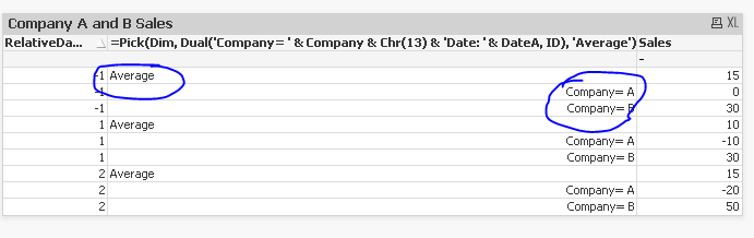
Pick is deciding which specific dimension value should get assigned which expression. So looking at it from the straight table view might make things easier to understand
When my dimension is Average, use the Avg(Sales) Expression. and when the dimension is Company = A or Company = B, then use Sum(Sales)
This dimension in itself is created using the pick function.
- Mark as New
- Bookmark
- Subscribe
- Mute
- Subscribe to RSS Feed
- Permalink
- Report Inappropriate Content
Hi Sean,
Take a look at this blog post, it may provide a solution for you:
http://www.quickintelligence.co.uk/qlikview-accumulate-values/
If you look at the part about the average bar in a bar chart, I think that is what you need. You simply have to create a new data island that links each of the dimensions to itself and to the 'average' dimension.
You may have to extrapolate the solution out a bit further, so that you have a single dimension field with five values and then the expression behaves differently based on which value in the dimension is in play.
Hope that gives you some ideas on how to approach this problem?
Steve
- Mark as New
- Bookmark
- Subscribe
- Mute
- Subscribe to RSS Feed
- Permalink
- Report Inappropriate Content
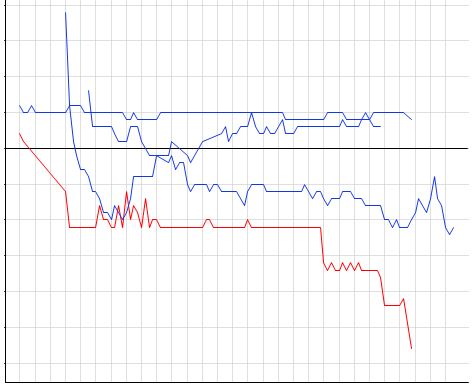
Hey guys - I'm having issues on a similar chart with similar data, but the expression is a % return. Can you take a look at the attached? I need to have a dynamic average of the two lines (Company A & B) show up, but when I add an additional expression (currently not enabled), it only charts the Average line, when I need it to plot all 3 of the lines together. Thanks again for the help!
- « Previous Replies
-
- 1
- 2
- Next Replies »