Unlock a world of possibilities! Login now and discover the exclusive benefits awaiting you.
- Subscribe to RSS Feed
- Mark as New
- Mark as Read
- Bookmark
- Subscribe
- Printer Friendly Page
- Report Inappropriate Content
There have been many chart label enhancements made in Qlik Sense. In this blog, I will cover some of the new options available such as:
- All labels visible
- Layered labels
- Line layer for labels
In the Appearance section of the Properties panel, if the “Show data point” checkbox is checked, there will be a drop down for Value labels as seen below. Selecting “All” will show all the data point labels in your charts.
In the chart above, all the data point labels are visible. This is a nice option when there are not too many data points or if the data points are spaced out. But if you find the labels overlapping as seen above, you may want to consider the “Auto” option. You always want the data to be readable, so if there are many data points that are close together to the point where the labels are not readable, switch to “Auto”. The “Auto” option has always been an available setting, but it is even better now. “Auto” displays labels based on the space available but it has been improved to display more labels. In the chart below, the Value labels is set to “Auto” and there is no overlap, and the labels are readable.
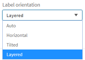
Another label enhancement is the ability to layer the labels on the x-axis. This property can be changed in the x axis section of the Properties panel as seen below (if the x-axis labels are set to be displayed in the chart).
We often see layers “Horizontal” or “Tilted” but now there is the “Layered” option which staggers the labels between two lines providing more space for the label text. I really like this option because it is clean, and most labels are fully visible.
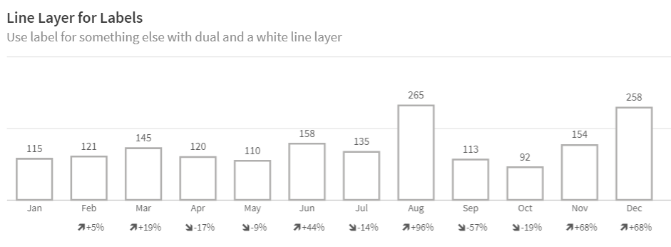
The last label enhancement I will cover today is the line layer for labels. This makes use of the Dual function to create a white line layer along the x-axis which can be used as a label for a visualization. The chart below shows an example of two line layer labels – one for the month and one for the percent change.
Let’s take a closer look at how these labels were created. Since we are creating the labels for the x-axis, Labels and title for the x and y axis is set to “None.”
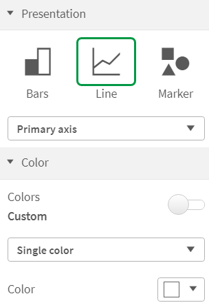
And the measure for the month and percent label is presented as a white line (which will not be visible since the background is also white).
The measure below is used to create the month label.
In this expression, the Dual function takes the month field and gives it a numeric value of -50. By using the Dual function, it allows the field to have a string representation that is displayed as the month and a numeric representation of -50 which we cannot see since the white line blends with the white background. The percent change label works the same way except in this expression, some additional formatting is added to show an indicator for an increase or decrease in sales since the previous month.
This is a cool trick that adds more value to your chart labels. You can learn more about the Dual function in Qlik Help and in one of my previous blogs.
Hopefully, you find these new label enhancements useful. All the examples shown here are available in the What’s New app which can be viewed and downloaded from the Demo Site.
Thanks,
Jennell
You must be a registered user to add a comment. If you've already registered, sign in. Otherwise, register and sign in.


