Unlock a world of possibilities! Login now and discover the exclusive benefits awaiting you.
- Subscribe to RSS Feed
- Mark as New
- Mark as Read
- Bookmark
- Subscribe
- Printer Friendly Page
- Report Inappropriate Content
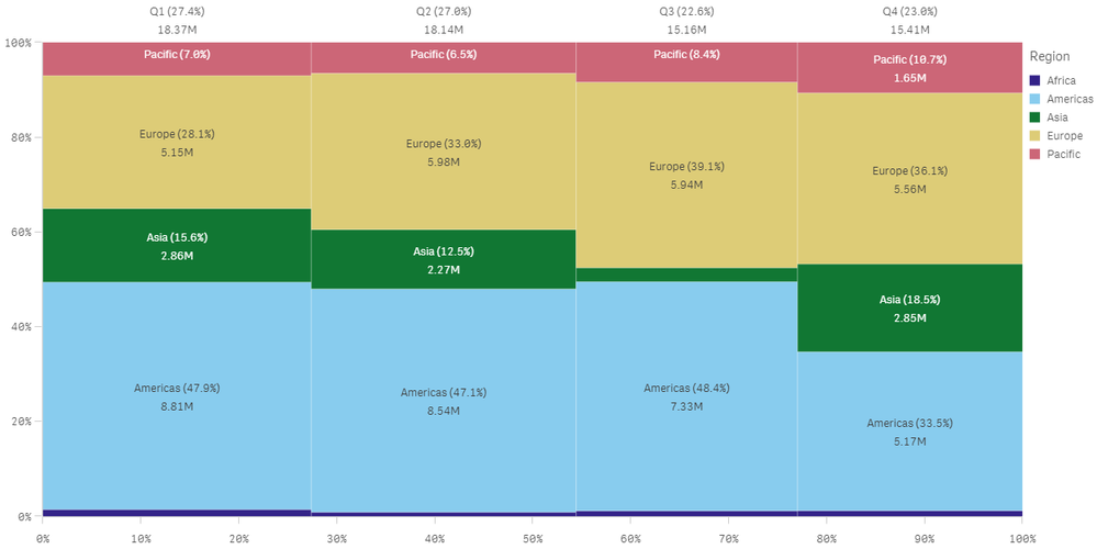
With the November 2019 release came a new chart for Qlik Sense - the mekko chart. The mekko chart allows users to compare a measure by group as well as by category within a group. The mekko chart takes two dimensions and one measure and utilizes height and width to show how values compare across dimensions.
Let’s look at an example. In the chart below, quarter is the first dimension, region is the second dimension and the measure is revenue. The quarters are listed across the top along with their normalized percentage value for revenue which is also visible via the width of each quarter (bar). So, you can see that Q1 is the widest bar because it had the largest revenue while Q3 is the narrowest and had the least amount of revenue. The height of each region in a quarter represents the normalized percentage value for revenue for that region within that quarter. So, if looking at Q1, the Americas had the most revenue while Africa had the least.
The design of the chart makes it easy for the user to compare revenue by quarter, revenue by region within each quarter, as well as revenue by region across quarters. A few things to note are the mekko chart cannot show negative values and does not work well if there are many dimension values. You should also avoid using the mekko chart if you want to mix absolute and relative values. The mekko chart is easy to create and easy to read. You can learn more about the mekko chart and other new features of the November 2019 release in the Qlik Product Innovation Blog, the What’s New – Qlik Product Release Video and the What’s New app.
Thanks,
Jennell
You must be a registered user to add a comment. If you've already registered, sign in. Otherwise, register and sign in.
