Unlock a world of possibilities! Login now and discover the exclusive benefits awaiting you.
- Qlik Community
- :
- Blogs
- :
- Technical
- :
- Design
- :
- P&L Pivot Chart Extension
- Subscribe to RSS Feed
- Mark as New
- Mark as Read
- Bookmark
- Subscribe
- Printer Friendly Page
- Report Inappropriate Content
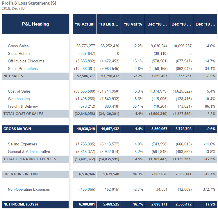
Several years ago, I blogged about how I used IntervalMatch to create a profit and loss statement. Now that Qlik Sense has the P&L Pivot chart extension in the visualization bundle, I decided to test out the extension to see how it may help create a P&L report in Qlik Sense. This blog will review some of my findings and what was involved to create the P&L Pivot chart shown below.
The P&L Pivot chart extension provides a lot of properties that allow you to change the style and coloring in the chart. You can find a complete list of the properties here in Qlik Help. The chart above uses one dimension and 6 measures but I could have used up to 9 measures with my single dimension or used 2 dimensions and up to 8 measures. After loading the data into Qlik Sense, my next step was to create a style template that I could use to handle the formatting of the chart. Here is a snapshot of the template in Excel:
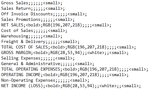
I added a header row so that I could easily see what options I could set but it is not required and can be omitted. In the styling template, Column A should include the data that is in the first dimension of the chart you will be applying the template to. Note that this data is case sensitive. The other columns have the various styles that can be modified via the template.
Here is an example of the same template in a CSV file.
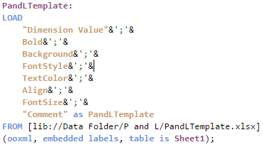
If a template is used, it needs to be loaded via the script. Here is how you can load the Excel and CSV versions of the templates:
Excel:
CSV:
The key in both scripts is that the entire template needs to be loaded into one field which can later be selected from the Style template field drop down in the Properties window of the P&L Pivot chart. In the Excel script, the styles are concatenated into one field separated by semi-colons. In the CSV file, the file format is set to Fixed record to load all the data into one field. Note that the name that you give the field in the script will be the template name you select from the Style template field drop down.
Each row of the template should have this format:
DimensionValue;Bold;Background;FontStyle;TextColor;Align;FontSize;Comment
- DimensionValue is the data value of the dimension in the row that you would like the change
- Bold is used to bold the text in a row
- Background is used to set the background color of a row
- FontStyle is used to change the font style of a row to italic or oblique
- TextColor is used to change the default black font color of a row to white
- Align is used to set the alignment to center
- FontSize is used to change the font size of a row
- Comment is used to replace all zeros with a space
Check Qlik Help to see the default and styling options that are available in the styling template.
There are many additional properties that can be set in the properties window of the P&L Pivot chart extension. I kept many of the defaults but here are some that I changed. In the Table Format section of the Properties, I checked Indent to indent the P&L Heading. The columns can be narrow so I moved the Column width slider all the way to the right, (for max width), and changed the Font family so that I could see as much of the numeric values in the chart as possible. I tweaked the header coloring in the Header format section. I opted not to color variances below 0% red because then I would lose some of my styling template changes. While I used a styling template in my example, you do not have to. The P&L Pivot chart extension can be styled via the Properties window without using a template.
The P&L Pivot chart extension provides a ton of styling options that can be used to easily make your profit and loss statement looks exactly the way you want. It is worth checking out or you can watch this video to learn more.
Thanks,
Jennell
- « Previous
-
- 1
- 2
- 3
- Next »
You must be a registered user to add a comment. If you've already registered, sign in. Otherwise, register and sign in.


