Unlock a world of possibilities! Login now and discover the exclusive benefits awaiting you.
- Qlik Community
- :
- Blogs
- :
- Technical
- :
- Design
- :
- Picasso.js - What separates it from other visualiz...
- Subscribe to RSS Feed
- Mark as New
- Mark as Read
- Bookmark
- Subscribe
- Printer Friendly Page
- Report Inappropriate Content
Picasso.js has been there for a while since its first release in 2018. It is an open-source charting library that is designed for building custom, interactive, component-based powerful visualizations.
Now, what separates Picasso from the other available charting libraries?
Apart from the fact that Picasso.js is open-sourced, here is my take on certain other factors -
Component-based visuals: A visualization usually comprises various building blocks or components that form the overall chart. For example, a Scatter plot consists of two axes with one variable on each of the axes. The data is displayed as a point that shows the position on the two axes(horizontal & vertical). A third variable can also be displayed on the points if they are coded using color, shape, or size. What if instead of an individual point you wanted to draw a pie chart that presents some more information? Something like this -
As we can see on the right-side image, a correlation between Sales and Profit is projected. However, instead of each point, we have individual pie charts that show the category-wise sales made in each city. This was developed using D3.js- a library widely used to do raw visualizations using SVGs.
Picasso.js provides a similar level of flexibility when it comes to building customized charts. Due to its component-based nature, you can practically build anything by combining various blocks of components.
Interactive visuals: Combining brushing and linking is key when it comes to interactivity between various visual components used in a dashboard or web application. Typically what it means is if there are any changes to the representation in one visualization, it will impact the others as well if they deal with the same data (analogous to Associations in Qlik Sense world). This is crucial in modern-day visual analytics solutions and helps overcome the shortcomings of singular representations.
Picasso.js provides these capabilities out of the box. Here is an example of how you could brush & link two charts built using Picasso:
const scatter = picasso.chart(/* */); const bars = picasso.chart(/* */); scatter.brush('select').link(bars.brush('highlight'));- Extensibility: What if you wanted to create visualizations with a set of custom themes that aligns with your organization? What if you needed to bind events using a third-party plugin like Hammer.js? Most importantly for Qlik Sense users, how do you bring the power of associations to these custom charts? Picasso.js allows users to harness these capabilities easily.
- D3-style programming: Picasso.js leverages D3.js for a lot of its features and this allows the D3 community to reuse and easily blend D3-based charts into the Picasso world. Having come from a D3.js background, I realized how comfortable it was for me to scale up when developing charts using Picasso since the style of programming(specifically building components) was very common.
If you would like to read more about the various concepts & components of Picasso, please follow the official documentation.
Now that we know a bit more about Picasso.js, let us try to build a custom chart and try to integrate it with Qlik Sense’s ecosystem, i.e. use selections on a Qlik Sense chart and apply it to the Picasso chart as well.
Prerequisite: picasso-plugin-q
In order to interact with and use the data from Qlik’s engine in a Picasso-based chart, you will need to use the q plugin. This plugin registers a q dataset type making data extraction easier from a hypercube.
Step 1: Install, import the required libraries for Picasso and q-plugin and register -
npm install picasso.js
import picassojs from 'picasso.js';
import picassoQ from 'picasso-plugin-q';

picasso.use(picassoQ); // register
Step 2: Create hypercube and access data from QIX -
 const properties = {
    qInfo: {
      qType: "my-stacked-hypercube"
    },
    qHyperCubeDef: {
      qDimensions: [
        {
          qDef: { qFieldDefs: ["Sport"] },
        }
      ],
      qMeasures: [
        { qDef: { qDef: "Avg(Height)" }
        },
        { qDef: { qDef: "Avg(Weight)" }
        }
      ],
      qInitialDataFetch: [{ qTop: 0, qLeft: 0, qWidth: 100, qHeight: 100 }]
    }
  };
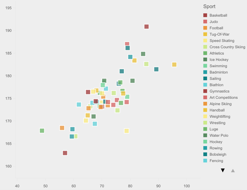
Our idea is to build a scatter plot to understand the height-weight correlation of athletes from an Olympic dataset. We will use the dimension ‘Sport’ to color the points. Therefore, we retrieve the dimension and 2 measures(Height, Weight) from the hypercube.
Step 3: Getting the layout and updating -
Once we create the hypercube, we can use the getLayout( ) method to extract the properties and use it to build and update our chart. For this purpose, we will create two functions and pass the layout accordingly like below.
const variableListModel = await app
    .createSessionObject(properties)
    .then(model => model);

  variableListModel.getLayout().then(layout => {
    createChart(layout);
  });

  variableListModel.on('changed',async()=>{
    variableListModel.getLayout().then(newlayout => {
    updateChart(newlayout);
  });
  });
First, we pass the layout to the createChart( ) method, which is where we build our Scatter plot. If there are any changes to the data, we call the updateChart( ) method and pass the newLayout so our chart can reflect the updated changes.
Step 4: Build the visualization using Picasso.js -
We need to let Picasso know that the data type we will be using is from QIX, i.e. q and then pass the layout like below:
function createChart(layout){
chart = picasso.chart({
 element: document.querySelector('.object_new'),
  data: [{
    type: 'q',
    key: 'qHyperCube',
    data: layout.qHyperCube,
  }],
}
Similar to D3, we will now define the two scales and bind the data (dimension & measure) extracted from Qlik Sense like this:
 scales: {
      s: {
        data: { field: 'qMeasureInfo/0' },
        expand: 0.2,
        invert: true,
      },
      m: {
        data: { field: 'qMeasureInfo/1' },
        expand: 0.2,
      },
      col: {
        data: { extract: { field: 'qDimensionInfo/0' } },
        type: 'color',
      },
    },
Here, the scale s represents the y-axis and m represents x-axis. In our case, we will have the height on the y-axis and weight on the x-axis. The dimension, ‘sports’ will be used to color as mentioned before.
Now, since we are developing a scatter plot, we will define a point component inside the component section, to render the points.
  key: 'point',
      type: 'point',
      data: {
        extract: {
          field: 'qDimensionInfo/0',
          props: {
            y: { field: 'qMeasureInfo/0' },
            x: { field: 'qMeasureInfo/1' },
          },
        },
      },
We also pass the settings of the chart inside the component along with the point like this:
settings: {
        x: { scale: 'm' },
        y: { scale: 's' },
        shape: 'rect',
        size: 0.2,
        strokeWidth: 2,
        stroke: '#fff',
        opacity: 0.8,
        fill: { scale: 'col' },
      },
Please note that I have used the shape ‘rect’ instead of circle here in this visualization as I would like to represent each point as a rectangle. This is just an example of simple customization you can achieve using Picasso.
Finally, we define the updateChart( ) method to take care of the updated layout from Qlik. To do so, we use the update( ) function provided by Picasso.
 function updateChart(newlayout){
       chart.update({
       data: [{
    type: 'q',
    key: 'qHyperCube',
    data: newlayout.qHyperCube,
  }],
    });
        }
The result is seen below:

Step 5: Interaction with Qlik objects -
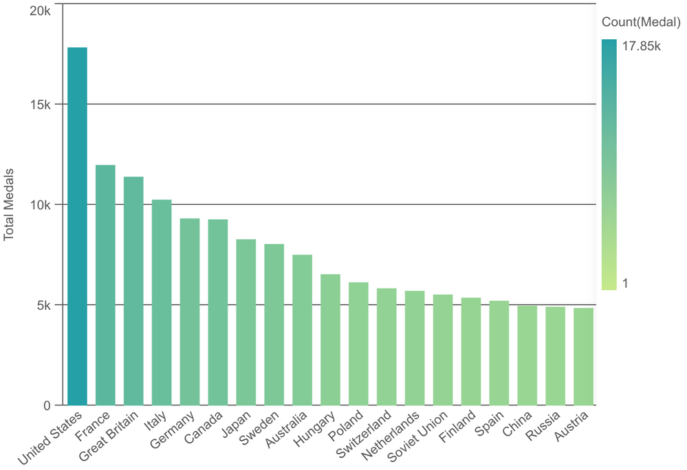
Our last step is to see if the interactions work as we would expect with a native Qlik Sense object. To clearly depict this scenario, I use Nebula.js (a library to embed Qlik objects) to call & render a predefined bar chart from my Qlik Sense environment. If you would like to read more on how to do that please refer to this. Here’s a sample code.
    n.render({
    element: document.querySelector(".object"),
    id: "GMjDu"
  })
And the output is seen below. It is a bar chart that shows country wise total medals won in Olympics.

So, now in our application, we have a predefined Qlik Sense bar chart and a customized scatter plot made using Picasso.js. Let’s see their interactivity in action.
The complete code for this project can be found on my GitHub.
This brings us to an end of this tutorial. If you would like to play around, here are a few collection of Glitches for Picasso. You can also refer to these set of awesome examples in Observable.
You must be a registered user to add a comment. If you've already registered, sign in. Otherwise, register and sign in.

