Unlock a world of possibilities! Login now and discover the exclusive benefits awaiting you.
- Subscribe to RSS Feed
- Mark as New
- Mark as Read
- Bookmark
- Subscribe
- Printer Friendly Page
- Report Inappropriate Content
With the June 2019 release of Qlik Sense, the trellis chart is now a visualization we can add to our apps right out-of-the-box. With this release, the Trellis container extension is part of the Qlik Visualization bundle allowing us to show a master visualization across various dimension values all at once. Here is an example of what a Trellis chart looks like:
In the Trellis chart above, Lost Time Value by Line for each Plant is being displayed. The master visualization is a bar chart with the dimension Line and the measure for Lost Time Value. When I add this master visualization to the Trellis container along with the Plant dimension, I can see the bar chart for all 5 plants. This allow me to compare the time lost value for each plant side by side. The Trellis chart is created by adding the Trellis container from the Qlik Visualization bundle to a sheet and adding a dimension and master visualization. One adjustment I had to make since I was using an expression for my measure was to add a label for the measure in the master visualization. This prevented the whole expression from being displayed as the label.
There are several Trellis options in the properties section that are quite helpful in customizing how you want the Trellis chart to look. In the chart above, I set number of columns property to 5 so that all charts could be displayed side by side. I also set the dimensions titles property to left side only. This shows the dimension label (Line 1, Line 2 and Line 3) on the left most chart only providing more space and removing redundant labels that are not necessary in this layout since the charts are side by side. Other title options included right side only, top only or bottom only. There is also the option to adjust the measure labels by setting the measures titles property but I opted to keep this set to chart default and show the label on each chart.
Here is another example of how the Trellis charts could be displayed:
In this example, I set the number of columns property to 3 and I kept the dimensions titles and measure titles properties set to the default, chart default, so that the x and y axis labels appear on all the charts. With this layout, if I set the dimensions titles to left side only, the top left chart would be the only chart with a dimension label and I did not think it would be clear to the user that it applied to all the charts.
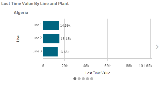
There are many other properties that can be set for the Trellis container such as slide mode. On mobile devices, slide mode is on and shows one Trellis chart at a time. The user can swipe to get to the next chart. Here is what the Trellis container with slide mode on looks like. Notice the arrow on the right that can be used to go to the next chart and the dots at the bottom to show that I am on the first of five charts.
Check out Qlik Help and the Trellis Container video to see all the ways the Trellis container can be customized. To learn more about the other new features in the Qlik Sense June 2019 release, check out the What’s New – Qlik Sense June 2019 app on Qlik’s Demo Site and the What’s New video. These resources also highlight the best practices you should consider when creating master visualizations that will be used in a Trellis container.
Thanks,
Jennell
You must be a registered user to add a comment. If you've already registered, sign in. Otherwise, register and sign in.


