Unlock a world of possibilities! Login now and discover the exclusive benefits awaiting you.
- Qlik Community
- :
- Forums
- :
- Analytics & AI
- :
- Products & Topics
- :
- App Development
- :
- line chart bug
- Subscribe to RSS Feed
- Mark Topic as New
- Mark Topic as Read
- Float this Topic for Current User
- Bookmark
- Subscribe
- Mute
- Printer Friendly Page
- Mark as New
- Bookmark
- Subscribe
- Mute
- Subscribe to RSS Feed
- Permalink
- Report Inappropriate Content
line chart bug
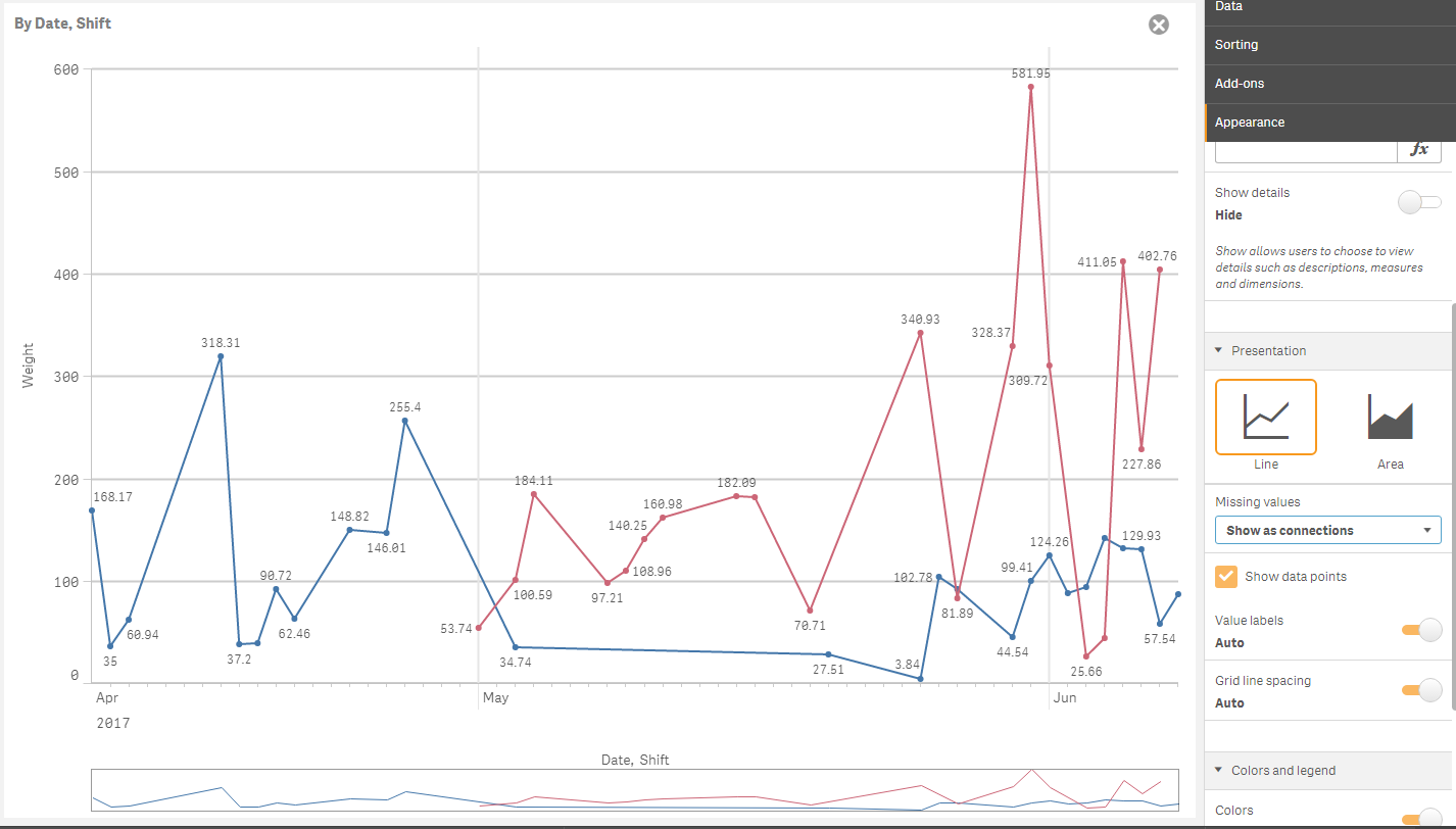
As you can see below, days with no data are shown as if they have data. This is how the "Show as connections" option should work. But the graph's appearance does not change at all when "Show as gaps" or "Show as zeros" is chosen instead. Unless I'm mistaken, this is a bug that needs to be fixed.

- Mark as New
- Bookmark
- Subscribe
- Mute
- Subscribe to RSS Feed
- Permalink
- Report Inappropriate Content
Anyone out there? This continues to be broken. Let me know if there is a better avenue for bug reporting.
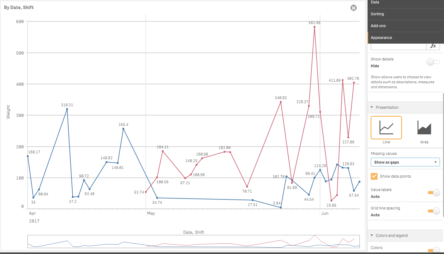
I'll add another graph to the mix. In this one, some missing data points are shown as gaps while others are shown as connections. Put another way, the graph couldn't care less about my "missing values" choice and does whatever it feels like.
![ScreenClip [20].png](/legacyfs/online/185675_ScreenClip [20].png)
- Mark as New
- Bookmark
- Subscribe
- Mute
- Subscribe to RSS Feed
- Permalink
- Report Inappropriate Content
Hi,
Try like this:
- Mark as New
- Bookmark
- Subscribe
- Mute
- Subscribe to RSS Feed
- Permalink
- Report Inappropriate Content
Thanks for the reply, Ivan. I tried what you said, and it made me realize what is going on.
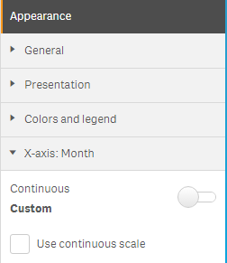
When I use the non-continuous x scale option, it becomes clear that for certain dates, none of the plots has any data. In non-continuous mode, those dates are just completely omitted from the horizontal axis. With those points omitted, Qlik no longer considers the plots to have missing data. For example, if all 4 plots have no data for 11-23-2017, then that date is hidden from the x scale and all 4 plots are drawn with connections from 11-22 to 11-24.
I think that this behavior is reasonable when the horizontal axis is not in continuous mode, but it is wrong when continuous mode is enabled because all dates are forcibly shown in that case. Qlik: please fix this. If a line graph's dimension is a date, then dates with no data for any plot should result in a missing point on each plot, meaning that those points should respond to the user's choice of how to handle missing data (zero, gap, or connection).
Until that hiccup is fixed, the only way to get the graph to act correctly is to make sure all dates are present in at least one of the plots on the graph. In my case, the source data had data for all of the dates, but the set analysis I used to generate the measures plotted on the graph did not. To fix this, I added a clause to the end of one of the plotted measures that does not filter the data at all and always evaluates to 0 so as not to affect the measure's number.
Original:
Set v_OEE = $(v_performance) * $(v_availability) * $(v_quality);
Set v_availability = $(v_uptime) / $(v_plannedUptime);
Set v_uptime = Sum({<Status={'Running'}>} m_minutes);
Set v_plannedUptime = Sum({<[Is Working Hours]={1}>} m_minutes);
...
Modified:
Set v_OEE = $(v_performance) * $(v_availability) * $(v_quality) + Sum(m_minutes)*0;
...
If anyone knows a less hacky way to achieve this, let me know.