Unlock a world of possibilities! Login now and discover the exclusive benefits awaiting you.
- Qlik Community
- :
- All Forums
- :
- QlikView Administration
- :
- Re: add two dimension and expression in one graph
- Subscribe to RSS Feed
- Mark Topic as New
- Mark Topic as Read
- Float this Topic for Current User
- Bookmark
- Subscribe
- Mute
- Printer Friendly Page
- Mark as New
- Bookmark
- Subscribe
- Mute
- Subscribe to RSS Feed
- Permalink
- Report Inappropriate Content
add two dimension and expression in one graph
Hi ,
I want to create graph where in i want to show two dimensions and expressions.
Employee not completing 8 Hrs and Dept not completing 8 hrs with percentage.
Dept whose 8 hrs percentage will less than 20%, Must be in Red same way more than 20% will be in Yellow. and more than 50% in Green.
Can i show it is same graph.
Please suggest.
I have attached the data.
DEPT_NO DEPT_NAME
1 Chairman
101 HR
102 IT
103 Inspector
120 Finance
121 Quality
Thanks and Regards,
- Tags:
- qlikview_deployment
- « Previous Replies
-
- 1
- 2
- Next Replies »
- Mark as New
- Bookmark
- Subscribe
- Mute
- Subscribe to RSS Feed
- Permalink
- Report Inappropriate Content
Please assist me on this
- Mark as New
- Bookmark
- Subscribe
- Mute
- Subscribe to RSS Feed
- Permalink
- Report Inappropriate Content
When it comes to:
1 Expression and 2 dimension
or
2 Expression and 1 Dimension...
Scatter/Grid Chart are the best options..
- Mark as New
- Bookmark
- Subscribe
- Mute
- Subscribe to RSS Feed
- Permalink
- Report Inappropriate Content
Hi Balraj,
Thanks...
I am looking for the expression where employees are not completing 8 hrs. If the percentage is less than 20%, it should be in RED color and where above should be green please help me writing the expression for the same.
- Mark as New
- Bookmark
- Subscribe
- Mute
- Subscribe to RSS Feed
- Permalink
- Report Inappropriate Content
Hi Shaikh,
You have any idea to convert time into percentage.
how to find 20% of 8 hours
- Mark as New
- Bookmark
- Subscribe
- Mute
- Subscribe to RSS Feed
- Permalink
- Report Inappropriate Content
Hi raman,
It is same mathematical expression you need to do for 20% of 8
(20/100) * 8 = 1.6hrs...Hope this helps..
Thanks,
V.
- Mark as New
- Bookmark
- Subscribe
- Mute
- Subscribe to RSS Feed
- Permalink
- Report Inappropriate Content
Hi,
Can u clarify the following points,
1. do u want to present both the dimensions at a time?
2. if yes which type of graph u want to use in ur presentation
BR
SK
- Mark as New
- Bookmark
- Subscribe
- Mute
- Subscribe to RSS Feed
- Permalink
- Report Inappropriate Content
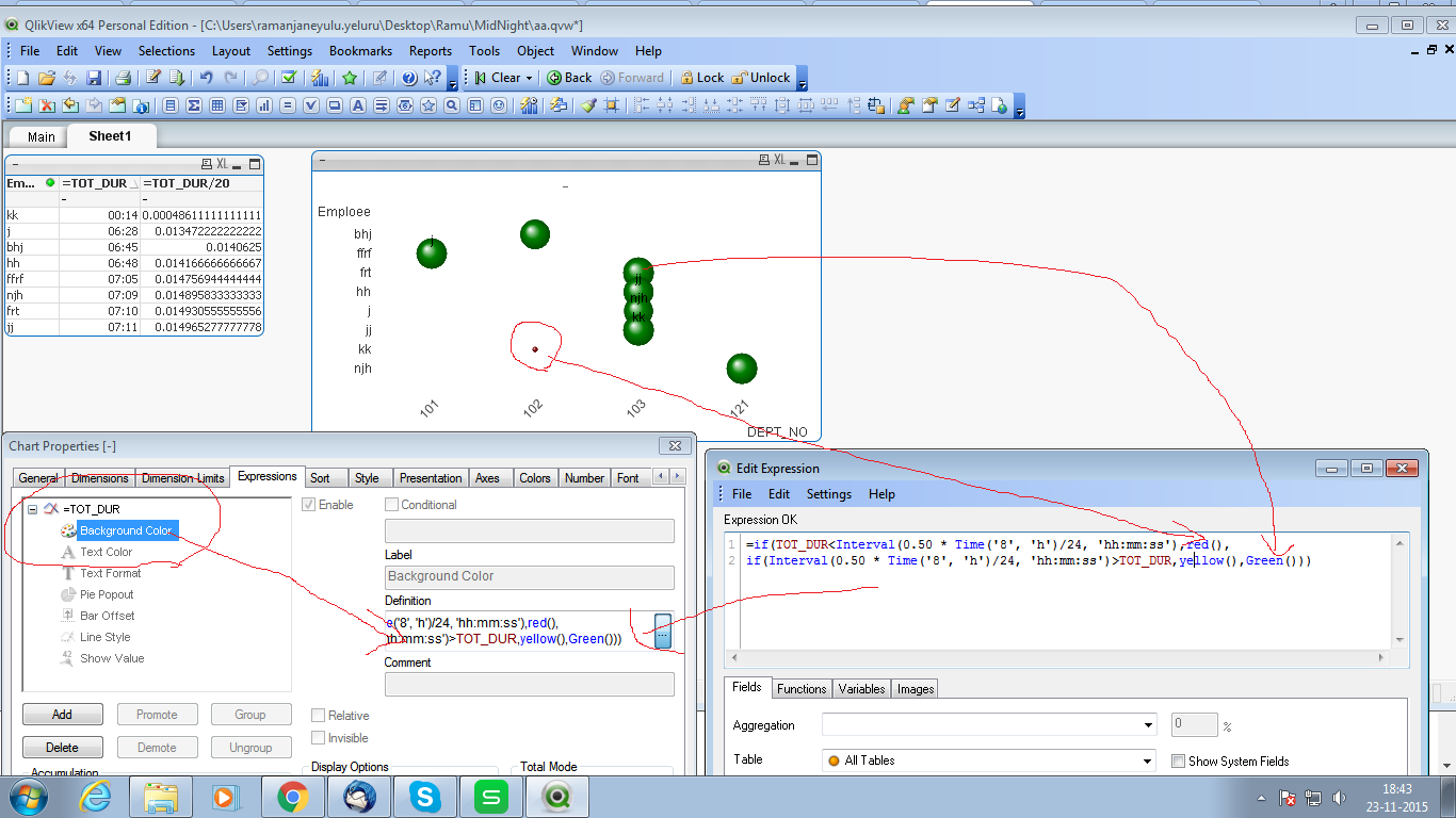
Hi,
i think this is hepfull for u
Expression:
=if(TOT_DUR<Interval(0.50 * Time('8', 'h')/24, 'hh:mm:ss'),red(),
if(Interval(0.50 * Time('8', 'h')/24, 'hh:mm:ss')>TOT_DUR,yellow(),Green()))
- Mark as New
- Bookmark
- Subscribe
- Mute
- Subscribe to RSS Feed
- Permalink
- Report Inappropriate Content
Hi
You did not get my point here suppose every day employees are going to office, They have to complete 8 hrs. Sometime they go early. percentage i can find out by using below expression
Count(TOT_DUR)>='08:00'/Count (TOTAL TOT_DUR)*100
Now i am getting a percentage now i don't know how to get get a different colour for different percentage.
I want to show dept and emp percentage with color on the same graph.
Hope this help.
- Mark as New
- Bookmark
- Subscribe
- Mute
- Subscribe to RSS Feed
- Permalink
- Report Inappropriate Content
Hi
I am trying to show the employees whose percentage is less than 20% must be green colour.
I am using the below expression to get the count of employees completing completing 7 Hrs.
count({1<TOT_DUR={'>=07:00'}>} TOT_DUR)
for percentage, I have to divide by total(TOT_DUR)
count({1<TOT_DUR={'>=07:00'}>} TOT_DUR)/count(TOTAL TOT_DUR)
I have attached the screenshot. I am using Pivot table. But i want to show the same with percentage and with colour on other graph like grid graph one which is suggested by Balraj.
Thanks
- « Previous Replies
-
- 1
- 2
- Next Replies »