Unlock a world of possibilities! Login now and discover the exclusive benefits awaiting you.
- Qlik Community
- :
- All Forums
- :
- QlikView App Dev
- :
- Re: AGGR in pivot tables for colour scaling
- Subscribe to RSS Feed
- Mark Topic as New
- Mark Topic as Read
- Float this Topic for Current User
- Bookmark
- Subscribe
- Mute
- Printer Friendly Page
- Mark as New
- Bookmark
- Subscribe
- Mute
- Subscribe to RSS Feed
- Permalink
- Report Inappropriate Content
AGGR in pivot tables for colour scaling
I’m attempting to implement a scaled colour formatting mechanism in Qlikview, similar to what you have in Excel. I’m very close to achieving this, but I’ve hit a problem
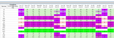
You’ll be able to select a number of rows and a number of dates. Each row will be evaluated separately. If the value in a cell is near the average for that row, the cell will be coloured green. If it’s a lot higher than the average it’ll be red. And if it’s a lot lower it’ll be blue. I’m using background colour expressions on the pivot table expression to calculate the RGB values based on the maximum, minimum and average of all the values shown in that row, so you’ll get lots of shades in between.
This works OK in my prototype, where I’ve typed the values 118, 64 and 170 into the expression itself as the average, minimum and maximum values, but now I want it to calculate the max, min and avg of the current row and use these values to calculate the colours.
As an interim measure, I’ve added an additional expression to calculate the average. Here’s what I’ve used:
= avg(aggr(avg(JourneyCount), ChargingStation, operator_code, service_code ))
It calculates the correct value, but it appears only in one column in the pivot table. So when I transfer this to the colour calculation expression, only one cell is coloured correctly.
I appreciate it may just be something very simple I’ve missed. Conversely, I may be attempting an impossible task!
Any pointers would be extremely welcome!
Regards
Steve
Accepted Solutions
- Mark as New
- Bookmark
- Subscribe
- Mute
- Subscribe to RSS Feed
- Permalink
- Report Inappropriate Content
You may try to add a NODISTINCT to the aggr() whereby I think it should also work without an aggr() but with a TOTAL statement within the calculation to ignore the dimensionality completely respectively with TOTAL <Dim1, Dim2 > certain dimensions of the chart.
- Marcus
- Mark as New
- Bookmark
- Subscribe
- Mute
- Subscribe to RSS Feed
- Permalink
- Report Inappropriate Content
Hola Disculpe encontró alguna solución tengo el mismo problema ya habilite las opciones de imprimir https://testmyspeed.onl/ a como se indicar y continua igual mi gráfico.
- Mark as New
- Bookmark
- Subscribe
- Mute
- Subscribe to RSS Feed
- Permalink
- Report Inappropriate Content
You may try to add a NODISTINCT to the aggr() whereby I think it should also work without an aggr() but with a TOTAL statement within the calculation to ignore the dimensionality completely respectively with TOTAL <Dim1, Dim2 > certain dimensions of the chart.
- Marcus
- Mark as New
- Bookmark
- Subscribe
- Mute
- Subscribe to RSS Feed
- Permalink
- Report Inappropriate Content
Many thanks for your assistance Marcus. This gave me the solution I was hoping for on the technical side of this. Incorporating this, I've managed to implement the feature largely as I'd envisaged. Obviously, it currently looks a little garish, I need to do some work on the expressions to choose the colours. But as far as calculating the max, min and avg exactly as I'd hoped, this very quickly sorted the problem.
Thanks again!
Steve
- Mark as New
- Bookmark
- Subscribe
- Mute
- Subscribe to RSS Feed
- Permalink
- Report Inappropriate Content
Problem is sorted Kasey. Marcus told me to use NODISTINCT. Hope this helps you too!


