Unlock a world of possibilities! Login now and discover the exclusive benefits awaiting you.
- Qlik Community
- :
- All Forums
- :
- QlikView App Dev
- :
- Aggregated data from and to the selected time peri...
- Subscribe to RSS Feed
- Mark Topic as New
- Mark Topic as Read
- Float this Topic for Current User
- Bookmark
- Subscribe
- Mute
- Printer Friendly Page
- Mark as New
- Bookmark
- Subscribe
- Mute
- Subscribe to RSS Feed
- Permalink
- Report Inappropriate Content
Aggregated data from and to the selected time period
Hi!
I am trying to do a diagram showing:
based on the selected YearMonth(s),
the number of customers that have been created per month up until that month.
So for example:
Jan 2011: 3 customers are created
Feb 2011: 4 customers are created
March 2011: 5 customers are created
If the months Feb and March are selected I want the diagram to show that in Feb 4 customers were created and in March 9 customers were created. My diagram is currently showing 4 in Feb and 5 in March.
Should I use a set analysis?
Thankful for any help!
Accepted Solutions
- Mark as New
- Bookmark
- Subscribe
- Mute
- Subscribe to RSS Feed
- Permalink
- Report Inappropriate Content
Hi,
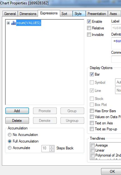
just use the accumulation feature in the properties of your chart:
- Mark as New
- Bookmark
- Subscribe
- Mute
- Subscribe to RSS Feed
- Permalink
- Report Inappropriate Content
Hi,
just use the accumulation feature in the properties of your chart:
- Mark as New
- Bookmark
- Subscribe
- Mute
- Subscribe to RSS Feed
- Permalink
- Report Inappropriate Content
Hello,
i also tried this and that works ok!
i tried this on a table with 4 colums:
month
amount year 2010
amount year 2011
% : amount year 2011/amount year 2010
i set column 2 and 3 to full accumulation, but what do i do now with the%?
it still calculates as if it wasn't accumulated!
grtz,
chris
- Mark as New
- Bookmark
- Subscribe
- Mute
- Subscribe to RSS Feed
- Permalink
- Report Inappropriate Content
Thanks! Such an easy answer 