Unlock a world of possibilities! Login now and discover the exclusive benefits awaiting you.
- Qlik Community
- :
- All Forums
- :
- QlikView App Dev
- :
- Average line for each group in a bar chart with 3 ...
- Subscribe to RSS Feed
- Mark Topic as New
- Mark Topic as Read
- Float this Topic for Current User
- Bookmark
- Subscribe
- Mute
- Printer Friendly Page
- Mark as New
- Bookmark
- Subscribe
- Mute
- Subscribe to RSS Feed
- Permalink
- Report Inappropriate Content
Average line for each group in a bar chart with 3 dimensions.
Hello,
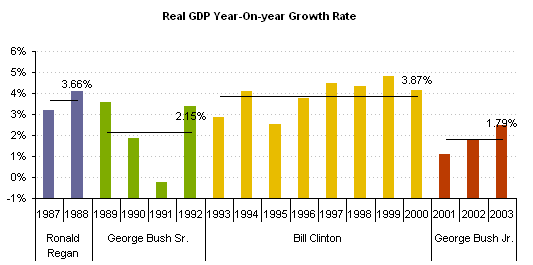
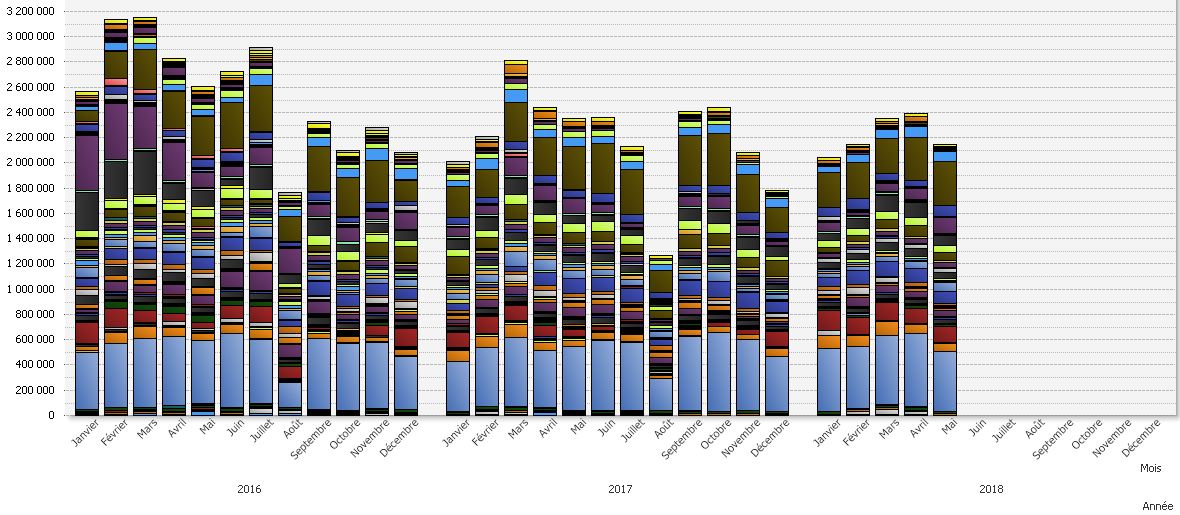
I would like to draw an average line for each group in a bar chart with 3 dimensions.
Here falls an example :

My real qlikview chart falls behind :

- Mark as New
- Bookmark
- Subscribe
- Mute
- Subscribe to RSS Feed
- Permalink
- Report Inappropriate Content
Hi,
I think an approach is use one single dimension in the x axis (year) and define the background color depending the President dimension.
Regards
- Mark as New
- Bookmark
- Subscribe
- Mute
- Subscribe to RSS Feed
- Permalink
- Report Inappropriate Content
I would like to draw an average line for each group in a bar chart. Here, for each year.
What the point with the background color ?
- Mark as New
- Bookmark
- Subscribe
- Mute
- Subscribe to RSS Feed
- Permalink
- Report Inappropriate Content
Sorry, I was thinking about the look & feel.
For the average, you can create value with a set analysis and show them in the char as a different expressions, isn´t it?
Regards
- Mark as New
- Bookmark
- Subscribe
- Mute
- Subscribe to RSS Feed
- Permalink
- Report Inappropriate Content
Yes but if the selection changes, this solution doesn't work anymore.
For example, if I select 2016 and 2017 and after that I change to 2017 and 2018.
Your solution works only if you know what will be selected.
- Mark as New
- Bookmark
- Subscribe
- Mute
- Subscribe to RSS Feed
- Permalink
- Report Inappropriate Content
In fact, this is impossible to do that with QlikView.
Thanks anyway Jose.