Unlock a world of possibilities! Login now and discover the exclusive benefits awaiting you.
- Qlik Community
- :
- All Forums
- :
- QlikView App Dev
- :
- Re: Axis value (offset)
- Subscribe to RSS Feed
- Mark Topic as New
- Mark Topic as Read
- Float this Topic for Current User
- Bookmark
- Subscribe
- Mute
- Printer Friendly Page
- Mark as New
- Bookmark
- Subscribe
- Mute
- Subscribe to RSS Feed
- Permalink
- Report Inappropriate Content
Axis value (offset)
Hi everyone
I'm trying to build a bar chart, similar to the one below, displaying the availability of machines. The target availability is 97 %, and I would like to display machines that have a higher availability as an rising bar, and a dropping bar for machines with a lower availability. I also want to display the actual values.
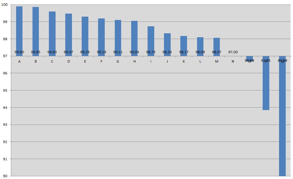
Unfortunately, I cannot find a way to achieve this. I tried working with a 97 % offset, but that would mean that a 99 % value is displayed as 2%, and a 95 % availability as -2 %. So the bars are shown correctly, but not the values themselves.
I would have expected that this would be possible, since this is a pretty standard functionality in Excel as well.
Any ideas, anyone?
Thanks,
Frederic
- Mark as New
- Bookmark
- Subscribe
- Mute
- Subscribe to RSS Feed
- Permalink
- Report Inappropriate Content
I'm facing the same problem. Have you sovled it?