Unlock a world of possibilities! Login now and discover the exclusive benefits awaiting you.
- Qlik Community
- :
- All Forums
- :
- QlikView App Dev
- :
- Bar Chart Question
- Subscribe to RSS Feed
- Mark Topic as New
- Mark Topic as Read
- Float this Topic for Current User
- Bookmark
- Subscribe
- Mute
- Printer Friendly Page
- Mark as New
- Bookmark
- Subscribe
- Mute
- Subscribe to RSS Feed
- Permalink
- Report Inappropriate Content
Bar Chart Question
Hi Qlik Gurus,
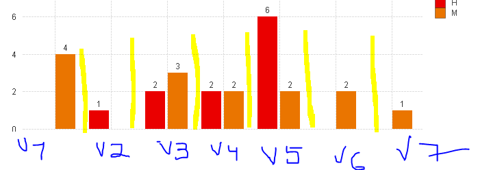
Is it possible to create lines separating the results on the bar chart? Similar to yellow drawing on the screen shot attached? Bar groups are related to different Vendor names and it would be great to separate the results.
Please advise.
Thank you-
- Mark as New
- Bookmark
- Subscribe
- Mute
- Subscribe to RSS Feed
- Permalink
- Report Inappropriate Content
Not easily (and dynamic). But you can increase the cluster distance on presentation tab if this is of any help.
- Mark as New
- Bookmark
- Subscribe
- Mute
- Subscribe to RSS Feed
- Permalink
- Report Inappropriate Content
I have tried to increase the cluster distance, the results are not what i would like it to be.
Thank you-
- Mark as New
- Bookmark
- Subscribe
- Mute
- Subscribe to RSS Feed
- Permalink
- Report Inappropriate Content
I use bar distance 0 for these cases. You may not be happy with that either, but I'm not sure what else to offer.

- Mark as New
- Bookmark
- Subscribe
- Mute
- Subscribe to RSS Feed
- Permalink
- Report Inappropriate Content
Hi,
You can create Data Island for the X axis Dimension Field and use it in PIVOT table and Overlap the X axis area of the chart. It will give you the near about look and fill as dimensions will be clearly separated out.