Unlock a world of possibilities! Login now and discover the exclusive benefits awaiting you.
- Qlik Community
- :
- All Forums
- :
- QlikView App Dev
- :
- Re: Bar Chart visualization
- Subscribe to RSS Feed
- Mark Topic as New
- Mark Topic as Read
- Float this Topic for Current User
- Bookmark
- Subscribe
- Mute
- Printer Friendly Page
- Mark as New
- Bookmark
- Subscribe
- Mute
- Subscribe to RSS Feed
- Permalink
- Report Inappropriate Content
Bar Chart visualization
I have the following problem and need guidance and help to resolve it.
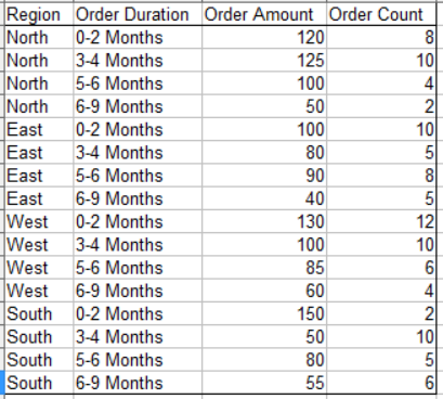
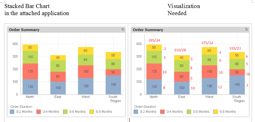
A company processes orders from several customers from the four regions. Each order has an order amount and order duration (time to fulfill the order). The summary data to be used for visualization extracted from the order detail table is given below. Using the application attached, I could get the stacked bar chart given below on the left, while the visualization needed is shown on the right. Please advise the changes in the application to get the desired visualization. You may suggest any other chart object which will display all the information (order amount and order count for each order duration, and the total order amount and total order count for each region). Thank you in advance for your help.
- « Previous Replies
-
- 1
- 2
- Next Replies »
- Mark as New
- Bookmark
- Subscribe
- Mute
- Subscribe to RSS Feed
- Permalink
- Report Inappropriate Content
thank u so much HEIN it's working
- Mark as New
- Bookmark
- Subscribe
- Mute
- Subscribe to RSS Feed
- Permalink
- Report Inappropriate Content
Thank you all for your time and for helping me resolve the issue to meet the business requirements for the application.
- Mark as New
- Bookmark
- Subscribe
- Mute
- Subscribe to RSS Feed
- Permalink
- Report Inappropriate Content
Hi NagaianK,
There is always an issue while copying the chart from app to ppt when you create a chart by overlapping multiple chart.
Do you have any solution for this? Even i am stuck with this issues. I tried few macros but couldn't find a solution.
Regards
KC
KC
- Mark as New
- Bookmark
- Subscribe
- Mute
- Subscribe to RSS Feed
- Permalink
- Report Inappropriate Content
For the export to excel you can add the two extra expressions to the top layer chart, with the option text as popup (no bars).
- Mark as New
- Bookmark
- Subscribe
- Mute
- Subscribe to RSS Feed
- Permalink
- Report Inappropriate Content
Hi,
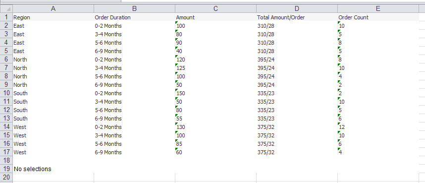
Writing some logic in script and some tricks on front end it is possible to achieve using the single chart. I have done the same. Even though you got the correct answer you can check it out
- Mark as New
- Bookmark
- Subscribe
- Mute
- Subscribe to RSS Feed
- Permalink
- Report Inappropriate Content
Yes, I actually had something similar, but did not like reloading some data twice, although it's ok with this example. I also think it can probably be done in one chart without loading extra data, using some synthethic dimensions, but that would get messy in the expressions.
- Mark as New
- Bookmark
- Subscribe
- Mute
- Subscribe to RSS Feed
- Permalink
- Report Inappropriate Content
Yes, If actual data is huge then it will affect the loading performance. Otherwise its good to go.
- « Previous Replies
-
- 1
- 2
- Next Replies »