Unlock a world of possibilities! Login now and discover the exclusive benefits awaiting you.
- Qlik Community
- :
- All Forums
- :
- QlikView App Dev
- :
- Re: Bar graph using sum of rows?
- Subscribe to RSS Feed
- Mark Topic as New
- Mark Topic as Read
- Float this Topic for Current User
- Bookmark
- Subscribe
- Mute
- Printer Friendly Page
- Mark as New
- Bookmark
- Subscribe
- Mute
- Subscribe to RSS Feed
- Permalink
- Report Inappropriate Content
Bar graph using sum of rows?
Hey everyone,
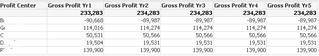
I've been building a profitability model in QlikView and have finished all the calculated needed to get to Gross Profit by Profit Center in a straight table. I have the table sum the rows at the top. The Gross Profit Columns (Yr1, Yr2, etc.) utilize various input boxes, other columns in the in the table and many aggregation functions to get to the value. Also many of the columns used to calculate GP contain conditional if statements which alter their calculation based on Profit center. Essentially what i need to do is graph just the Total of the rows . The way it is set up now, when i convert it to a bar graph, Profit Center is along the X axis and each profit center has five bars for GP (5 Years). Instead I'm trying to get GP Yr1, GP Yr2, GP Yr3, etc. along the X axis and the total GP across all profit centers on the Y. Below is the aforementioned chart. Any advise would be appreciated!
- Mark as New
- Bookmark
- Subscribe
- Mute
- Subscribe to RSS Feed
- Permalink
- Report Inappropriate Content
Hi,
Try using Grid Chart. You can add two dimensions and one measure.
1st dimension as X axis and 2nd dimension will be as Y axis. Metrics in expression tab will be plotted as Bubble in the Grid form.
- Mark as New
- Bookmark
- Subscribe
- Mute
- Subscribe to RSS Feed
- Permalink
- Report Inappropriate Content
hey,
Thanks for the answer. Unfortunately I need a bar graph. Since GP is being calculated by referencing labels of other dimensions I cant figure out a way to get to the sum of all Profit Centers.
- Mark as New
- Bookmark
- Subscribe
- Mute
- Subscribe to RSS Feed
- Permalink
- Report Inappropriate Content
You might be able to create a synthetic dimensions such as this for your bar chart:
=ValueList('GP Yr1', 'GP Yr2', 'GP Yr3', 'GP Yr4', 'GP Yr5')
and then use this expressions:
Pick(Match(ValueList('GP Yr1', 'GP Yr2', 'GP Yr3', 'GP Yr4', 'GP Yr5'), 'GP Yr1', 'GP Yr2', 'GP Yr3', 'GP Yr4', 'GP Yr5'),
Sum(Aggr(YourExpression4GrossProfitYear1, [Profit Center])),
Sum(Aggr(YourExpression4GrossProfitYear2, [Profit Center])),
Sum(Aggr(YourExpression4GrossProfitYear3, [Profit Center])),
Sum(Aggr(YourExpression4GrossProfitYear4, [Profit Center])),
Sum(Aggr(YourExpression4GrossProfitYear5, [Profit Center])))
Here replace the text in red with your current expressions from the straight table. Also make sure to change the [Profit Center] dimension within the Aggr to whatever the actual name of the dimension is.
Also note that the dimension created using ValueList() is not selectable. So you won't be able to look at GP Yr1 by selecting it in the chart. If selection is one of the requirement, then create an Island Inline table in the script and replace it with the ValueList:
Dim:
LOAD * INLINE [
Dim
GP Yr1
GP Yr2
GP Yr3
GP Yr4
GP Yr5
];
And then your dimension for bar chart would be: Dim
Expression:
Pick(Match(Dim, 'GP Yr1', 'GP Yr2', 'GP Yr3', 'GP Yr4', 'GP Yr5'),
Sum(Aggr(YourExpression4GrossProfitYear1, [Profit Center])),
Sum(Aggr(YourExpression4GrossProfitYear2, [Profit Center])),
Sum(Aggr(YourExpression4GrossProfitYear3, [Profit Center])),
Sum(Aggr(YourExpression4GrossProfitYear4, [Profit Center])),
Sum(Aggr(YourExpression4GrossProfitYear5, [Profit Center])))
For a more specific help, you would need to provide a sample.
Best,
Sunny