Unlock a world of possibilities! Login now and discover the exclusive benefits awaiting you.
- Qlik Community
- :
- All Forums
- :
- QlikView App Dev
- :
- Re: Beginner line graphs
- Subscribe to RSS Feed
- Mark Topic as New
- Mark Topic as Read
- Float this Topic for Current User
- Bookmark
- Subscribe
- Mute
- Printer Friendly Page
- Mark as New
- Bookmark
- Subscribe
- Mute
- Subscribe to RSS Feed
- Permalink
- Report Inappropriate Content
Beginner line graphs
Hello everyone,
I'm totally new to Qlik View and am interested in bringing in data from a variety of sources and making a workbook with several different line graphs. I have been working with a dummy excel file trying to get the graph functionality to work and have been unsuccessful - I think it may have to do with the way that I set up the fields in the excel file (which is attached). What I would like to do is plot the month on the x axis of the graph, and then plot the (fraction of total / total) as a percentage with respect to its corresponding month. Would somebody be able to help me do this? Thanks.
Accepted Solutions
- Mark as New
- Bookmark
- Subscribe
- Mute
- Subscribe to RSS Feed
- Permalink
- Report Inappropriate Content
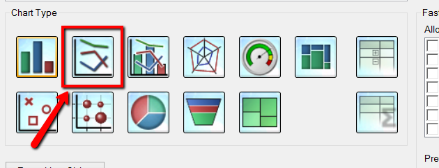
Choose Line Chart

Select Month as the Dimension
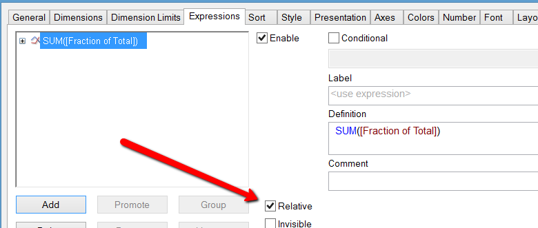
and SUM([Fraction of Total]) as the Expression, tick the relative tick box

- Mark as New
- Bookmark
- Subscribe
- Mute
- Subscribe to RSS Feed
- Permalink
- Report Inappropriate Content
Are you using a licensed version or Personal Edition?
- Mark as New
- Bookmark
- Subscribe
- Mute
- Subscribe to RSS Feed
- Permalink
- Report Inappropriate Content
Create a line graph
Take Dimension = Month
Expression
SUM(Fraction of Total)
Tick Relative ...
- Mark as New
- Bookmark
- Subscribe
- Mute
- Subscribe to RSS Feed
- Permalink
- Report Inappropriate Content
Right now I'm using the personal one but I will eventually be using the licensed small business version.
- Mark as New
- Bookmark
- Subscribe
- Mute
- Subscribe to RSS Feed
- Permalink
- Report Inappropriate Content
Choose Line Chart

Select Month as the Dimension
and SUM([Fraction of Total]) as the Expression, tick the relative tick box

- Mark as New
- Bookmark
- Subscribe
- Mute
- Subscribe to RSS Feed
- Permalink
- Report Inappropriate Content
Thanks that worked.