Unlock a world of possibilities! Login now and discover the exclusive benefits awaiting you.
- Qlik Community
- :
- All Forums
- :
- QlikView App Dev
- :
- Re: Build a supply curve
- Subscribe to RSS Feed
- Mark Topic as New
- Mark Topic as Read
- Float this Topic for Current User
- Bookmark
- Subscribe
- Mute
- Printer Friendly Page
- Mark as New
- Bookmark
- Subscribe
- Mute
- Subscribe to RSS Feed
- Permalink
- Report Inappropriate Content
Build a supply curve
Good day,
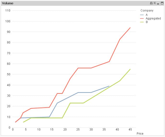
While doing my coursework, I've faced a problem with building an aggregate supply curve of different companies. I have several companies with their prices and volumes. I need to sum each volume to build a supply curve. Is there a way to do it in QlikView?
Here is an example of 2 companies, but it could much more of them. Also, I attached an Excel file to understand what supply curve is.

- « Previous Replies
-
- 1
- 2
- Next Replies »
Accepted Solutions
- Mark as New
- Bookmark
- Subscribe
- Mute
- Subscribe to RSS Feed
- Permalink
- Report Inappropriate Content
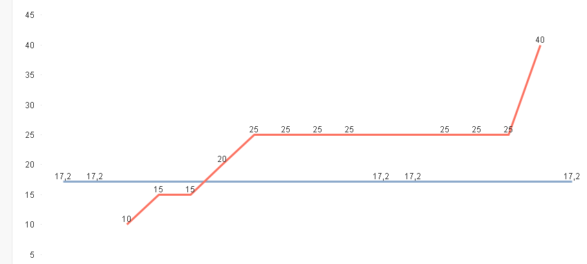
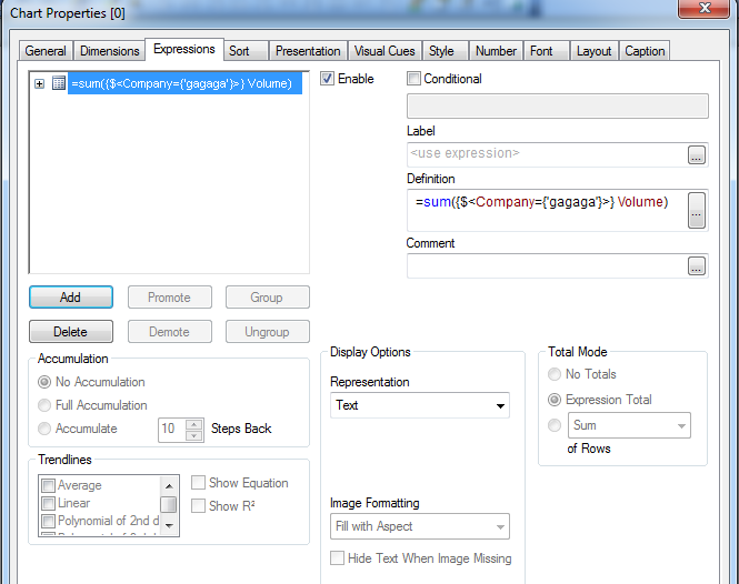
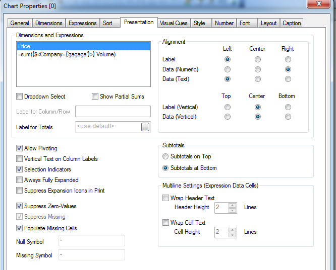
attached some screenshots that should help you to recreate my example using your personal edition:
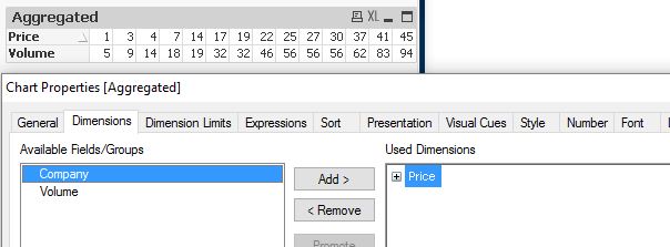
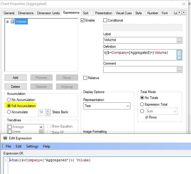
hope this helps
regards
Marco
- Mark as New
- Bookmark
- Subscribe
- Mute
- Subscribe to RSS Feed
- Permalink
- Report Inappropriate Content
Hi,
maybe one solution could be:
tabPriceVol:
LOAD 'A' as Company,
    Price,
    RangeSum(Volume,-Previous(Volume)) as Volume
INLINE [
    Price, Volume
    1, 5
    3, 9
    14, 10
    17, 23
    25, 33
    30, 33
    37, 39
];

LOAD 'B' as Company,
    Price,
    RangeSum(Volume,-Previous(Volume)) as Volume
INLINE [
    Price, Volume
    4, 5
    7, 9
    19, 9
    22, 23
    27, 23
    41, 44
    45, 55
];

LOAD 'Aggregated' as Company,
    Price,
    Volume
Resident tabPriceVol;
hope this helps
regards
Marco
- Mark as New
- Bookmark
- Subscribe
- Mute
- Subscribe to RSS Feed
- Permalink
- Report Inappropriate Content
Hello Marco Wedel,
Thanks for your answer. But still, it is not what I am looking for. In my case, I am seeking to know if there is a way to automatically generate an aggregate supply table (last table in Excel file) or chart. As I mentioned before, I can manually calculate a curve for several companies but if there are 20-30 companies it becomes almost impossible.
- Mark as New
- Bookmark
- Subscribe
- Mute
- Subscribe to RSS Feed
- Permalink
- Report Inappropriate Content
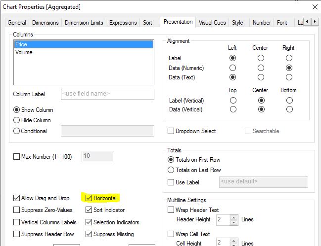
maybe it helps to present my chart as straight table and compare to your specified aggregated supply table:
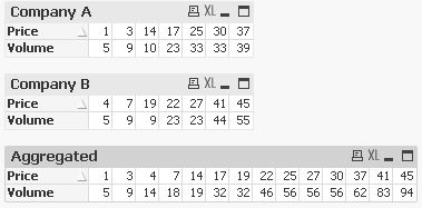

regards
Marco
- Mark as New
- Bookmark
- Subscribe
- Mute
- Subscribe to RSS Feed
- Permalink
- Report Inappropriate Content
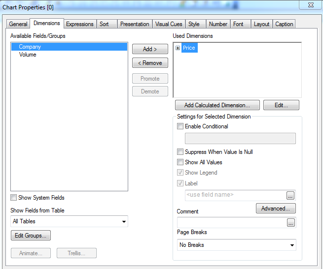
Sorry but I can not open the "QlikCommunity_Thread_210174_v2.qvw" file because of my Personal Edition. Also, I 've discovered a function Total in Dimension limits. It sums dimension values but only if all expressions have the same Dim values. Example:
When I use Total function in Dimension limits, it sums only distinct values:
So, if is there a way to assign a (n-1) value for each blank space? Example: if a blank space is and [i-1]=17.2, then =17.2.
- Mark as New
- Bookmark
- Subscribe
- Mute
- Subscribe to RSS Feed
- Permalink
- Report Inappropriate Content
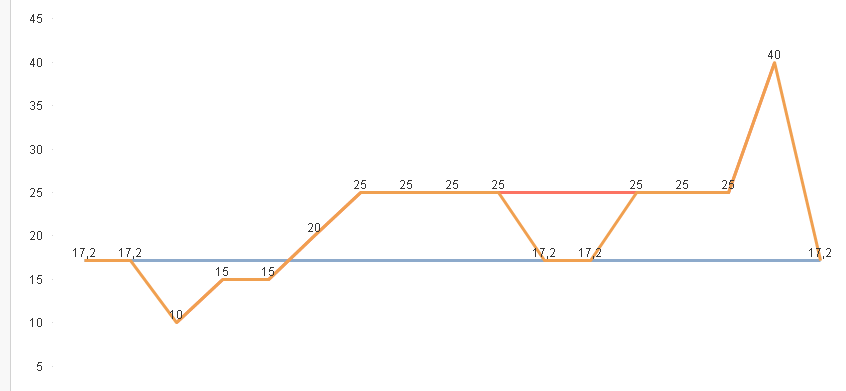
attached some screenshots that should help you to recreate my example using your personal edition:
hope this helps
regards
Marco
- Mark as New
- Bookmark
- Subscribe
- Mute
- Subscribe to RSS Feed
- Permalink
- Report Inappropriate Content
- Mark as New
- Bookmark
- Subscribe
- Mute
- Subscribe to RSS Feed
- Permalink
- Report Inappropriate Content
please post sample application to check.
thanks
regards
Marco
- Mark as New
- Bookmark
- Subscribe
- Mute
- Subscribe to RSS Feed
- Permalink
- Report Inappropriate Content
Change your chart from a pivot to a straight table.
Then check if you can reproduce Marco's results and if these match your requirement.
If they do match, I believe he can also solve your requirements how to display the curve as next step.
- Mark as New
- Bookmark
- Subscribe
- Mute
- Subscribe to RSS Feed
- Permalink
- Report Inappropriate Content
swuehl, MarcoWedel, thanks for the advice. Now it works.

As swuehl has mentioned before, can you help me to display the curve?
- « Previous Replies
-
- 1
- 2
- Next Replies »