Unlock a world of possibilities! Login now and discover the exclusive benefits awaiting you.
- Qlik Community
- :
- All Forums
- :
- QlikView App Dev
- :
- Re: Re: Calculated dimension of time ranges on x-a...
- Subscribe to RSS Feed
- Mark Topic as New
- Mark Topic as Read
- Float this Topic for Current User
- Bookmark
- Subscribe
- Mute
- Printer Friendly Page
- Mark as New
- Bookmark
- Subscribe
- Mute
- Subscribe to RSS Feed
- Permalink
- Report Inappropriate Content
Calculated dimension of time ranges on x-axis
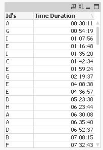
I have a table like shown below
| Time Duration | Id's |
|---|---|
| 00:45 | A |
| 00:35 | A |
| 01:10 | B |
| 01:16 | B |
I wanted to plot a graph with Time Duration on X-axis and Count(Id's) on Y-axis (as expression). But on X-axis i wanted time duration as time range, i.e. 0 < x < 1 and 1 < x < 2 (count of id's with time duration between 0 and 1 hour; and 1 and 2 hours).
I used class function to group time duration like, Class([Time Duration], Time#(1,'HH')). It worked, but the problem is with the visualization. The X-axis scale is showing like 0 < x < 0.0034 and 0.004 < x < 0.0063 (some decimal number, i just wanted to indicate the how it is being show). How to make Class function understand that it is time that i am trying to display.
- « Previous Replies
-
- 1
- 2
- Next Replies »
- Mark as New
- Bookmark
- Subscribe
- Mute
- Subscribe to RSS Feed
- Permalink
- Report Inappropriate Content
with some more Buckets:
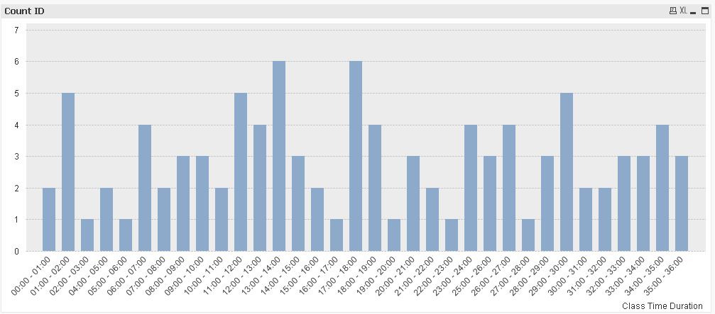
hope this helps
regards
Marco
- Mark as New
- Bookmark
- Subscribe
- Mute
- Subscribe to RSS Feed
- Permalink
- Report Inappropriate Content
Hi Marco
Your latest solution works like charm. Thanks!
-Sandeep
- Mark as New
- Bookmark
- Subscribe
- Mute
- Subscribe to RSS Feed
- Permalink
- Report Inappropriate Content
you're welcome
regards
Marco
- Mark as New
- Bookmark
- Subscribe
- Mute
- Subscribe to RSS Feed
- Permalink
- Report Inappropriate Content
how can i open this?
- « Previous Replies
-
- 1
- 2
- Next Replies »