Unlock a world of possibilities! Login now and discover the exclusive benefits awaiting you.
- Qlik Community
- :
- All Forums
- :
- QlikView App Dev
- :
- Calculating average
- Subscribe to RSS Feed
- Mark Topic as New
- Mark Topic as Read
- Float this Topic for Current User
- Bookmark
- Subscribe
- Mute
- Printer Friendly Page
- Mark as New
- Bookmark
- Subscribe
- Mute
- Subscribe to RSS Feed
- Permalink
- Report Inappropriate Content
Calculating average
hey everyone.
So i am creating a report that needs to calculate the average per department.
My data is as followed:
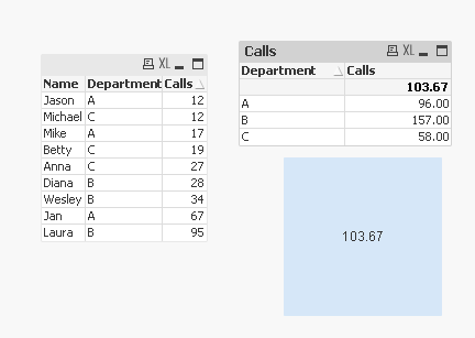
| Name | Department | Calls |
| Mike | A | 17 |
| Jason | A | 12 |
| Jan | A | 67 |
| Wesley | B | 34 |
| Diana | B | 28 |
| Laura | B | 95 |
| Betty | C | 19 |
| Michael | C | 12 |
| Anna | C | 27 |
| Average | 34.56 | |
| Department | Calls | |
| A | 96 | |
| B | 157 | |
| C | 58 | |
| Average | 103.67 |
Now i dont want to use straight tables or pivot tables, for this specific report i am using text objects for better visualization.
The formula in the text object is:
=Num(Sum({<Week={$(vCurrentWeek)}>}distinct tAgentCalls),'#,##0.00')
tAgentCalls being the field in which i have the data of the amount of calls obviously.
Now if i would do an average on this formula it would calculate the average of all employees in that selection.
Which would result in the average as seen above 34.56.
While i need it to calculate the average of the departments they are in.
Now on this specific data i have 3 people on each department, but as you can imagine this varies.
Can anybody help me with this.
- Tags:
- new_to_qlikview
- « Previous Replies
-
- 1
- 2
- Next Replies »
Accepted Solutions
- Mark as New
- Bookmark
- Subscribe
- Mute
- Subscribe to RSS Feed
- Permalink
- Report Inappropriate Content
Try this:
Avg(Aggr(Sum({<Week={$(vCurrentWeek)}>}distinct tAgentCalls), Department))
or
Avg({<Week={$(vCurrentWeek)}>} Aggr(Sum({<Week={$(vCurrentWeek)}>} Distinct tAgentCalls), Department))
- Mark as New
- Bookmark
- Subscribe
- Mute
- Subscribe to RSS Feed
- Permalink
- Report Inappropriate Content
Also find attached the same with the expected output:
- Mark as New
- Bookmark
- Subscribe
- Mute
- Subscribe to RSS Feed
- Permalink
- Report Inappropriate Content
I think
Num(Avg(Aggr(Sum(tAgentCalls), Department)),'#,##0.00')
without distinct
add the set modifier if required
<Week={$(vCurrentWeek)}>
- Mark as New
- Bookmark
- Subscribe
- Mute
- Subscribe to RSS Feed
- Permalink
- Report Inappropriate Content
Hi Mike,
while it's technically possible to calculate your desired result in a text object, the solution would be rather convoluted and very difficult to maintain.
Let me challenge your initial premise - you opted for a text object "for better visualization". Since your end result includes multiple departments and multiple averages, the Straight Table is the book answer for that. If you don't like captions, borders, backgrounds, etc. - all of that can be disabled or tweaked to reach the kind of a visualization that you desire, while keeping tour logic simple.
For example, turn on the Design grid and right-click on the Straight Table cell. Check "Custom Design Cell". You will get full control over colors, borders, etc... Anything you don't like can be turned off using transparent color.
If you'd like to post a picture of your desired visualization, I could possibly show you how to do it in a Straight Table.
cheers,
Oleg Troyansky
- Mark as New
- Bookmark
- Subscribe
- Mute
- Subscribe to RSS Feed
- Permalink
- Report Inappropriate Content
Hey Oleg,
Thank you for your answer, here is the screenshot.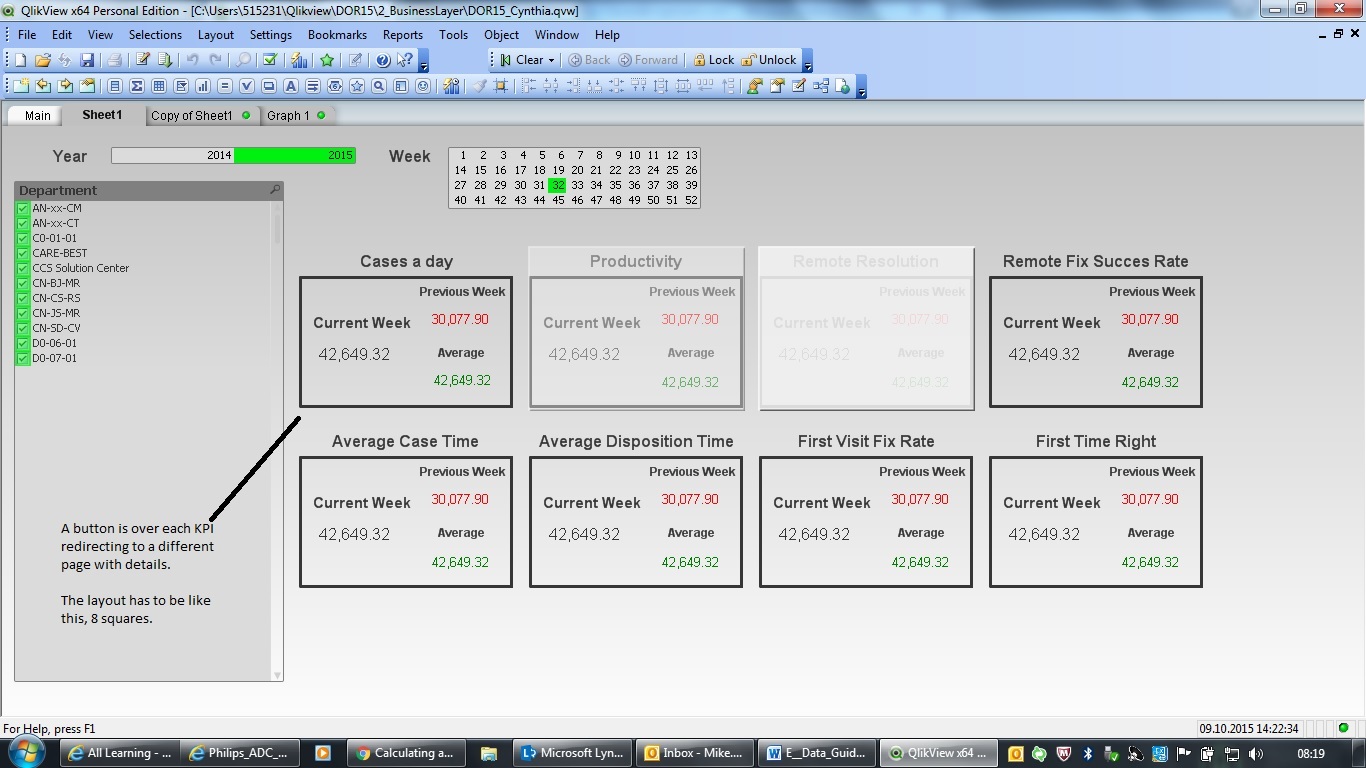
If you could tell me how to create this with a straight table it would be very much appreciated!
Kind regards,
Mike Cleven.
- Mark as New
- Bookmark
- Subscribe
- Mute
- Subscribe to RSS Feed
- Permalink
- Report Inappropriate Content
Hey Sunny, thank you,
I had to adjust it a tad to suit my real data set but now it does what i want perfectly.
- Mark as New
- Bookmark
- Subscribe
- Mute
- Subscribe to RSS Feed
- Permalink
- Report Inappropriate Content
I do have 1 question, can i somehow always show the average of ALL departments instead of just the ones i select? in my dataset i have over 50 departments.
I would like it to show the average of all departments at all times.
- Mark as New
- Bookmark
- Subscribe
- Mute
- Subscribe to RSS Feed
- Permalink
- Report Inappropriate Content
You just need to add {<Department = >} in your set analysis field to make sure any selection in Department doesn't change anything in your output. If you want this to now change based on any selection you can use {1}
So for the give example, use this:
=Num(Avg({1}Aggr(Sum({1}Calls), Department)), '#,##0.00') //for no impact on any selection or
=Num(Avg({<Department = >}Aggr(Sum({<Department = >}Calls), Department)), '#,##0.00') //for no impact on just Department Selection.
- Mark as New
- Bookmark
- Subscribe
- Mute
- Subscribe to RSS Feed
- Permalink
- Report Inappropriate Content
Hi Mike,
clearly, this dashboard doesn't show averages per department, as you initially asked for. Instead, you are showing the total average, even if you pre-aggregated it by department.
In this case, what you need is nested aggregation, and the formula suggested by Sunny is the right way to go (depending on what you need to do about user selections).
cheers,
Oleg Troyansky
- « Previous Replies
-
- 1
- 2
- Next Replies »