Unlock a world of possibilities! Login now and discover the exclusive benefits awaiting you.
- Qlik Community
- :
- All Forums
- :
- QlikView App Dev
- :
- Change grouping based on number of filter selectio...
- Subscribe to RSS Feed
- Mark Topic as New
- Mark Topic as Read
- Float this Topic for Current User
- Bookmark
- Subscribe
- Mute
- Printer Friendly Page
- Mark as New
- Bookmark
- Subscribe
- Mute
- Subscribe to RSS Feed
- Permalink
- Report Inappropriate Content
Change grouping based on number of filter selection
Hello,
I am new to Qlik and I got a requirement to make a particular chart dynamic where in it will show dimension A if only 1 value is selected and dimension B if multiple values are selected on a filter. Right now, I have it as a cyclic group that manually switches when user clicks on it really basic stuff. Wondering if there is a way to accomplish my requirement in Qlikview (hopefully nothing too complex).
Thank you!
Little bit more info, the filter will be a calendar filter wherein 1 date can have multiple records because of the timestamp. Basically if only one day is selected I want the chart to show the hours on that day (if possible from hour 0-23). And if multiple days are selected I want it to show the days on the chart.
- « Previous Replies
-
- 1
- 2
- Next Replies »
Accepted Solutions
- Mark as New
- Bookmark
- Subscribe
- Mute
- Subscribe to RSS Feed
- Permalink
- Report Inappropriate Content
Hi,
You can put a dimension with an if condition.
=if(GetSelectedCount(DimensionA)=1, DimensionA, DimensionB)
- Mark as New
- Bookmark
- Subscribe
- Mute
- Subscribe to RSS Feed
- Permalink
- Report Inappropriate Content
Hi,
You can put a dimension with an if condition.
=if(GetSelectedCount(DimensionA)=1, DimensionA, DimensionB)
- Mark as New
- Bookmark
- Subscribe
- Mute
- Subscribe to RSS Feed
- Permalink
- Report Inappropriate Content
Dear Roebrich,
Use Drilldown Group in the dimension ,
when you select one date from the filter, in the chart it will show you the hours ,
when you select more than one date from the filter ,in the chart it will show you those selected dates,
if you are looking for something else please do let me know.
Thanks,
Mukram.
- Mark as New
- Bookmark
- Subscribe
- Mute
- Subscribe to RSS Feed
- Permalink
- Report Inappropriate Content
"
when you select one date from the filter, in the chart it will show you the hours ,
when you select more than one date from the filter ,in the chart it will show you those selected dates
"
Yes that's what I want, I tried changing it to Drilldown group instead of cyclic and I don't think it meets what I want.
- Mark as New
- Bookmark
- Subscribe
- Mute
- Subscribe to RSS Feed
- Permalink
- Report Inappropriate Content
I tried this but I think I'm missing something. I put in my chart:
=if(GetSelectedCount(Date(opened_at))=1, Hour(opened_at), Date(opened_at))
But selecting 1 date on my calendar filter returns many records which is why the chart always shows the dates.
- Mark as New
- Bookmark
- Subscribe
- Mute
- Subscribe to RSS Feed
- Permalink
- Report Inappropriate Content
Try separating Date and Hour in two diferent fields
- Mark as New
- Bookmark
- Subscribe
- Mute
- Subscribe to RSS Feed
- Permalink
- Report Inappropriate Content
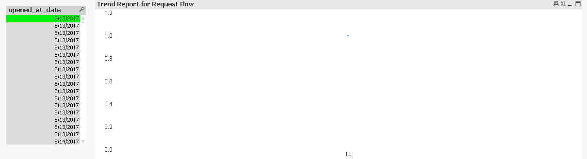
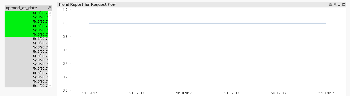
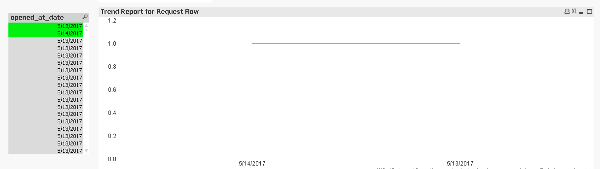
Hi I tried that by creating those in the script and called it "opened_at_date" and "opened_at_hour"
On the first image below, I select 1 value on the filter and it shows the hour as expected. On the second image, multiple values of the same date is selected and it shows the date. And the last, where multiple values of the different date are selected and it shows as expected.
The second screenshot represents the way it will be when I put the filter in a calendar object. wherein even if I select only 1 date, it treats it as multiple and shows the dates on the chart.
- Mark as New
- Bookmark
- Subscribe
- Mute
- Subscribe to RSS Feed
- Permalink
- Report Inappropriate Content
Dear ,
when i look at second image
opened_at_date is showing as duplicates because of the Timestamp
so what you have to do use the ceil or round function in the script then we will see unique dates in the opened_at_date field.
Else share with us sample data so that we can help you in better way,
Thanks,
Mukram,
- Mark as New
- Bookmark
- Subscribe
- Mute
- Subscribe to RSS Feed
- Permalink
- Report Inappropriate Content
I think we're getting there! Thank you so much! I implemented date(Ceil(opened_at)) and looks like the chart is following the condition now, I'm wondering though because it seems like I lost the 5/13/2017 date which I used in the screenshots.
- Mark as New
- Bookmark
- Subscribe
- Mute
- Subscribe to RSS Feed
- Permalink
- Report Inappropriate Content
Use Round function instead of ceil
- « Previous Replies
-
- 1
- 2
- Next Replies »