Unlock a world of possibilities! Login now and discover the exclusive benefits awaiting you.
- Qlik Community
- :
- All Forums
- :
- QlikView App Dev
- :
- Re: Change the axis
- Subscribe to RSS Feed
- Mark Topic as New
- Mark Topic as Read
- Float this Topic for Current User
- Bookmark
- Subscribe
- Mute
- Printer Friendly Page
- Mark as New
- Bookmark
- Subscribe
- Mute
- Subscribe to RSS Feed
- Permalink
- Report Inappropriate Content
Change the axis
Hai and good afternoon,
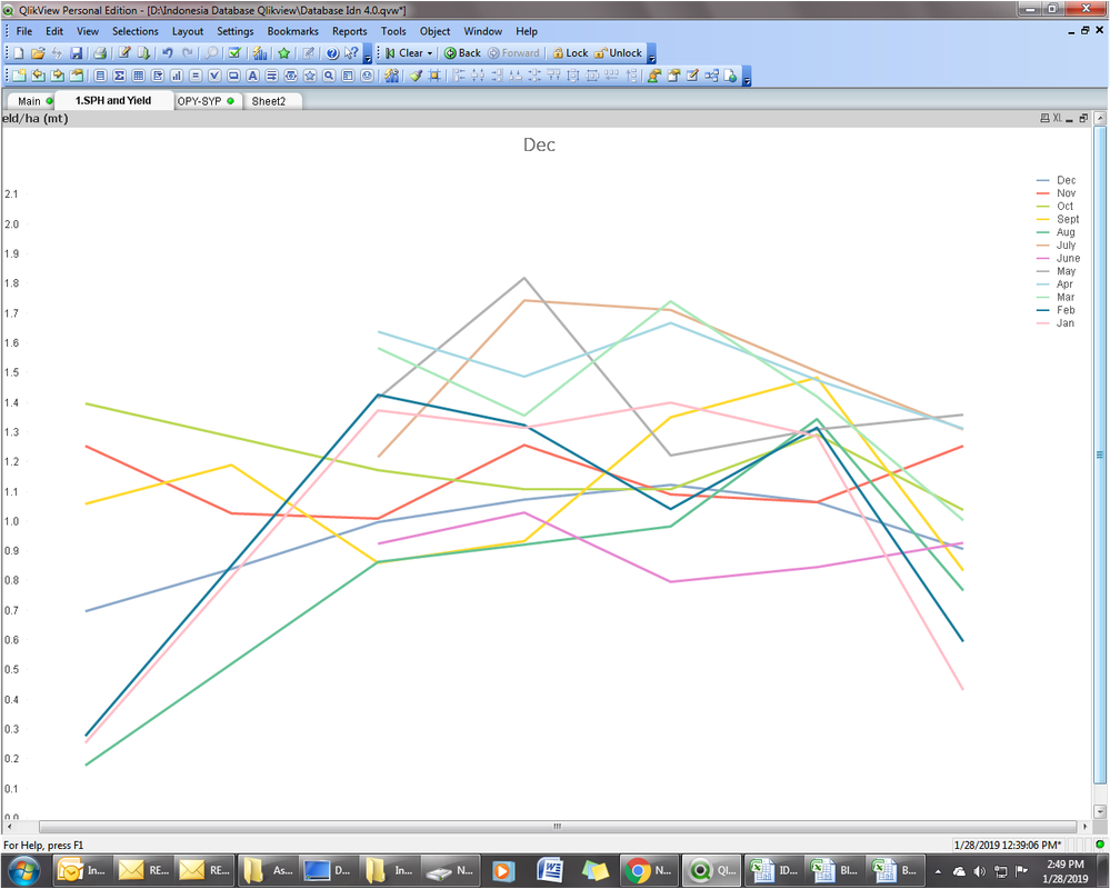
enclosed is the graph that i have.
how can i change my Y axis to X axis.
I wish to have month to X axis and Elements in Axis Y.
But the expression is the monthly yield per area basis
the graphs is Location Yield per area
Accepted Solutions
- Mark as New
- Bookmark
- Subscribe
- Mute
- Subscribe to RSS Feed
- Permalink
- Report Inappropriate Content
Well you may skip the group by and sum , but concatenate and as keyword are essential,like the attached
- Mark as New
- Bookmark
- Subscribe
- Mute
- Subscribe to RSS Feed
- Permalink
- Report Inappropriate Content
Hi,
I am not sure if this is the answer you are looking for, whatever you put up on Dimension Tab of a chart becomes your X Axis and the Expression your Y Axis , if you have added Month as Dimension in Dimension Tab you should already be seeing it on X: Axis, Please provide the sample qvw if you are looking for something in specific.
- Mark as New
- Bookmark
- Subscribe
- Mute
- Subscribe to RSS Feed
- Permalink
- Report Inappropriate Content
it didnt work
if in excel it will look like in the excel
my data compilation as attached
- Mark as New
- Bookmark
- Subscribe
- Mute
- Subscribe to RSS Feed
- Permalink
- Report Inappropriate Content
It can be done as per this solution.
- Mark as New
- Bookmark
- Subscribe
- Mute
- Subscribe to RSS Feed
- Permalink
- Report Inappropriate Content
- Mark as New
- Bookmark
- Subscribe
- Mute
- Subscribe to RSS Feed
- Permalink
- Report Inappropriate Content
i have open the file
is they other way that i can use just from the chart function and not the editting the script?
- Mark as New
- Bookmark
- Subscribe
- Mute
- Subscribe to RSS Feed
- Permalink
- Report Inappropriate Content
You could also try this method as its much cleaner than the previous solution provided
- Mark as New
- Bookmark
- Subscribe
- Mute
- Subscribe to RSS Feed
- Permalink
- Report Inappropriate Content
Well you may skip the group by and sum , but concatenate and as keyword are essential,like the attached
