Unlock a world of possibilities! Login now and discover the exclusive benefits awaiting you.
- Qlik Community
- :
- All Forums
- :
- QlikView App Dev
- :
- Changing color in bar chart and problem in scrolli...
- Subscribe to RSS Feed
- Mark Topic as New
- Mark Topic as Read
- Float this Topic for Current User
- Bookmark
- Subscribe
- Mute
- Printer Friendly Page
- Mark as New
- Bookmark
- Subscribe
- Mute
- Subscribe to RSS Feed
- Permalink
- Report Inappropriate Content
Changing color in bar chart and problem in scrolling bar
Hi Community !
I was able to create a two-axis bar chart with 2 dimensions ((week number and service type). The expression is sum of cost.
Now I am facing two issues. I checked community pages, but could not come across yet to my solution...
1. Is there anyway to change the color of the bars in the chart, depending on the service type ? Any chance for automatic
coloring ? At the moment week numbers are shown as dimension 1 and service type is dimension 2.
All service types are shown with blue color by default. I have seen "multicolored" option in "Color" tab of the chart properties,
but for my chart it is dimmed. There are so many service types in my chart, it would not be feasible to define color to
each of them manually...Still if this is the only solution, I wonder how to do it...
2. Even I enable "X-axis scrollbar" for dimension 1, nothing happens. For dimension 2 it is shown as dimmed again.
I wonder if this is also because of having two-axis ? I need this scrolling property to be able to see the rest of the chart.
Are there anyways to solve these ?
Thank You very much !
Zeynep
- Tags:
- new_to_qlikview
Accepted Solutions
- Mark as New
- Bookmark
- Subscribe
- Mute
- Subscribe to RSS Feed
- Permalink
- Report Inappropriate Content
Hi Zeynep,
Maybe it had something to do with not enough items for the scrollbar to appear (less than 15) 🙂
The scrollbar only appears if necessary.
Grtz Fred
- Mark as New
- Bookmark
- Subscribe
- Mute
- Subscribe to RSS Feed
- Permalink
- Report Inappropriate Content
try this,
from expression tab---explore ur expression(click on + )--write ur if statement accordingly service type u can apply different colours
ex:if(servicetype=1,rgg(255,245,200),
if(servicetype=2.rgb()..etc)
- Mark as New
- Bookmark
- Subscribe
- Mute
- Subscribe to RSS Feed
- Permalink
- Report Inappropriate Content
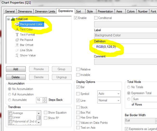
Hi Zeynep,
1
a. If you'd like to change it as a single color,
you can use the Background color in the expression, see image
b. You could add an extra dimension to all of your service levels
and assign a color to each service level (group), like:
=
if(servicegroup=1, RGB(255,0,0),
if(servicegroup=2, RGB(255,0,200),
if(servicegroup=3, RGB(0,128,0),
RGB(200,200,200)
)))
2. To enable your scollbar, change 'When number exceeds..' to a value > 10.
Just make sure it's not 10 (don't ask..)
Grtz Fred
- Mark as New
- Bookmark
- Subscribe
- Mute
- Subscribe to RSS Feed
- Permalink
- Report Inappropriate Content
Hi Shiva and Fred !
I am afraid I am looking for more automatized way of assigning colors, as I have over 130 service types...I can recycle perhaps some of the colors, but it is not easy...I am only showing the service types which are used in the chart and usage does not have a pattern that I know yet.
For the scroll bar, I have tried Fred's hint, but making >10 erases actually all the bars. It showed nothing. I wonder why...
Thanks !!
Zeynep
- Mark as New
- Bookmark
- Subscribe
- Mute
- Subscribe to RSS Feed
- Permalink
- Report Inappropriate Content
Hi Zeynep,
With > 10 in the scrollbar, I meant changing it to 11 or 20 or whatever 😉
- Mark as New
- Bookmark
- Subscribe
- Mute
- Subscribe to RSS Feed
- Permalink
- Report Inappropriate Content
Hi Fred !
 I had tried it already, with 15, but it did not react then unfortunately...
But do you know what, I now set to 3 and ......scroll bar is there now !!! Nice and weird. I think it has to do something with 2-axis....
Thanks a lot !!!
Zeynep
- Mark as New
- Bookmark
- Subscribe
- Mute
- Subscribe to RSS Feed
- Permalink
- Report Inappropriate Content
Hi Zeynep,
Maybe it had something to do with not enough items for the scrollbar to appear (less than 15) 🙂
The scrollbar only appears if necessary.
Grtz Fred
- Mark as New
- Bookmark
- Subscribe
- Mute
- Subscribe to RSS Feed
- Permalink
- Report Inappropriate Content
Yes, exactly, I just realized it did so, because I have -in fact- 8 weeks data (which I converted from days format). So even though, it is harshly populated with hundreds of service types per week (dimension 2), scroll bar sees only the number of weeks, so dimension 1. Of course. A good a-ha moment ....
- Zeynep
- Mark as New
- Bookmark
- Subscribe
- Mute
- Subscribe to RSS Feed
- Permalink
- Report Inappropriate Content
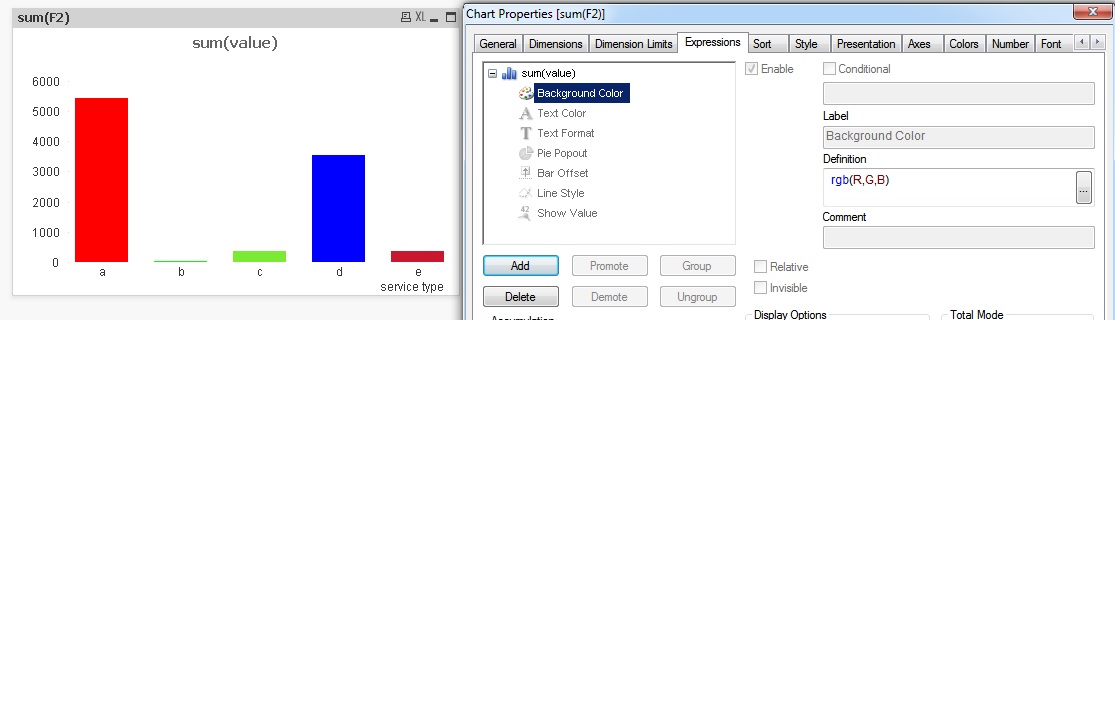
1.Assign a RGB (color) for each service type in the script by creating three fields for R ,G B with values 0 to 255 in each.
2. then use pass these fields in the expression (rgb(R,G,B))
LOAD
* INLINE
[
service type, value, R, G, B
a, 5434, 255, 0, 0
b, 35, 0, 255, 0
c, 353, 123, 234, 50
d, 3535, 0, 0, 255
e, 353, 201, 23, 45
]
;