Unlock a world of possibilities! Login now and discover the exclusive benefits awaiting you.
- Qlik Community
- :
- All Forums
- :
- QlikView App Dev
- :
- Re: Chart Formatting
Options
- Subscribe to RSS Feed
- Mark Topic as New
- Mark Topic as Read
- Float this Topic for Current User
- Bookmark
- Subscribe
- Mute
- Printer Friendly Page
Turn on suggestions
Auto-suggest helps you quickly narrow down your search results by suggesting possible matches as you type.
Showing results for
Anonymous
Not applicable
2017-02-06
08:42 AM
- Mark as New
- Bookmark
- Subscribe
- Mute
- Subscribe to RSS Feed
- Permalink
- Report Inappropriate Content
Chart Formatting
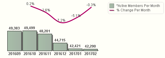
I have the below chart. I was asked if I could change the formatting of the % Change Per Month apperance. The decreased and increases are not visually accrutately represented. Essentially, is it possible to straighten out the line so the increased and decreases are not as dramatic? I have attached a sample of the screenshot below. Any suggestions would help.

496 Views
1 Solution
Accepted Solutions
Anonymous
Not applicable
2017-02-06
08:55 AM
Author
- Mark as New
- Bookmark
- Subscribe
- Mute
- Subscribe to RSS Feed
- Permalink
- Report Inappropriate Content
I was able to adjust the axis scale under under axes. See below for change and above question for original state.

422 Views
2 Replies
Champion III
2017-02-06
08:49 AM
- Mark as New
- Bookmark
- Subscribe
- Mute
- Subscribe to RSS Feed
- Permalink
- Report Inappropriate Content
did you know that Split Axis is checked for your chart?
Vineeth Pujari
If a post helps to resolve your issue, please accept it as a Solution.
If a post helps to resolve your issue, please accept it as a Solution.
422 Views
Anonymous
Not applicable
2017-02-06
08:55 AM
Author
- Mark as New
- Bookmark
- Subscribe
- Mute
- Subscribe to RSS Feed
- Permalink
- Report Inappropriate Content
I was able to adjust the axis scale under under axes. See below for change and above question for original state.

423 Views