Unlock a world of possibilities! Login now and discover the exclusive benefits awaiting you.
- Qlik Community
- :
- All Forums
- :
- QlikView App Dev
- :
- Re: Chart with Week over Week Data
- Subscribe to RSS Feed
- Mark Topic as New
- Mark Topic as Read
- Float this Topic for Current User
- Bookmark
- Subscribe
- Mute
- Printer Friendly Page
- Mark as New
- Bookmark
- Subscribe
- Mute
- Subscribe to RSS Feed
- Permalink
- Report Inappropriate Content
Chart with Week over Week Data
Hi,
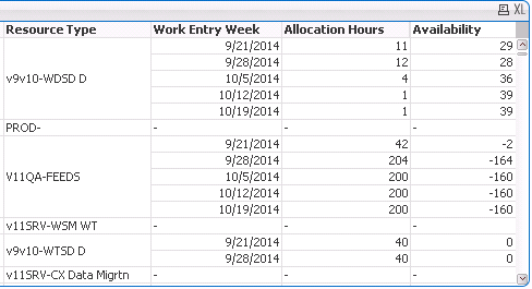
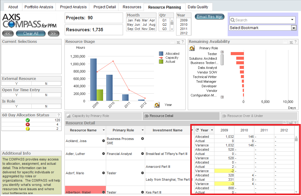
I'm looking to create a pivot table that has week over week allocation data for resources. I've been able to get this data into QlikView no problem (see screenshot 1) but am unhappy with the format. I would like to have the weeks along the top (see screenshot 2).
I found an example of this in a QlikView demo (screenshot 2) but have been unable to reverse engineer this. Would anyone be able to shed some light as to how to go from screenshot 1 to screenshot 2?
Accepted Solutions
- Mark as New
- Bookmark
- Subscribe
- Mute
- Subscribe to RSS Feed
- Permalink
- Report Inappropriate Content
You need to use a pivot-chart and could then drag the week-column on the right top - by dragging appeared a blue line. Sometimes you need more then one attempt.
- Marcus
- Mark as New
- Bookmark
- Subscribe
- Mute
- Subscribe to RSS Feed
- Permalink
- Report Inappropriate Content
You need to use a pivot-chart and could then drag the week-column on the right top - by dragging appeared a blue line. Sometimes you need more then one attempt.
- Marcus
- Mark as New
- Bookmark
- Subscribe
- Mute
- Subscribe to RSS Feed
- Permalink
- Report Inappropriate Content
Well that was a lot easier than expected, thanks Marcus!
Any idea as to how they managed to get allocated AND actual into the pivot table as is seen in the screenshot? Guessing it has to do with a group but I'm having trouble figuring that out as well.
- Mark as New
- Bookmark
- Subscribe
- Mute
- Subscribe to RSS Feed
- Permalink
- Report Inappropriate Content
You could set totals for each dimension - top left within the tab presentation from chart.
- Marcus