Unlock a world of possibilities! Login now and discover the exclusive benefits awaiting you.
- Qlik Community
- :
- All Forums
- :
- QlikView App Dev
- :
- Re: Charts based on selection
- Subscribe to RSS Feed
- Mark Topic as New
- Mark Topic as Read
- Float this Topic for Current User
- Bookmark
- Subscribe
- Mute
- Printer Friendly Page
- Mark as New
- Bookmark
- Subscribe
- Mute
- Subscribe to RSS Feed
- Permalink
- Report Inappropriate Content
Charts based on selection
Hi I have a list box which links to a chart what I am trying to go is create a chart per selection.
For example if I selected 5 airports I want to see the number of flights per month in 5 individuals graphs
Thanks
Simon
Accepted Solutions
- Mark as New
- Bookmark
- Subscribe
- Mute
- Subscribe to RSS Feed
- Permalink
- Report Inappropriate Content
I'd explore the Trellis chart option. If you use Airport as your Trellis dimension, then you will see as many charts as the number of selected Airports.
Otherwise, you'd have to create a fixed number of identical charts and use Show Conditions to determine what charts should be visible, based on the Airports selection.
cheers,
Oleg Troyansky
Upgrade your Qlik skills at the Masters Summit for Qlik - coming soon to Milan, Italy and Austin, TX!
- Mark as New
- Bookmark
- Subscribe
- Mute
- Subscribe to RSS Feed
- Permalink
- Report Inappropriate Content
That's great thanks
any ideas how I make the charts bigger. I have made the chart window bigger but the charts have not changed size 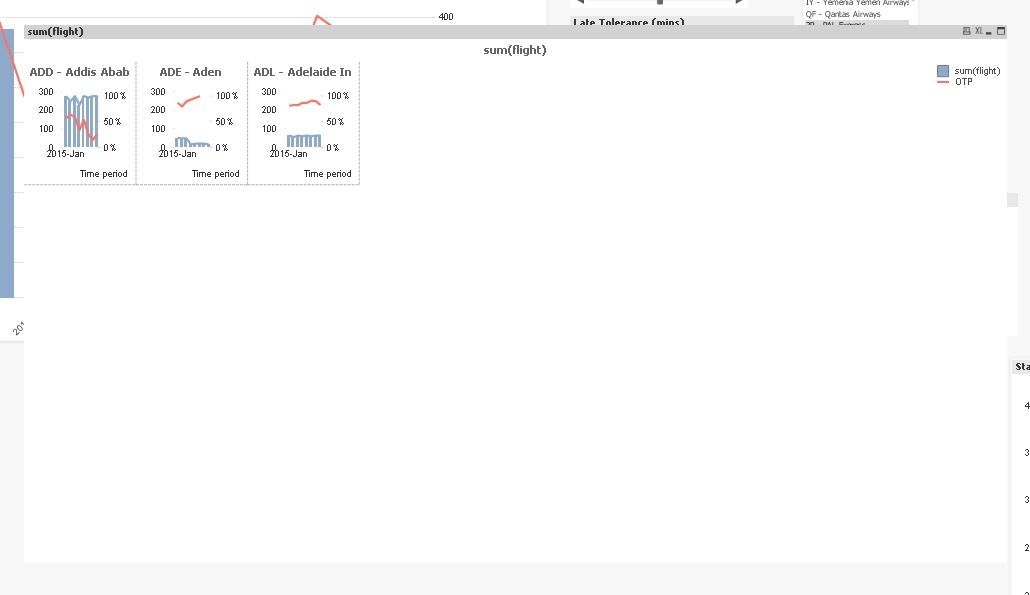
- Mark as New
- Bookmark
- Subscribe
- Mute
- Subscribe to RSS Feed
- Permalink
- Report Inappropriate Content
cracked it I changed the row and column setting on the trellis chart properties 
- Mark as New
- Bookmark
- Subscribe
- Mute
- Subscribe to RSS Feed
- Permalink
- Report Inappropriate Content
If your problem is now solved, please flag the Correct Answer.
If not, please tell us what part of your question you still need help with  .
.