Unlock a world of possibilities! Login now and discover the exclusive benefits awaiting you.
- Qlik Community
- :
- All Forums
- :
- QlikView App Dev
- :
- Re: Charts for counts based on dates
- Subscribe to RSS Feed
- Mark Topic as New
- Mark Topic as Read
- Float this Topic for Current User
- Bookmark
- Subscribe
- Mute
- Printer Friendly Page
- Mark as New
- Bookmark
- Subscribe
- Mute
- Subscribe to RSS Feed
- Permalink
- Report Inappropriate Content
Charts for counts based on dates
Hello guys,
I am pretty new to Qlikview.I need to design a chart in qlikview.In my current report I am showing table box which shows all the table content.Now I have to show a chart with it.
In my scenario ,my table has 2 two columns, one has date and other has some repeated values.Now I have to calculate the counts of repeated values based on month appears in date column.
for eg:
Date Values
01/01/2014 a
24/01/2014 b
01/01/2013 a
24/12/2013 b
01/01/2014 a
24/02/2014 b
now counts are::
a counts --
for jan13-1
for jan14-2
b counts--
for dec 13-1
for jan14-1
for feb14-1
What chart can I use for this scenario and please suggest me expression for it.
Thanks in advance.
- Tags:
- new_to_qlikview
Accepted Solutions
- Mark as New
- Bookmark
- Subscribe
- Mute
- Subscribe to RSS Feed
- Permalink
- Report Inappropriate Content
Hi Tushar,
see attached example.
I used two types of charts for better understanding: Straight Tables and Pivot Tables.
All kind of charts (table, bar, radar, ...) have two main topics:
-- dimensions (like Year, Month, ...., Customer, region...)
-- expressions (like sum(Amount), Count(Parts), ....
These can be modified via chart properties --> dimension tab and/or expression tab.
HtH
Roland
Note:
Changed date fromat into german.
- Mark as New
- Bookmark
- Subscribe
- Mute
- Subscribe to RSS Feed
- Permalink
- Report Inappropriate Content
Hi,
use for dimension the month as a calculated dimension or add a new field month in your table in the script
expression is count(values) according to the dimension you choose.
any graph like bar, straight, pivot, lines can fit your needs
best regards
christian
- Mark as New
- Bookmark
- Subscribe
- Mute
- Subscribe to RSS Feed
- Permalink
- Report Inappropriate Content
Hi Tushar,
see attached example.
I used two types of charts for better understanding: Straight Tables and Pivot Tables.
All kind of charts (table, bar, radar, ...) have two main topics:
-- dimensions (like Year, Month, ...., Customer, region...)
-- expressions (like sum(Amount), Count(Parts), ....
These can be modified via chart properties --> dimension tab and/or expression tab.
HtH
Roland
Note:
Changed date fromat into german.
- Mark as New
- Bookmark
- Subscribe
- Mute
- Subscribe to RSS Feed
- Permalink
- Report Inappropriate Content
thanks for reply.I have use the expression you suggested but we have to find out the counts for a and b differently.The expression you suggested didnt counts for a and b differently,it just show total counts.
I am using month(date) in calculated dimension and count(values) in dimension.
- Mark as New
- Bookmark
- Subscribe
- Mute
- Subscribe to RSS Feed
- Permalink
- Report Inappropriate Content
thanks Roland,this is perfect
- Mark as New
- Bookmark
- Subscribe
- Mute
- Subscribe to RSS Feed
- Permalink
- Report Inappropriate Content
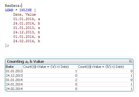
Hi Tushar,
I took your sample data and created a pivot table counting the a's and b's per date.
See the picture below. Hope this is what you wanted to achieve.