Unlock a world of possibilities! Login now and discover the exclusive benefits awaiting you.
- Qlik Community
- :
- All Forums
- :
- QlikView App Dev
- :
- Combo chart values on data points colors?
- Subscribe to RSS Feed
- Mark Topic as New
- Mark Topic as Read
- Float this Topic for Current User
- Bookmark
- Subscribe
- Mute
- Printer Friendly Page
- Mark as New
- Bookmark
- Subscribe
- Mute
- Subscribe to RSS Feed
- Permalink
- Report Inappropriate Content
Combo chart values on data points colors?
Hi All,
I am facing an issue on adjusting data points in combo chat,
the required output of the chart should be like
but our chart output is appearing like below shown.
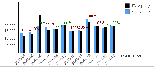
How to move values on data points on top of each combo bar as shown in first pic, for example in third bar(70%) is in incorrect position. For the values on data points i am using third expression and keeping that bar expression as invisible.
Thanks,
Ganesh
- « Previous Replies
-
- 1
- 2
- Next Replies »
- Mark as New
- Bookmark
- Subscribe
- Mute
- Subscribe to RSS Feed
- Permalink
- Report Inappropriate Content
Thanks Sunny for asking this,
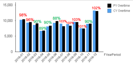
PFA sample work file. Actually my aim is to adjust all colored value points to the top of each bar.
you can see, as of now there is no uniformity on placing those values.
- Mark as New
- Bookmark
- Subscribe
- Mute
- Subscribe to RSS Feed
- Permalink
- Report Inappropriate Content
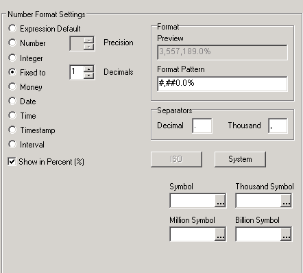
Hi
In actual app by using below shown options we are calculating % expression values,
- Mark as New
- Bookmark
- Subscribe
- Mute
- Subscribe to RSS Feed
- Permalink
- Report Inappropriate Content
Expression is [CY Value]/[PYValue]
Thanks
- Mark as New
- Bookmark
- Subscribe
- Mute
- Subscribe to RSS Feed
- Permalink
- Report Inappropriate Content
Hi Sunny,
Any luck on adjusting all colored value points to the top of each bar.
- Mark as New
- Bookmark
- Subscribe
- Mute
- Subscribe to RSS Feed
- Permalink
- Report Inappropriate Content
From this, What are you expecting to show the Data points?
- Mark as New
- Bookmark
- Subscribe
- Mute
- Subscribe to RSS Feed
- Permalink
- Report Inappropriate Content
No man.... not able to get it done...
- « Previous Replies
-
- 1
- 2
- Next Replies »