Unlock a world of possibilities! Login now and discover the exclusive benefits awaiting you.
- Qlik Community
- :
- All Forums
- :
- QlikView App Dev
- :
- Re: Re: Re: Compare Dimension Selection vs All val...
- Subscribe to RSS Feed
- Mark Topic as New
- Mark Topic as Read
- Float this Topic for Current User
- Bookmark
- Subscribe
- Mute
- Printer Friendly Page
- Mark as New
- Bookmark
- Subscribe
- Mute
- Subscribe to RSS Feed
- Permalink
- Report Inappropriate Content
Compare Dimension Selection vs All values in dimension on two lines
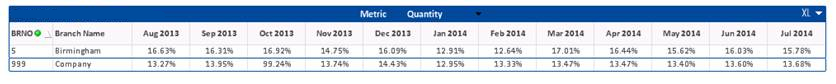
I want to be able to show the a comparative table of a single branch/site vs the same expression across whole the dataset.
I've achieved this by overlapping two straight tables but I wanted to know if there is a better way of doing this within a single table/chart by being clever with a calculated dimension or something similar?
All help appreciated
Richard
- Tags:
- dimension
Accepted Solutions
- Mark as New
- Bookmark
- Subscribe
- Mute
- Subscribe to RSS Feed
- Permalink
- Report Inappropriate Content
This should give you the right result by creating a valuelist and allowing a different expression to calculate per value in the dimension.
It's not the cleanest way to do it though, if I had a bit more time I would do it properly using a Pick/Match instead.
Maybe check out Value Loop and Input Boxes - Create Bar Chart
that thread to give you a steer on that solution
(sorry pressed for time today, I'm sure someone else will post up the better way in due course)
hope that help
Joe
- Mark as New
- Bookmark
- Subscribe
- Mute
- Subscribe to RSS Feed
- Permalink
- Report Inappropriate Content
Hi Richard,
not sure I follow exactly what you are after but sounds like set analysis will be your answer. Have a look at the below links and that should give you a good steer
Set Analysis: syntaxes, examples
Failing that post up a working example with a bit more detail
Hope that helps
Joe
- Mark as New
- Bookmark
- Subscribe
- Mute
- Subscribe to RSS Feed
- Permalink
- Report Inappropriate Content
I've generated an example file which I hope better illustrates what I'm trying to achieve (yes I'm inarticulate!  )
)
- Mark as New
- Bookmark
- Subscribe
- Mute
- Subscribe to RSS Feed
- Permalink
- Report Inappropriate Content
Ah I see,use
Sum({<Dim1=>}Total Expression1)
As your second expression then
The set there will basically remove your Dim1 selection and give you the total of Expression1 (your 24012)
If you wanted to show the 24012 regardless of any selection made, you would use Sum({1}Total Expression1) instead
hope that helps
Joe
Edit: ignore that sorry I read it wrong, so you basically want the 24012 in the same column, when you have B in Dim1 selected?
- Mark as New
- Bookmark
- Subscribe
- Mute
- Subscribe to RSS Feed
- Permalink
- Report Inappropriate Content
That absolutely the right value - it's just by doing it as a separate expression I'm getting additional columns whereas what I'm am looking to achieve is a separate row containing the "Sum({<Dim1=>}Total Expression1)" value so I can compare the selection vs the total.
Any ideas?
- Mark as New
- Bookmark
- Subscribe
- Mute
- Subscribe to RSS Feed
- Permalink
- Report Inappropriate Content
This should give you the right result by creating a valuelist and allowing a different expression to calculate per value in the dimension.
It's not the cleanest way to do it though, if I had a bit more time I would do it properly using a Pick/Match instead.
Maybe check out Value Loop and Input Boxes - Create Bar Chart
that thread to give you a steer on that solution
(sorry pressed for time today, I'm sure someone else will post up the better way in due course)
hope that help
Joe
- Mark as New
- Bookmark
- Subscribe
- Mute
- Subscribe to RSS Feed
- Permalink
- Report Inappropriate Content
It works for the example given and I appreciate your time.
Now I need to get my head around solution and apply it to the more complicated live data!
Thanks Joe
- Mark as New
- Bookmark
- Subscribe
- Mute
- Subscribe to RSS Feed
- Permalink
- Report Inappropriate Content
No problem, glad to be of help, like I say it's not the best solution and if you have a large data set it will cause you problems with performance.
Hopefully it gives you a decent idea and the thread should help too with the pick/match option.
I'll try to find some time to knock that example up too