Unlock a world of possibilities! Login now and discover the exclusive benefits awaiting you.
- Qlik Community
- :
- All Forums
- :
- QlikView App Dev
- :
- Count problems
- Subscribe to RSS Feed
- Mark Topic as New
- Mark Topic as Read
- Float this Topic for Current User
- Bookmark
- Subscribe
- Mute
- Printer Friendly Page
- Mark as New
- Bookmark
- Subscribe
- Mute
- Subscribe to RSS Feed
- Permalink
- Report Inappropriate Content
Count problems
Hello everybody!
Need you help.
I have table KPI, where I made some Fact and Plan calculations and also wrote simple if expression
if (Fact>=Plan, ‘yes’, ’no’) .
I got ‘yes’ and ‘no’ KPI-es of every id with the fixations at a certain time. That works correct.
The problem is in counting ID-s with ‘yes’ and ‘no’ in chart. How to count in chart diagram values from straight table? I used variables, but this approach also work incorrect.
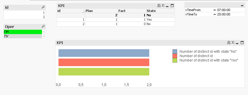
The result chart should look like this:
Id | Plan | Fact | State |
1 | 1 | 1 | yes |
2 | 1 | 0 | no |
If there are any ideas how to do that?
Look forward to you reply
Thanks
- Mark as New
- Bookmark
- Subscribe
- Mute
- Subscribe to RSS Feed
- Permalink
- Report Inappropriate Content
Use below three expressions
=SUM(Aggr(IF(sum({<Times={">$(vTimeFrom) <$(vTimeTo)"}>}Fact_fiks)>=sum(Plan_fiks_day),1,0),id))
=COUNT(DISTINCT id)
=SUM(Aggr(IF(sum({<Times={">$(vTimeFrom) <$(vTimeTo)"}>}Fact_fiks)<sum(Plan_fiks_day),1,0),id))
- Mark as New
- Bookmark
- Subscribe
- Mute
- Subscribe to RSS Feed
- Permalink
- Report Inappropriate Content
1.Define the field State here as the first expr and rename it as State_Calc
2.No of distinct Id:
the Expr is : Count(Distinct id)
3.No of Distinc id with state No:
count({<State_Calc={'No'}>}Distinct id)
4.No of Distinc id with state Yes:
count({<State_Calc={'yes'}>}Distinct id)
Hope this helps u
- Mark as New
- Bookmark
- Subscribe
- Mute
- Subscribe to RSS Feed
- Permalink
- Report Inappropriate Content
Thank you, it works good! But what if not use binary(1,0) values in sum expression, for example instead of two States "yes" and "no", if I have other several states? In this case, how to count id-s whith other states?
- Mark as New
- Bookmark
- Subscribe
- Mute
- Subscribe to RSS Feed
- Permalink
- Report Inappropriate Content
Thanks for your reply, it seems that such approach work as mine, not correctly... the fact is that States are dynamically changed according to time ranges. Counts work correctly in stright table, but in chart they dont't
- Mark as New
- Bookmark
- Subscribe
- Mute
- Subscribe to RSS Feed
- Permalink
- Report Inappropriate Content
Provide example please...!
- Mark as New
- Bookmark
- Subscribe
- Mute
- Subscribe to RSS Feed
- Permalink
- Report Inappropriate Content
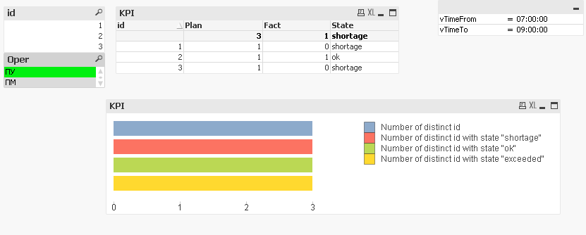
For example, i created 3 kpi states: ok, shortage, exceeded
According to the KPI table , there are should be 2 id with state 'shortage', 1 id with 'ok' and no one id with 'exceeded' states in Diagramm.
Also qvd file is attached.