Unlock a world of possibilities! Login now and discover the exclusive benefits awaiting you.
- Qlik Community
- :
- All Forums
- :
- QlikView App Dev
- :
- Re: Counting relative values
- Subscribe to RSS Feed
- Mark Topic as New
- Mark Topic as Read
- Float this Topic for Current User
- Bookmark
- Subscribe
- Mute
- Printer Friendly Page
- Mark as New
- Bookmark
- Subscribe
- Mute
- Subscribe to RSS Feed
- Permalink
- Report Inappropriate Content
Counting relative values
Hello everyone,
I am working in a chart where i need to count the porcentage of people of a field that measure the avarage of knowlodge of the employees.
The total of people are 202, and they are divided in 3 Departments:
Department A: 25
Department B: 105
Department C: 72
There is the expression of the bar chart:
count ([Avg of Knowledge])
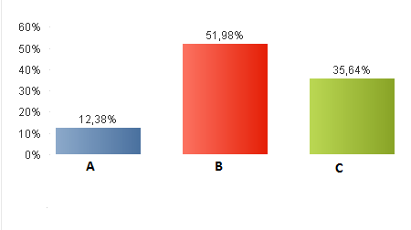
And the chart displays the correct value when no filters are applied:

The user required to create a filter where it is possible to view each value of the volume (in percentage), so i have created the list below, using the field [Avg of Knowledge]:
So, for instance, the user selected all values under 80% to see how many people (in percentage) are under 80%:
After cheking my database, I have the following situation:
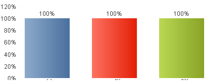
- The department A has 25 employees, and 25 are under 80%, so the chart should display 100%;
- The department B has 105 employess, and 98 are under 80%, so the chart should display 93%;
- The department C has 72 employees, and 70 are under 80%, so the chart should display 97%;
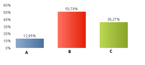
But the chart did not displayed to correct values from each department, as you can see below:

I am setting the Relative option on this chart.
Anyone could help to solve this problem?
Thanks
- « Previous Replies
-
- 1
- 2
- Next Replies »
Accepted Solutions
- Mark as New
- Bookmark
- Subscribe
- Mute
- Subscribe to RSS Feed
- Permalink
- Report Inappropriate Content
Please check the attached:
Without Selection
With Selection:
Expression:
=If(GetSelectedCount(Flag) > 0, Count([Avg of Knowledge]) / Count({1}[Avg of Knowledge]), Count([Avg of Knowledge]) / Count(TOTAL [Avg of Knowledge]))
- Mark as New
- Bookmark
- Subscribe
- Mute
- Subscribe to RSS Feed
- Permalink
- Report Inappropriate Content
Try disabling the relative option and calculate your percentage like
=Count([Avg of knowlegde]) / Count({1} [Avg of knowledge])
- Mark as New
- Bookmark
- Subscribe
- Mute
- Subscribe to RSS Feed
- Permalink
- Report Inappropriate Content
Hi Swuehl,
Your solution worked, but when i clean the filters, the 3 departments display 100%:

Why?
- Mark as New
- Bookmark
- Subscribe
- Mute
- Subscribe to RSS Feed
- Permalink
- Report Inappropriate Content
Clearing a selection in a list box, so that all values are shown white, is equivalent to all values possible.
Hence in this scenario, the calculation is equivalent to having all list box items selected.
Count of all records divided by the count of all records equals 100%.
What do you want to see instead? 0%
=If(GetSelectedCount([Avg of knowlegde])>0,
Count([Avg of knowlegde]) / Count({1} [Avg of knowledge]),
0)
- Mark as New
- Bookmark
- Subscribe
- Mute
- Subscribe to RSS Feed
- Permalink
- Report Inappropriate Content
May be this?
=If(GetSelectedCount([Avg of knowlegde]) > 0,
Count([Avg of knowlegde]) / Count({1} [Avg of knowledge]), Count([Avg of knowlegde]) / Count(TOTAL [Avg of knowledge]))
- Mark as New
- Bookmark
- Subscribe
- Mute
- Subscribe to RSS Feed
- Permalink
- Report Inappropriate Content
Right, that should display the chart as shown in the OP (which I already forgot after my first reply).
But to me, it's kind of confusing that the same chart shows different measures depending on selection (personal opinion, you can do what you want).
- Mark as New
- Bookmark
- Subscribe
- Mute
- Subscribe to RSS Feed
- Permalink
- Report Inappropriate Content
I agree, I wouldn't want to see a chart which shows something with selection and something else without selection. But I thought that he might be looking for getting the original chart when nothing is selected.
- Mark as New
- Bookmark
- Subscribe
- Mute
- Subscribe to RSS Feed
- Permalink
- Report Inappropriate Content
Sorry, Sunny, I was replying to your post, but adressing more the OP, or maybe talking to myself...
Your solution is a correct solution to the requirement, I believe.
- Mark as New
- Bookmark
- Subscribe
- Mute
- Subscribe to RSS Feed
- Permalink
- Report Inappropriate Content
No apologizes needed Stefan. We still don't know if this is what is required or not. But my comment was to agree with what you mentioned above ![]() . I don't see the logic behind what I proposed, but proposed it anyway
. I don't see the logic behind what I proposed, but proposed it anyway ![]()
- Mark as New
- Bookmark
- Subscribe
- Mute
- Subscribe to RSS Feed
- Permalink
- Report Inappropriate Content
Hi guys, thanks for your answers.
Clearing the filters, i was expecting no selection from any filter. so the calculation it was suposed to be equivalent to having any list box items selected.
So, the expected result was the count of all possible values from each department:
When i used the expression suggested by Sunny, the chart displayed the correct values when the filter is cleared, but after applying the filter, the calculation was incorrect, it returned the following result:
Expression:
=If(GetSelectedCount([Avg of knowlegde]) > 0,
Count([Avg of knowlegde]) / Count({1} [Avg of knowledge]), Count([Avg of knowlegde]) / Count(TOTAL [Avg of knowledge]))
Thanks
- « Previous Replies
-
- 1
- 2
- Next Replies »