Unlock a world of possibilities! Login now and discover the exclusive benefits awaiting you.
- Qlik Community
- :
- All Forums
- :
- QlikView App Dev
- :
- Re: Creating a histogram using data spanning two t...
- Subscribe to RSS Feed
- Mark Topic as New
- Mark Topic as Read
- Float this Topic for Current User
- Bookmark
- Subscribe
- Mute
- Printer Friendly Page
- Mark as New
- Bookmark
- Subscribe
- Mute
- Subscribe to RSS Feed
- Permalink
- Report Inappropriate Content
Creating a histogram using data spanning two tables
Hello community!
Background:
I have two data tables, one showing value of payments over time by individuals split by types of payment, the second showing account status for each individual by year:
Table 1: payments over time
| Individual ID | Tax Year Ended | Payment type | Payment amount |
| 1 | 2010 | Voluntary | 0 |
| 1 | 2010 | Scheduled | 0 |
| 1 | 2011 | Voluntary | 5 |
| 1 | 2011 | Scheduled | 15 |
| 1 | 2012 | Voluntary | 15 |
| 1 | 2012 | Scheduled | 5 |
| 2 | 2010 | Voluntary | 4 |
| 2 | 2010 | Scheduled | 10 |
| 2 | 2011 | Voluntary | 10 |
| 2 | 2011 | Scheduled | 15 |
| 2 | 2012 | Voluntary | 0 |
| 2 | 2012 | Scheduled | 6 |
Table 2: account status over time
| Individual ID | Tax Year Ended | Is Account Active |
| 1 | 2010 | 0 |
| 1 | 2011 | 1 |
| 1 | 2012 | 1 |
| 2 | 2010 | 1 |
| 2 | 2011 | 1 |
| 2 | 2012 | 1 |
I would like to create a histogram showing the number of active accounts split between £10 total payment bands in each year. Once I've cracked this, I'd then like to be able to filter between Voluntary and Scheduled payments.
My current syntax is as follows:
Dimension1: = class(sum(Payment Amount), 10) //intended to create £10 total payment bandings.
Dimension2: [Tax Year Ended]
Expression: Sum(Is Account Active) //Adds the number of active accounts for the combination of payment amount and year
The above results in the X axist of my chart reading as "//Error in calculated dimension".
I'm quite new to Qlikview but have tried a whole range of approaches to cracking this without any success. Maybe it needs a completely different approach. I'd really appreciate it if somebody out there could help me. If possible I'd like to solve this without having to change the structure of my input data.
Thanks in advance
John
Accepted Solutions
- Mark as New
- Bookmark
- Subscribe
- Mute
- Subscribe to RSS Feed
- Permalink
- Report Inappropriate Content
Mistake was on your field name. QlikView is case sensitive.You dont have any field Called "amount" it is "Amount".
This was causing the issue. Find the corrected expression below.
=CLASS(AGGR(Sum ([Amount]),[Tax Year Ended]),[Repayment Bandings])
Have a look at the attched application.
Hope this helps you.
-Sridhar
- Mark as New
- Bookmark
- Subscribe
- Mute
- Subscribe to RSS Feed
- Permalink
- Report Inappropriate Content
can you attach sample file.
- Mark as New
- Bookmark
- Subscribe
- Mute
- Subscribe to RSS Feed
- Permalink
- Report Inappropriate Content
Hi,
You Expression should be some thing like below.
=CLASS(AGGR(Sum ([Payment amount]),[Tax year ended]),10)
You need to enclose your Sum([Payment amount]) with aggr() function, since you are using expression in dimension.
Have a look at the attached application.
Hope this helps you.
-Sridhar
- Mark as New
- Bookmark
- Subscribe
- Mute
- Subscribe to RSS Feed
- Permalink
- Report Inappropriate Content
Thanks
This is hugely helpful.
I've looked at your sample file and implemented the expression in the real thing. Unfortunately it's putting everything in the 0-10 category when I know there should be a wider spread.
One difference I noted between your file and mine is that you've set up extra key fields in the script. Are these important?
I don't have them and Qlikview is creating new "Syn" tables to link my tables together. Could this be what's going wrong?
Thanks
John
- Mark as New
- Bookmark
- Subscribe
- Mute
- Subscribe to RSS Feed
- Permalink
- Report Inappropriate Content
Extra key field which i have created is only to avoid "syn" table.
Having "Syn" table is not wrong but it is not advisable to have in Qlikview because it will slow down the Qlikview application performance if you work with huge data.
Now i have changed my data model also like your data model i.e. with "syn" table. Please have a look at the table and if this is not helping you, post your sample application. so that we can help you.
-Sridhar
- Mark as New
- Bookmark
- Subscribe
- Mute
- Subscribe to RSS Feed
- Permalink
- Report Inappropriate Content
Thanks for the advice on synthetic tables. Good to know.
Still haven't found a way around the problem so here is a sample file.
Note that I there are a couple of extra fields and some extra payment types in this version.
Thanks
John
- Mark as New
- Bookmark
- Subscribe
- Mute
- Subscribe to RSS Feed
- Permalink
- Report Inappropriate Content
Also note that I've defined the repayment banding sizes as a variable.
- Mark as New
- Bookmark
- Subscribe
- Mute
- Subscribe to RSS Feed
- Permalink
- Report Inappropriate Content
Mistake was on your field name. QlikView is case sensitive.You dont have any field Called "amount" it is "Amount".
This was causing the issue. Find the corrected expression below.
=CLASS(AGGR(Sum ([Amount]),[Tax Year Ended]),[Repayment Bandings])
Have a look at the attched application.
Hope this helps you.
-Sridhar
- Mark as New
- Bookmark
- Subscribe
- Mute
- Subscribe to RSS Feed
- Permalink
- Report Inappropriate Content
Excellent.
I had to make one further adjustment. Qlikview was giving the banding that the overall total for the year sat in, rather than the number of individuals in each band in each year. I fixed this by including the individual in the AGGR function as follows:
=CLASS(AGGR(-Sum ([Amount]),[Tax Year Ended], [Simulation number]),[Repayment Bandings])
The image below is exactly what I was aiming for!
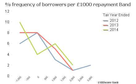
Huge huge thanks.
Next I'd like to see if I can show the y axis values as a percentage of the total number of active accounts each year. The difficult bit is setting up a denominator which excludes the filters we set up as part of the dimensions. At the moment I have this which is returning no data:
=sum(Active)/sum(total <[Tax Year Ended], CLASS(AGGR(-Sum ([Amount]),[Tax Year Ended], [Simulation number]),[Repayment Bandings]>Active)
Any ideas about how I can sort this out?
Thanks
John