Unlock a world of possibilities! Login now and discover the exclusive benefits awaiting you.
- Qlik Community
- :
- All Forums
- :
- QlikView App Dev
- :
- Creating chart for accumulation data
- Subscribe to RSS Feed
- Mark Topic as New
- Mark Topic as Read
- Float this Topic for Current User
- Bookmark
- Subscribe
- Mute
- Printer Friendly Page
- Mark as New
- Bookmark
- Subscribe
- Mute
- Subscribe to RSS Feed
- Permalink
- Report Inappropriate Content
Creating chart for accumulation data
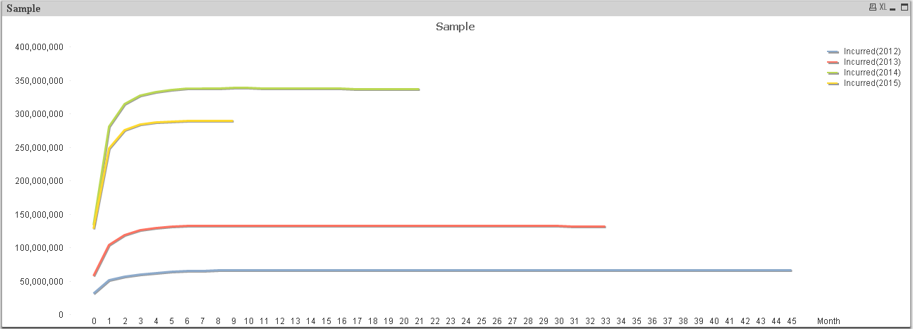
I have a problem in creating a chart for cumulative graph.
For example,

In this graph, the cumulative sum go to the end because I using the function
rangesum(above(sum(Incurred),0,rowno())
But I want the graph to look like this in the example below,
In this graph, I use the function if() and create a new field as the maximum month for each year.
if( Month>MaxMonth2012 OR IsNull(Month) ,0 , rangesum( above ( sum( Incurred ) , 0 , MaxMonth2012 +1)))
This result in many extra field created for each year and take a long time to run.This is just data for the 2012 onwards, this could be more and more messy and time consuming if I take in the data from 2000 onwards.
Is there any other possible way to do this and make this easier?
Thank you very much for your help!
- Mark as New
- Bookmark
- Subscribe
- Mute
- Subscribe to RSS Feed
- Permalink
- Report Inappropriate Content
Hi Kenth,
try setting Full accumulation option to your expression:
- Chart Properties->Expressions
- select Full accumulation from Accumulation options
best regards
Andrea
- Mark as New
- Bookmark
- Subscribe
- Mute
- Subscribe to RSS Feed
- Permalink
- Report Inappropriate Content
This cannot works.
This will create the graph of the first example that all the line go to the end of the month since it is accumulation.
I want the graph to be like stop at the middle like in the second sample.
- Mark as New
- Bookmark
- Subscribe
- Mute
- Subscribe to RSS Feed
- Permalink
- Report Inappropriate Content
hi Kenth,
could you provide sample data ?
Andrea