Unlock a world of possibilities! Login now and discover the exclusive benefits awaiting you.
- Qlik Community
- :
- All Forums
- :
- QlikView App Dev
- :
- Re: Customer Satisfaction qlikDoc
- Subscribe to RSS Feed
- Mark Topic as New
- Mark Topic as Read
- Float this Topic for Current User
- Bookmark
- Subscribe
- Mute
- Printer Friendly Page
- Mark as New
- Bookmark
- Subscribe
- Mute
- Subscribe to RSS Feed
- Permalink
- Report Inappropriate Content
Customer Satisfaction qlikDoc
Hello Guys,
I'm new in qlikview but i've already read qlikview for developers. the thing i want to get help with is this:
I have a table of customer satisfaction data in excel which contains customers' ID,State,City,Year,Season,Month,.. and the answers to 12 questions about the opinion of customers.
Possible answers to those 12 questions are: Highly agree, agree, no opinion, disagree, Highly disagree.
i like to compare different Years|Seasons|months - States|Cities - Products the used , etc and see their satisfaction trends.
what kind of bar would answer my requirements? and what are my dimentions?
Just pay attention that there are 12 question columns in the table with 5 possible answers. so if i choose a drill down group including the 12 questions i would have a bar which its X axis are 5 possible answers and Y axis are the Count or any other functions that i chose.
but i like to have a comparison between different criteria.
any comment will be greatly appreciated.
Thank you
- Mark as New
- Bookmark
- Subscribe
- Mute
- Subscribe to RSS Feed
- Permalink
- Report Inappropriate Content
EDIT: Visualization experience can further be enhance by adding more dimensions in to selection criteria and charts.
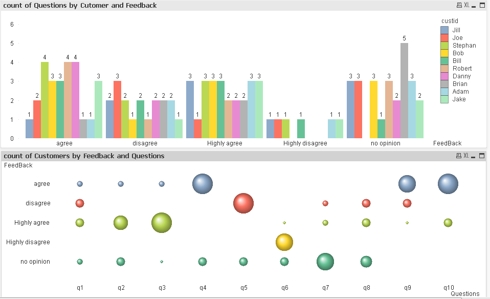
I've created two charts to show information.
The first chart shows the count of Questions answered by Customers by Feedback.
You can find that which customers have given good or bad feedback. For example customer (Brian) has given "No Opinion" to 5 questions. It could happen because the customer might not be able to understand the feedback form or there is something which needs attention.
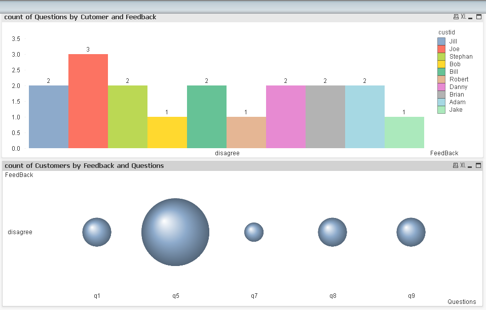
also you can find that many customers have given Disagree feedback to couple of question which further can be drill down and found out what are those questions. See image 2 below. So you can find that question # 5 has been disagreed by many customers further if you drill down the Question # then you can find who are those customers and you can find what can be done to improve the service.
The second chart shows it by questions. So you can see that question 7 has got maximum feedback as No Opinion. It could happen that customers might not have understood the question.Q6 has got many Highly Disagree and when you drill down the question then you can find the customer names from the top chart.
- Mark as New
- Bookmark
- Subscribe
- Mute
- Subscribe to RSS Feed
- Permalink
- Report Inappropriate Content
Thank you Dear Sudeep, you apparently spent much time to answer my question and part of that was so helpful and gave me interesting ideas, but i want to have comparison between two variables.
for instance, Two seasons of a year(or two different states,cities,products) and see how the results are.
i guess i need a cyclic group including those items on the dimension to select which criteria i want to check. but i want to compare to selective criteria at the same time. that's the puzzle for me!
Thanks again buddy
- Mark as New
- Bookmark
- Subscribe
- Mute
- Subscribe to RSS Feed
- Permalink
- Report Inappropriate Content
Have you already checked examples of Alternate States. To me from your explanation it seems you want to do a parallel comparison for example one to another city or one season to another season instead of looking at the total data set of two seasons. Please take a look at the alternate states examples.
- Mark as New
- Bookmark
- Subscribe
- Mute
- Subscribe to RSS Feed
- Permalink
- Report Inappropriate Content
I'm sorry if i unmarked the correct answer, now that i read alternate state functionality, despite its great application it doesn't apply in my case. i don't need a comparison between two portfolio or groups.
I want to compare satisfaction of customers in 2 different Cities,States,Years,Months and ....
i cannot possibly draw 30 charts for that. there should be a way to set the expressions in variables and user can select which criteria he/she wants to compare.