Unlock a world of possibilities! Login now and discover the exclusive benefits awaiting you.
- Qlik Community
- :
- All Forums
- :
- QlikView App Dev
- :
- Re: Dash in graphs
- Subscribe to RSS Feed
- Mark Topic as New
- Mark Topic as Read
- Float this Topic for Current User
- Bookmark
- Subscribe
- Mute
- Printer Friendly Page
- Mark as New
- Bookmark
- Subscribe
- Mute
- Subscribe to RSS Feed
- Permalink
- Report Inappropriate Content
Dash in graphs
Hi, as no googling and searching helped, I would like to ask for suggestions how to solve my issue.
I have one simple excel table with sales data from 2012-today that I load into QV and filter by time, segments, customers.
There is one column graph that is meant do display the sales for the selected subsegment over the whole period the data is provided for.
I have three dimensions: Year, Month, and a "dummy dimension" =1 as suggested elswere on the forums to force Year and Month on the X axis. The expression is simple Sum(Sum)
- I have created a master calendar and linked it to the original table in order to fill in the missing months/years (which might have not been necessary if I select "Show all values" in Chart Properties > Dimensions > Month, and ... > Year as the dataset contains all the values)
- I have unchecked the Supress Zero-Values in the Chart Properties > Presentation tab in order to see columns for all the months
- I have unchecked the Supress Missing option even though it doesn't seem to have effect on the graph.
- I have doublechecked both tables in the table view preview to make sure there are no missing values in the Date column
Problem:
I can't get rid of the "dash" that appears in addition to all the month and years values and suggest there are some NULL values in both tables (which I'm not aware of)
This is probably going to be a very stupid problem...
Sorry, I can't attach the QV file as I'm still evaluating the app in the personal edition.
- « Previous Replies
-
- 1
- 2
- Next Replies »
- Mark as New
- Bookmark
- Subscribe
- Mute
- Subscribe to RSS Feed
- Permalink
- Report Inappropriate Content
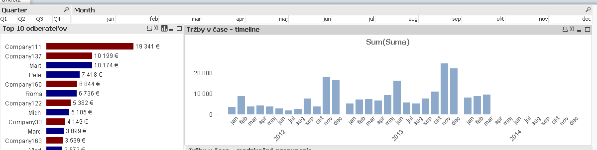
Hi, this is what I'm getting.
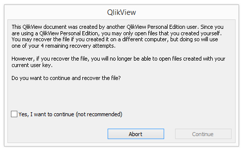
Not being able to open other files created with my current user key would be a disaster 
I could... I don't care so much about getting the extra dash for months values, but the extra empty area created by the year dash takes up a whole lot of space...
- Mark as New
- Bookmark
- Subscribe
- Mute
- Subscribe to RSS Feed
- Permalink
- Report Inappropriate Content
Don´t open. After 5 of this you can´t use qv.
- Mark as New
- Bookmark
- Subscribe
- Mute
- Subscribe to RSS Feed
- Permalink
- Report Inappropriate Content
I tried loading the data from the xls and found that your script is fine. I created a bar chart and found this as below.
Is this something how you want this chart to be displayed. I didn't use the "Show All Values" option.
- Mark as New
- Bookmark
- Subscribe
- Mute
- Subscribe to RSS Feed
- Permalink
- Report Inappropriate Content
Yes, exactly, this is how I want it to look.
When you select Company137 with your curent settings, does it still display all the months for jan 2012 - dec 2014 although there are values just in jun 2013 and feb 2014? Because that what I was trying to achieve, but I was always getting either the full timeline + dashes, or only individual months.
Thanks!
- Mark as New
- Bookmark
- Subscribe
- Mute
- Subscribe to RSS Feed
- Permalink
- Report Inappropriate Content
Had the same problem, this article shows you how to fix it!
- « Previous Replies
-
- 1
- 2
- Next Replies »