Unlock a world of possibilities! Login now and discover the exclusive benefits awaiting you.
- Qlik Community
- :
- All Forums
- :
- QlikView App Dev
- :
- Deduction Counts
- Subscribe to RSS Feed
- Mark Topic as New
- Mark Topic as Read
- Float this Topic for Current User
- Bookmark
- Subscribe
- Mute
- Printer Friendly Page
- Mark as New
- Bookmark
- Subscribe
- Mute
- Subscribe to RSS Feed
- Permalink
- Report Inappropriate Content
Deduction Counts
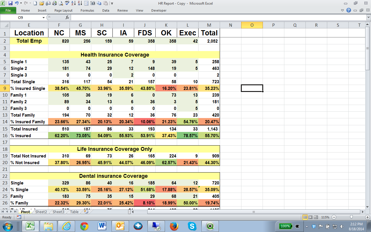
I am looking to recreate this spreadsheet that I made in Excel using a data connection and a series of pivot tables. Any ideas on how to get me started creating this in QlikView will be greatly appreciated.
- Tags:
- new_to_qlikview
- Mark as New
- Bookmark
- Subscribe
- Mute
- Subscribe to RSS Feed
- Permalink
- Report Inappropriate Content
You can try loading the row headers as a dimension so that the data in Qlik is like:
Location, Metric, Metric Value, Insurance Type
NC,Single 1, 135, Health
NC, Single 2, 181, Health
etc....
Then create a pivot table with Location and Metric as the dimensions.
The expression would then leverage the [Metric Value] field with some IF statements to pick up the different number formatting and aggregations.
Use 3 different charts for the insurance types and SET ANALYSIS to focus each chart to a specific insurance type.
If you have more than 3 insurance types and need that to be dynamic it will be more complicated.