Unlock a world of possibilities! Login now and discover the exclusive benefits awaiting you.
- Qlik Community
- :
- All Forums
- :
- QlikView App Dev
- :
- Different data of one excel tabel in different Qli...
- Subscribe to RSS Feed
- Mark Topic as New
- Mark Topic as Read
- Float this Topic for Current User
- Bookmark
- Subscribe
- Mute
- Printer Friendly Page
- Mark as New
- Bookmark
- Subscribe
- Mute
- Subscribe to RSS Feed
- Permalink
- Report Inappropriate Content
Different data of one excel tabel in different QlikView-tabs
I have 1 Excel table with many rows, looks like this:
Project | Area | Ready in % |
Project 1 | Area 1 | 80 |
Project 2 | Area 3 | 40 |
Project 3 | Area 2 | 20 |
Project 4 | Area 3 | 70 |
Project 5 | Area 3 | 90 |
Project 6 | Area 5 | 70 |
I want to have 1 QlikView-tab each Area and then 1 gauge charts each Project in 1 QlikView-tab, that I can switch between the tab rows and see all projects of one area in one QlikView-tab.
I already got to load ONLY the data of one Area (with a where-command), but then I get the same data for all tab rows…
LOAD Project,
Area,
[Ready in %],
FROM
[\\Q.xlsx]
(ooxml, embedded labels, table is Table1)
where Area = 'Area 3';
So I have 2 questions:
- Is there any possibility to load the separated data only in one tab?
- Is there a possibility to get two gauges in one tab with of different excel rows?
- Mark as New
- Bookmark
- Subscribe
- Mute
- Subscribe to RSS Feed
- Permalink
- Report Inappropriate Content
Hi Hanna W
If I am reading this correctly, then you need to use Set Analysis in your expression.
Firstly, do not use your WHERE clause in the script, load ALL the data into this table.
Then, when you are building your quage, create a script something like this to filter the data accordingly.
AVG({1<Area={'Area 1'}>}[Ready in %])
Note the '1' near the start of the expression. This ensures that the guage ignores any selections you have already made.
hope that helps
George
- Mark as New
- Bookmark
- Subscribe
- Mute
- Subscribe to RSS Feed
- Permalink
- Report Inappropriate Content
Oh, to filter on Project too, do this:
AVG({1<Area={'Area 1'}, Project={'Project 1'}>}[Ready in %])
- Mark as New
- Bookmark
- Subscribe
- Mute
- Subscribe to RSS Feed
- Permalink
- Report Inappropriate Content
Hi George,
thanks a lot, it alreadys helps doing some things in an much easier way I did it before!
But still, I get two gauges where I get the same display (what makes sense, because with the script I take the average of all Area 3 projects. Finally i´d like to have e.g. for the area 3 tab 3 gauges: one for project 2 (with ready 40%), one for project 4 (with ready 70%) and one for project 5 (with ready 90%). But not by naming the projects, because they can change or become more.
I thought about putting all projects of one area first af all in one new "group" and then counting something like for (i=0,1)... and put every i in one gauge... But don´t really know how to do in Qlikview and how to go further...
Hanna
- Mark as New
- Bookmark
- Subscribe
- Mute
- Subscribe to RSS Feed
- Permalink
- Report Inappropriate Content
Hanna,
Have a look at the attached document, maybe something along these lines would help.
Good Luck
Oscar
- Mark as New
- Bookmark
- Subscribe
- Mute
- Subscribe to RSS Feed
- Permalink
- Report Inappropriate Content
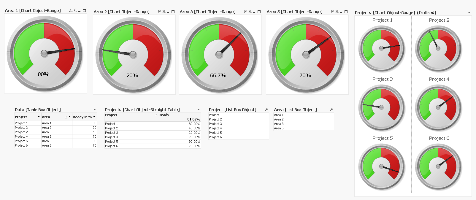
Hi Oscar,
yes! The gauges on the right are like I wanted to have them, but unfortunaley I can not open you file since I can just open my own written scripts... Could you copy it to the comments?
Thanks, Hanna
- Mark as New
- Bookmark
- Subscribe
- Mute
- Subscribe to RSS Feed
- Permalink
- Report Inappropriate Content
Hi Hanna,
You can still achieve what you are trying to using set analysis. Here's a link to a good page at help.qlik.com which explains the basics of set expressions. It's a bout a 5 min read but will open up a whole new world of possibilities.
Good luck
George
- Mark as New
- Bookmark
- Subscribe
- Mute
- Subscribe to RSS Feed
- Permalink
- Report Inappropriate Content
Hanna,
I didn't do anything special in the script. I simply loaded the table you defined in the original post.
Data:
LOAD
Project,
Area,
[Ready in %]
FROM
[https://community.qlik.com/thread/269677]
(html, codepage is 1252, embedded labels, table is @1);
I then created the Gauge chart and trellised it.
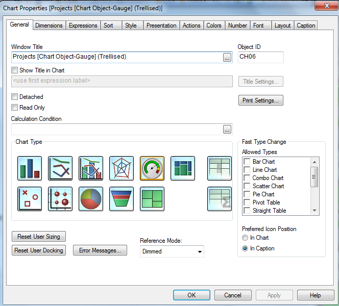
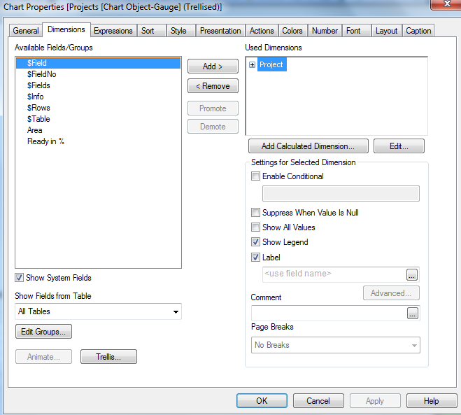
I chose Projects as my Dimension and then clicked on the Trellis button:
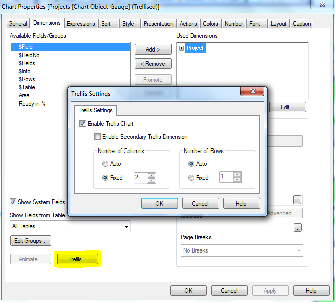
I set the size of my trellis:
And finally my expression:
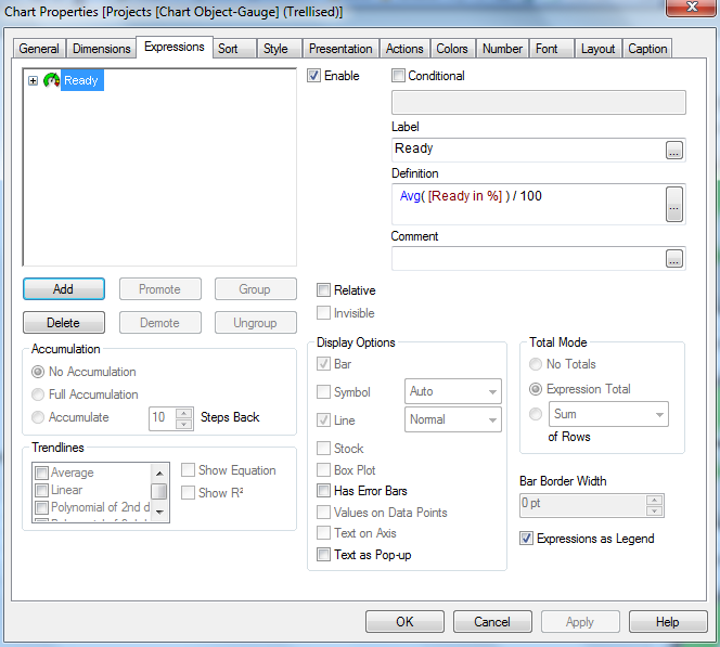
Good luck
Oscar
- Mark as New
- Bookmark
- Subscribe
- Mute
- Subscribe to RSS Feed
- Permalink
- Report Inappropriate Content
Hi George, hi Oscar,
I could implement BOTH possibilities! So, you answered my question. Thank you!
I have advantages and disadvantages with both solutions:
“Trellis-Solution”:
I can use the multi box and switch in ONE tab between the areas and its projects!! I do not have to rework if there are changes in the number of projects! Great! I would prefer this solution, BUT
- I also use another gauge chart for the budget, where I have to define the maximum (which is defined in my excel table). With the trellis it is not possible to use different maxima each chart.
- And I also want to read out text (‘next steps’) out of the excel table, so I used a text object and there the “trellis-function” is not possible.
Set analysis (thanks for the link, george):
All this points are possible with the set analysis functions, BUT of cause it´s not that smart and if there are new projects coming up in the list, I have to rework.
If you have any ideas for these problems just let me know. I will close this discussion, because you solved my initial problem. Thanks a lot!
Hanna
- Mark as New
- Bookmark
- Subscribe
- Mute
- Subscribe to RSS Feed
- Permalink
- Report Inappropriate Content
Hanna,
If you were able to open my example you would see I did some work on both set analysis as well as the trellis. All of this is based on a small sample of data. As you go through your process of building your data model and user interface just keep an open mind on the possibilities of what you can do. When I first started I would go down a path in my mind of what I should do to create my visualization. That sometimes limited me to what I could do with the visualizations in QlikView. Also, when you get to the point of having difficulties writing an expression on the front end, remember that you can modify the script to help support what you are trying to do in the front end.
Good luck
Oscar