Unlock a world of possibilities! Login now and discover the exclusive benefits awaiting you.
- Qlik Community
- :
- All Forums
- :
- QlikView App Dev
- :
- Re: Different scales in trellis
- Subscribe to RSS Feed
- Mark Topic as New
- Mark Topic as Read
- Float this Topic for Current User
- Bookmark
- Subscribe
- Mute
- Printer Friendly Page
- Mark as New
- Bookmark
- Subscribe
- Mute
- Subscribe to RSS Feed
- Permalink
- Report Inappropriate Content
Different scales in trellis
Hello 
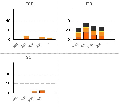
I would like to have 1 stacked bar chart per department (ECE, ITP, SCI) and per month => 2 dimension graphs.
So I created a trellis.
Problem is that the same scale is used for all the trellis chart.
Is it possible to have one scale per trellis so the graphes look nicer than the one in example?
In example, I have the graphes for ITD which is too big and the others look too small.
Thank you in advance!!
Or maybe the trellis is not the perfect solution?
- Mark as New
- Bookmark
- Subscribe
- Mute
- Subscribe to RSS Feed
- Permalink
- Report Inappropriate Content
hi,
Since ITD data is huge, I am assuming that you need not compare your data among ECE,ITD and SCI.
In such case it would be better if you create different charts for each one of them.
Its my personal view, if you have tooo many data in chart its not easy to read and understand the data.
Hence I would suggest you you to have three different charts.
or
In the above trellis you can define the maximum Y axis may be to 20.
Deepak
- Mark as New
- Bookmark
- Subscribe
- Mute
- Subscribe to RSS Feed
- Permalink
- Report Inappropriate Content
Hi,
You can't have different scales into a treilli chart.
It's a limitation of Qlikview but with such a limitation you are sure that your chart will not be missunderstood. If a bar is bigger that an other it means that the value is bigger, you don't have to check the scale in order to compare your values.
Regards